Showing posts with label technology. Show all posts

28 October 2024

NHS appointments are a mess

There has been much discussion recently about fining people for missing NHS appointments and the consensus seems to be that people have no excuse for missing them and it is only fair that they should pay a fine when they do so. 

My experience suggests that it is quite easy to miss them, because the appointments system is a mess, and my situation is much simpler than many people's.

I am documenting my views here so that I can easily share them as and when required, starting with the hospital's Patient Advise Liaison Service.

My appointments cycle

I have one underlying condition that is being managed by one hospital. I continue to see my GP for other things like the recent flu and Covid booster jabs.

This condition means that I need to see one consultant every three months and another every six weeks with the second visit followed by a treatment session the following day. I also have two scans every other treatment cycle, i.e. once every twelve weeks, which are done at a separate site.

That means that at any one time I have five future appointments booked.

Different appointment systems

The big problem is that there is no consistency in how these are managed:
  • For the two consultants appointments I get paper letters and they also appear in the NHS app, which means that I get automated reminders by text
  • For the two scans I get paper letters but nothing else
  • For the treatment sessions I have an appointment card (!) which gets updated by hand each visit.
The only place all these appointments are consolidated is on my fridge where I store all the letters and appointment card in date order. 

I also put them all in my online calendar manually which is prone to error (more on that later).

Other issues

There are several other niggles in the systems that while are not significant in themselves they all add to the friction in the system and increase the chances that errors will be made. One such niggle has already caused me to get one appointment wrong, luckily I arrived a day early so no really damage was done.

Where electronic communications are used, e.g. NHS app, this just points to a message that is in the form of a PDF file that contains an image of the letter, i.e. it is not possible to simply cut and paste the appointment details in to a personal calendar. 

Many apps that I use, e.g. MeetUp, have an "Add to Calendar" function and NHS app should be able to do this too.

There are inconsistencies in the naming of locations within the hospital, e.g. letters refer to "Oncology & Haematology Outpatients” whereas the signage in the hospital says Haematology & Oncology Outpatients (HOOP)", and the two letters for the scans 

The letters for the scans give the data (dd/mm/yy) but not the day of the week, which is how most people refer to dates most of the time, e.g. it says "31 October 2024" rather then "Thursday 31 October 2024".

The two letters for the scans have slightly different descriptions for the same address. They also use different sized fonts. which may be an attempt to keep all of the main information on the front page.

I sometimes get automated reminders to my landline! I did not know that the hospital even had this number much less intended to use it. I am not sure which appointments these are for as I never listen to the whole message once I know who it is from.

Summary

Three things should happen:
  1. The NHS app should be used for all appointments
  2.  The app this should link to personal online calendars
  3. Appointment letters to patients should be reviewed for consistency and clarity.

25 November 2020

Walking with Google Maps

Why I am doing this

I walk a lot, around 30,000 steps a day at the moment, and I use maps several times a day so I thought that it was about time that I documented my experience, good and bad, of using my most common tool, Google Maps.

The last time that I wrote about maps was in 2009 and things have improved since then.

I have also been asked by the local Ramblers group to say something about editing maps and so I will cover that in this longer piece.

Planning a walk is easy

This is probably the best thing about Google Maps and the reason that I use it the most.

Like most mapping systems that I have (but not the free OS one) it can draw a walking route between two points. For my main weekly walk, with a friend when permitted, we think of a part of Greater London that we want to explore and let Google Maps do the rest.

In this case we fancied going to Hampstead Heath and chose two endpoints that are on direct train routes from Richmond, we can get to Embankment on the District Line and back from Hampstead Heath on the Overground.

Google draws the most direct walking route between the two. Sadly the distance is given in miles (this can be changed but you have to do it every time) and the walking speed is a little slow but it is a useful start for planning.

As drawn, this route is too short and too ugly, in particularly it avoids the two large parks in the area.

And this is where Google Maps comes up trumps, you can simply select a point on the route and drag it as required. 

You can do this multiple times to add all the places and routes that you want to include in the walk.

I do not play around too much, the aim is just to get a better guide and the decisions on where to actually walk will be taken on the day according to the prettiness of the landscape and the condition of the paths.

By adding a loop in Hyde Park and a route through Regents Park our planned walk increased to a more meaty 14 km with scope to increase it further on the day.


A (small) library of walks

Having created a route on Google Maps it is possible to save and share it. There is no point in doing this for our ad hoc routes but, luckily, other people have done it for established routes like London's Capital Ring.

This map is not on the Capital Ring page and I found it through a simple Google Search, on the optimistic assumption that someone would have mapped it, and they had. The map is here.

Unfortunately the use of Google Maps is inconsistent among walkers with many other technologies also being used, most of which lack the familiarity and near ubiquity of Google Maps.

Keeping track on the walk

The big advantage of using a mapping app on your phone, as opposed to a static guide, picture or pdf, is that you get a little blue dot showing where you are on the route or, as often happens to us, if you drift off the route it is easy to see how to get back on it without necessarily having to retrace your steps.

I have done walks using the "turn left in 150m" type instructions and having got lost it has been quite an effort to work out where the mistake could have been made and/or what could be done to correct it.

Adding missing paths

Google Maps is pretty good at including paths, it is better than Apple Maps but not as good as Open Street Maps (I use the Pokemon Go interface continuously while walking) but there are times when things are missing and this can be frustrating.

These errors, in my experience, are usually small in size but significant in impact. Here, for example, Google does not know about the two (!) paths from the end of Mead Road to Lock Road and so takes you all around the block. Having been slightly derogatory about Apple Maps earlier it is worth saying that they do know about these paths.

Similarly, until recently Google Maps did not know that you could walk through Sheaf Gate or Sandy Lane Gate to get into Bushy Park, despite the rather obvious clue in their names.

The reason that Google knows those paths now is because I told it.

Within Google Maps it is a simple matter to "Report a data problem" but I find the approval process a bit hit and miss. I had to try adding a new unnamed path through Sheaf Gate a couple of times before it was accepted.

One error that really annoyed me, a long path stopping pointlessly just 2m short of another so that they were not connected, took me several attempts to get changed, this despite the fact that a lack of any obstacle was very clear from the satellite view in Google Maps. 

Likewise I do not know why they would not accept that Sheaf Gate is a gate the first time despite this being clear in their Street View as well as in its name.

It is a question of being precise in describing the error and patient in pushing the amendments through.


Common problems with maps

Google Maps suffers from some problems that are common to all mapping apps that I have tried:
  • There is no indication of gradient so the steep climbs to places like Dawson Heights can be something of a shock, outside of the centre London is quite hilly!
  • What is shown as a path can vary from tarmac to unwalkable mud.
  • Some green spaces are things like centenaries or golf courses and while these may have paths across them they may be gated and locked. 
  • Similarly places like Bushy Park have fenced off sections that are not shown on the map. The counter problem to this is that it does not recognise that you can walk almost anywhere in places like Regents Park, because it is just grass, and are not restricted to the formal paths.
None of these problems are catastrophic but they all lead to adjustments on the fly when I am out walking.

In summary

Google Maps is excellent for planning routes and for tracking progress on the day but data quality issues mean that you have to be flexible and, for example, use other tools as well or change plans slightly as you go. And where you find data errors it is worth trying to get them fixed for everyone's benefit.


24 April 2020

We have solar power!

We had been put off installing solar panels because our roofs face east and west but we finally relented when invited to join a joint procurement scheme run by Kingston Council with Spirit Energy as the contractor.

It all went very smoothly and we now have ten solar panels on our back roof (facing east) with a total generation capacity of just over 3Kw

Obviously the sun does not shine all the time, even on a bright day, and the panels only catch the morning sun, and then increasingly obliquely, but we are managing to generate around 13Kwh per day at the moment, which we are happy with.

During the design stage we went through the financial models but, frankly, that was not the point. We all need to reduce or consumption of fossil fuels (and their derivatives) and this is one way that we could do that.


19 March 2020

How to renew your garden waste collection in 12 easy steps

I have had a garden waste collection service from Kingston Council for a few years now and every year the convoluted renewal process annoys me so this year I thought that I would record it step by step.

This is the web page that the renewal letter (not an email) from the Council tells you to go to.

There is a big Subscribe button and no mention of renewal, but this is the right place.

Press Subscribe.

I am an existing customer but the system pretends, for the moment, that it does not know me and starts an address search.

If you are asking for house number and post code then you do not need the full address too. No other website I can think of does this.

Success, it has found me!

Sorry, it has not found me, it has only found my address.

Now it needs to do a second search to find the service at that address, the one that I am here to renew.

We both agree that I have one garden waste bin.

For reasons that escape me, at this point, in the middle of the process, it decides to ask me if I really want to do this.

Basically this is the same screen as the one two back where we both agreed that I have one garden waste bin that I wish to renew.

No, I have not changed my mind since you last asked me two screens ago.

A payment request, now we are getting somewhere!

I minor point but the payment process is embedded in the renewal process and behaves differently. The dark blue square buttons are now rounded and light blue, and Next has been replaced by Continue.


I was about time we had another confirmation screen. This is number three.

All done and the transaction is confirmed.

Note that in this dialogue it uses the word "Confirmation" to mean both "your confirmation is required" and "our confirmation is given".

Saying Thank You is so important that it gets a screen of its own when saying that on the confirmation screen would have done the job.

29 June 2017

Sometimes Apple Maps is better than Google Maps

The consensus seems to be that Google Maps are god and Apple Maps are bad but, despite this, I persevere with Apple Maps as the default mapping system on my iPhone and, because of that, on my iPad and iMac too. So I was pleased to find an example where Apple Maps was clearly better.

I am going to see a flat this evening and while I know the route very well I wanted to check the distance so that I could time the walk; 1km is a convenient 10 minutes for planning purposes.

I am actually travelling from Teddington but I redid the planning from Northweald Lane as that demonstrates my point better.

Apple Maps shows a quick and easy route.

On the other hand, Google Maps wants to take me on a large detour, taking 9 minutes instead of 4.

The reason for this is that Google Maps does not know about some of the local footpaths that Apple Maps does know and so it takes me along the roads instead.

That is not my only grips with Google Maps either; it insists in showing me distances in Miles (their default for the UK) rather than in km (my preference). This is despite me having a Google Profile where it could hold details of my preference.

And that is not my only gripe with Google either! I wrote something about the accuracy of online maps back in 2009 and somehow in all the changes with Google Photos (remember Picasa?) they have managed to lose some. Update 30/6/17: Google have found my old photos and they are now shown on the previous blog post.

31 May 2016

Why I hate working with Microsoft Word

Like a lot of people, especially those who style ourselves as consultants, Microsoft Office is my main tool and while I would not claim to be an expert in it I have been singing it heavily since the very early 1990s with Office v1.0 which included Word v1.1. While I use OpenOffice out of choice at home I have been using Office ever since wherever I have worked.

Twenty five years of serious use and I am still frequently confused and frustrated by the quirks in Word that makes it do things that are so weird that I find it hard to believe that they were intended yet they are so obvious that if they are bugs then surely they would have been found and fixed many years ago.

I have said many times that I defy anybody to use numbered and/or bulleted lists and to get the result that they expected and I came foul of my own rule this morning.

I had pasted some text (keep text only) from one document to another. I then added the headings (1.6, 1.6.1 and 1.6.2) using the styles from the target document. So far so good.


Then I wanted to restore the numbered lists that had been imported as text, i.e. the "1", "a" etc. were included within the text rather than in the formatting. I wanted to use the numbered list formatting for the obvious reasons, to be consistent with the rest of the document and to make modifying the list easy.

So I selected the relevant text and pressed the numbered list button on the toolbar.


The numbering worked much as I hoped but in creating the numbered list Word also decided to modify the styles of my headings! Headings 1.6 and 1.6.1 were both indented and by different amounts. The paragraph mark on the normal line above the 1.6 heading shows where they were and should have been left.

Checking the style confirmed that it was the style that had been changed (so the changes were made to the whole document) rather than just the settings to those paragraphs.

I have absolutely no idea why Word chose to do that and this is a typical example of the frustrations that I have with working with Microsoft Office. It's simply not up to the job.

11 February 2014

TODAY WE FIGHT BACK


Today we fight back against internet surveillance by the NSA and GCHQ etc.

If you are unsure of what this is all about then read this Guardian article.


17 August 2013

Deke at Dorset County Council

I was not intending to do any own-trumpet blowing but a story on Facebook about the musician Deke Leonard reminded me of the days in the 1980s when I worked at Dorset County Council (DCC) and led a team developing an information retrieval package called "Deke".

When I started work at DCC as a Trainee Programme in 1978 they were using a ICL 1904 mainframe running George. Cobol was the main programming language with some stuff written in a lower-level language called PLAN. FILETAB was used to do quick and simple reports, often once-offs.

Soon after I joined, DCC moved on to a ICL 2900 under VME/B. We still used Cobol but there was no equivalent to FILETAB; so we wrote one. I was the main designer and led a small team of developers that included, at various times, Alan Fowler, Martin McMeeken, Steve Crook, Chris Whitley and Vince Pomagalski.

To submit a query in Deke, users completed a few easy screens, e.g. select "rateable value > £500" and "district = Purbeck", print "address" and "rateable value" and sort by "rateable value". This generated a Cobol programme to run the query.

The whole point was to make it easy and we boasted of never having to train anybody in how to use it. They key was to use terms like "rateable value" and "rv" that users were familiar with and to build the query in a few simple screens.

To provide this level of simplicity for users we had to do some work up-front to define each of the files to Deke. This took around half a day even for an application that had several related files. Once set-up this way there was nothing else that we needed to do and the users could generate reports and queries to the hearts' content.

We developed Deke for in-house use and we started to promote it to other organisations when we realised that other people moving to ICL 2900 would have the same problem. This was a few years before Query Master and Report Master appeared.

Prompted by the other reference to Deke, I did a quick search for "deke dorset county council" and found these two extracts from BIIRISA the Newsletter of the British Urban, and Regional Information Systems Association.

BIIRISA 62, February 1984

Operating STRATPLAN consists of two distinct ,stages :-
(i) Data entry and maintenance, using up to five standard data entry VDU screen displays (including a menu screen);
(ii) Data retrieval and analysis using the DEKE inquiry package.
DEKE is a powerful but very easy to use general inquiry programme generator which has been developed by Dorset County Council.*
••• DEKE is available for ICL 2900 series machines running under the VME operating system. For further details write to : County Treasurer, Dorset County Council, County Hall, Dorchester DTI 1XJ, or telephone Ridiard Goodridge on (0305) 63131, ext. 4078.

BIIRISA 78, May 1987
File interrogation will be via Dorset' s DEKE report. writing package. This is not only exceptionally easy to use, but also is already familiar to a wide spectrum of administrative staff in the Colleges.

14 October 2012

Neil Young and Crazy Horse live in bed

Life does not get much better that this.

It had been a good Saturday evening watching a local band in a local pub then going to another local pub for a nightcap before settling in to bed around 2am.

Going to bed these days means a quick look at my new iPad (what are they going to call it when the next one comes out?) to check on my Words with Friends games and to check on the state of the world as reported on Twitter.

That was when I learnt from ThrashersWheat that a Neil Young and Crazy Horse concert was about to be streamed live from Austin, Texas. I followed the link and snuggled down in bed to watch the show.


I knew that it would be good but it was much better than that.

My previous experience of webcasts had been experimental and exciting for a technological perspective but somewhat lacking in terms of the quality of the music and video. This was completely different.

The technology has improved several fold since then. I now have BT Infinity broadband that delivers up to around 36Mbps (it varies by device) and an iPad with a retina screen to watch the bits on. The overall result was high definition picture and sound with not a hint of a skip or a pause.

With the technology working well that left me free to concentrate on the music. And that's how it should be, technology is at its best when it's invisible.

Neil Young playing live with Crazy Horse, what more is there to say? You know that means extended songs with Neil doing whatever he wants and the band following along as if it had all be rehearsed down to the last detail when you know that's not true. The first song lasted around 15 minutes, maybe more.

The concert offered up some of the expected classics (there are so many to choose from) including the most-played Powderfinger. It was also my first chance to hear some of the new songs and they sounded excellent, i.e. very much in the same vein as other Neil Young songs written with Crazy Horse in mind.

My only regret was the late hour and my lack of stamina. I watched for about an hour before the lack of sleep caught up with me and I drifted off very happy.

07 July 2012

Spam comments can be amusing

I moderate comments on this blog merely to keep spammers out and at times I think that is a shame as some of the spam is quite funny due so I have decided to include some of it here.

You'll notice the bad English suggesting this was written in something like Russian and then translated by a robot. Some thought has gone in to it though as shown by the generic praise that applies to all posts (and none) and also the references to other people who like the post.

I guess that is why the comments get past the Google spam filter but are easy to spot by a human.
  • I'm amazed, I must say. Rarely do I come across a blog that's both equally educative and interesting, and let me tell you, you have hit the nail on the head. The issue is an issue that too few men and women are speaking intelligently about. I'm very happy that I stumbled across this in my search for something regarding this.
  • Hi! This post could not be written any better! Reading through this post reminds me of my good old room mate! He always kept talking about this. I will forward this write-up to him. Fairly certain he will have a good read. Thanks for sharing!
  •  My partner and I absolutely love your blog and find most of your post's to be exactly I'm looking for. Again, awesome website!
  • An impressive share! I've just forwarded this onto a colleague who had been conducting a little research on this. And he in fact ordered me breakfast because I stumbled upon it for him... lol. So allow me to reword this.... Thanks for the meal!! But yeah, thanks for spending time to discuss this issue here on your web page.
  • What i do not realize is in fact how you're no longer really a lot more smartly-favored than you might be now. You're very intelligent. You know therefore considerably on the subject of this matter, made me in my view imagine it from so many numerous angles. Its like women and men are not interested until it is something to do with Girl gaga! Your personal stuffs excellent. Always deal with it up!
Remember, this is all rubbish and the fawning praise is just to get me to accept their links.

10 June 2012

Ministry of Space by Warren Ellis and Chris Weston

I'll come to the comic in a moment but I want to start with the technology that made it all happen.

I treated myself to an iPad a couple of months ago (it's the so-called new iPad that followed the iPad2) and one of the things that I wanted to use it for was reading comics. The main reason for this is that it is easy to carry one iPad around with me but rather hard to carry the few dozen comics that are in my read pile.

The secondary reason is that it is easy to get complete series and back issues so missing issues ceases to be a problem. Digital comics are also cheaper that paper ones but that is a lesser reason for buying them that way.

I've read a few Warren Ellis comics over the years and I like his style and the subjects that he writes about.

I follow him on Twitter and was catching up with things after a busy day touristing in Amsterdam when he tweeted that his Ministry of Space, previously unknown to me, was now available digitally, and for the ridiculous price of £3.99.

It took but a couple of minutes to find and download it. This is frictionless commerce at its best. Previously I would have had to email my comic shop and ask them to get a copy for me and then go to the shop to collect it. Easy enough but that would have taken weeks rather than days.

Warren's own afterword explains the story's relationship to Dan Dare, to which it clearly pays homage.

Essentially it is a prequel to the Dan Dare we all know and love and it explains how Great Britain came to be the dominant space power in the 1950s.

Of course this is Warren Ellis so the story does rather more than that and it ventures in to dark places where power and gold play their part.

As does some decidedly unfriendly fire.

Then the last panel knocks you sideways with an unexpected ending to a story that you did not know was there.

Warren is his economical safe and words and their attendant balloons are few and far between.

This leaves plenty of space for the art which is a good thing.

Chris Weston was a new name for me and that's my fault. The artwork is clean, very detailed and very evocative of the original Dan Dare without in anyway being a copy of it. Here the monorail has some Frank Hampson curves and colours and the flying boys are a direct lift.

Ministry of Space is a delightful little comic (it was originally issued in three chapters) that takes you back to a different future and shows you the good and the bad of what might have been.

10 February 2012

LIKE 32: The Future of History

Having missed LIKE 31, on information literacy, a topic I am very interested in, (due to working away) I was keen to get back in the groove and go to LIKE 32 on digital archives, a topic I am not that interested in. Or so I thought.

Our guides for the evening were LIKE stalwart Lena Roland and Adrian Brown from the Parliament Archives.

Lena opened with a general description of the problems relating to the retention of digital materials and some of the approaches than can be used to address these. Adrian then explained the specific issues that Parliament has and the work that they are now doing.

In the past most information was stored on physical media (paper, film, etc.) and while these have their own preservation problems they are generally understood. Whereas now most is created and stored digitally. This creates new problems that we need to solve.

Compounding the problem is the sheer volume of information. Once we just had a few newspapers and TV channels to worry about, now we have to add the likes of blogs, twitter, Google+, Facebook, etc. etc.

This means that a "save everything" solution is difficult to create and even harder to search. The alternative "save the important stuff" solution relies on good judgement on what is worth saving and that judgement often only comes with hindsight. For example, all my old family photos may become useful if one of my sons becomes famous but otherwise they have little external value.

This is not just a problem for historians and archivists, we are all creators of digital content and need to come up with our own solutions for our documents, photos, blogs and tweets.

Some organisations are wise to the problem with initiatives to, for example, archive Twitter.

Searching will become more of a problem. Books have ISBNs to identify and classify them but there are no equivalents for blogs, tweets, etc.

Customisation of web sites to individual users, e.g. the Amazon home page, complicates matters further. How do you archive Amazon if every person's view of it is different?

The Parliamentary Archives in some ways have a simpler problem to solve in that it is just concerned with a relatively small and discrete set of records but this is made harder by the historical records, some of which are on parchment, and the need to have a precise and accurate record.

The approach they are taking is to separate the content (the words) from the media (a PDF file on a CD-ROM). Adrian gave the example of an old movie that requires the preservation of both the acetate film and a projector to display it. Separating content from media allows the preservation of both to be addressed separately.

Approaches to be considered include Preservation (keep everything as it is today), Migration (move it periodically to new media, e.g. from WordStar to Word) and Emulation (a new machine pretending to be an old one).

There are some decisions to make about what constitutes "content". Clearly it is the words but it may matter how the pages are laid out, which font was used, etc.

Links are an increasing problem. For example, a debate may refer to a policy document that is held on a Departmental website that is not under the Archives' control, i.e. it could move or be deleted. Archives are working with the Departments on this and one approach is to get them to keep everything in its original place even if it is no longer directly addressable from the Department's website.

Archives are considering whether the only way that they can be sure of keeping an accurate record is to keep a copy of all the things that they link to, with the implications that has for storage.

My notes from this session broke my golden rule and went on to a second page, which only goes to show that I am more interested in this topic than I thought.

Overall the debate was encouraging in that bright minds are aware of and understand the problem. What was less convincing was whether anybody has yet got the answers.

04 September 2011

Kew Gardens in late August

Going to Kew Gardens regularly gives me the chance to explore different parts of the gardens, the same parts in different seasons and also different ways of keeping a record of what I see and do.

My usual routine is: 1) check-in to Kew Gardens on FourSquare, 2) take about a hundred photos with my Canon Ixus 80IS, 3) put about forty of these on Facebook, 4) put about eight of these on Flickr, 5) add five to the Kew Gardens group there, 6) select my four to six for a blog post (like this one), 7) tweet that I've written a new blog post, and finally, 8) add a link to the blog post to the Kew Gardens page on facebook.

This time I did all that and also experimented with Instagram. This takes photos on your iPhone, applies a choice of filters to them and lets you post it quickly and easily to a range of sites including Facebook, Twitter and Flickr. The two main differences from what I usually do are the choice of filters and the ability to post at the time rather than, which is often the case, a week or so later.

This visit, on the last weekend in August, started at Lion Gate, ending a run of visits that had started at the more popular Victoria Gate.

The first thing to greet you there is the Pagoda but, regrettably, that is closed so I carried on towards the little Japanese Garden with its small decorative plants and swirls of neatly raked grey gravel.

At the top of a short gentle ride sits a small squat building looking over it all and confirming the Oriental nature of the garden with its distinctive architecture.

The garden is tranquil and restful both through deliberate design and also the relative lack of visitors to this corner of Kew.

From there it is a short walk to the Redwood Grove and then on to then Waterlilly Pond.

The redwoods do what you expect redwoods to do, stand tall and silent. It's hard to gauge their height and their even greater potential when standing amongst them but one of the educational displays that Kew provides helps to put everything in context.

The Waterlilly Pond is just pretty. This is the ideal spot to linger for a few minutes of rest before heading further in to the garden.

The good people of Kew have thought about this and have provided plenty of benches for that purpose. There is also lots of vibrant planting around the pond in case you ever get tired of looking at just the pond itself.

I came across the Woodland Glade by accident (it's not on the iPhone app) and that added a little more interest to the walk around the compost heap towards the Xstrata Treetop Walkway.

This is an impressive and effective structure that I am now getting used to despite my (sensible) fear of heights and the obvious fact that the floor of the walkway is full of holes.
Luckily the design means the the holes point away from you as you take the prescribed route round clockwise but if you look behind you at any point then the holes reveal the ground far below and remind you why you are uncomfortable about being so far up.

The vertigo is worth it though as the walkway takes you up close to the trees and also offers unparalleled views across the garden. The Temperate House is clearly visible through the trees and looks large even from a reasonable distance.

Having seen it from above the next thing to do was to see it from inside.

The Temperate House is probably my favourite place in Kew Gardens.

It has that special combination of being a large decorative and unusual building stuffed full with large decorative and unusual plants, several of which threaten to bust through the flimsy roof.

A tight spiral staircase takes you up a level to a narrow walkway that circles the large central greenhouse (there are five green houses linked together). From here you can appreciate the size and variety of the plants and also the Victorian splendour of the roof.

To be honest, I prefer the roof more than the plants which is why it features more in the picture than they do.

Having traversed the length of the Temperate House I found myself closest to Victoria Gate so headed out that way.

That is a jolly route taking in the formal Cherry Walk and the Mediterranean Garden that mirrors the earlier Japanese Garden by having a slight slope and a building on the top.

Just before Victoria Gate the Times Eureka Chelsea Garden waits for you.

Having spent the morning amongst the trees at the southern end of the garden the colourful flowers here give a jolt that can only be relieved by walking and sitting among them for a while.

I still have no idea what the wooden construction is meant to be for but, as a piece of abstract design, it has grown on me and it looks at home here.

Another Sunday morning, another few hours in Kew and another set of pictures and words to remember them by.

21 June 2011

SmartGov live 2011

I first went to the pregenitor of SmartGov live around six years ago when I was working for the London Borough of Lambeth.

In those days it was called Government Computing and was held conveniently at Earls Court but now it has adopted the topical adjective "smart" and has moved out to the posh but inaccessible ExCeL complex by Victoria Docks in what is still very much the East End.

Previously it had been the exhibition that had attracted me with the large hall full of vendors eager to sell their latest content management or customer relationship management products. I went to one or two talks but they were of peripheral interest.

This time the talk programme was my main pull and I identified several sessions that would all but fill my day.

and it's just as well that I did as the exhibition part of the event had shrunk alarmingly and there was not one stand that I found more than mildly interesting.

The reduced scale was reflected in the freebies. I went expecting to have to fight off the cloth bags but I managed to leave with none. There were a only few there, just three stalls had them, and none were of any brand that I wanted to carry with me to the shops. And I alread have more pens than I'll ever need too.

Luckily it was not long to wait until the first talk.

10:00 - 10:30 Channel shifts and large scale transformation

David Wilde, Chief Information Officer, City of Westminster gave his view of the trends in government technology and how these are helping the transformation of public services.

He explained that Local Authorities had initially responded badly to external players, like FixMyStreet, but had learnt to accept and then to work with them.

He went on to say that the adoption of web services had been less successful than had been expected (they were the big cure when I worked at Lambeth) but he had high hopes for easy to use apps that citizens could access any time anywhere.

We also heard a fair bit about the shared service initiatives being run by the three Conservative boroughs. Remarkably this is a five year programme of IT standardisation and consolidation. Stalin might have approved but I cannot see it working.

11:00 - 11:40 Public data transparency and open standards

Paul Davidson, Chairman and CIO, E-Government Standards Board (LeGSB) and Sedgemoor District Council, and Simon Rogers, editor - Datablog, The Guardian, gave us two contrasting perspectives on open public sector data.

Paul Davidson came with enough slides for a week that broke all sorts of records for words per page and boredom per minute.

The LeGSB reminded me of some of the public organisations that I was involved in at Lambeth and which I hoped had all died a natural death.

Local Authorities just love talking to each other at length about standards even though this has no impact on the delivery of services. It's just foilware for gullible executives.

Simon Rogers followed with a breath of fresh air.

He talked through some examples of how the Guardian has collected, analysed and presented public sector data in a clear and understandable way.

The Freedom of Information Act is a useful lever to pull to get this data but it takes a lot of effort to pose the same questions to each authority and to consolidate it in a consistent format before the clever design work with the presentation can begin.

The Guardian also makes the consolidated data available, usually in spreadsheet format, for other people to play with.

This is a genuinely interesting and useful application of open data, and the originating local authorities are not involved.

12:15 - 13:15 Lunchtime keynote debate: how is information technology changing the UK?

I was really looking forward to the lunchtime debate with Dave Briggs Kind of Digital, Andy Gibson founder and director, Sociability, Chris Chant interim executive director for digital Cabinet Office, Dominic Campbell director, FutureGov and Professor Paul Watson director of the digital institute Newcastle University because I'd come across some of these people before, e.g. at citycamplondon, and I follow them on Twitter.

In the end the session proved to be disappointing as it tried to cover a wide range of topics, from identity to the Cloud, and so failed to cover any of them in any real depth.

It may be because that I am am fairly close to the subject and the people involved that none of this was new to me and I took no notes during the session.

13:30 - 14:00 Open Standards and Open Source Software: Crucial for Government IT in a Big Society

Bill McCluggage, deputy government CIO Cabinet Office and Gerry Gavigan, chair Open Source Consortium gave us some very lively views on Open. Put simply, Bill said that the Government takes Open very seriously and Gerry firmly replied that this is not true.

I found Gerry to be the more convincing and I tweeted at the time, "The Government speaks Open but acts Microsoft."

Gerry's main argument was that Government likes building cathedrals, and rewards their staff for doing so, and so it naturally opposed to open even if those at the top would like to embrace it.

One of the reasons for this is at Open leads to Localism (if you have access to the tools you can do it yourself) and Central Government does not like losing control.

14:15 - 14:45 Intelligence based public customer service reform

The day ended with a case study from Valerie Pearce, programme director- Improving the Customer Experience, Brighton and Hove City Council.

In some ways this was the most positive session as it told us what is really happening and there were some nice nuggets in there. Such as the effort that they make to get information out there, e.g. giving extreme weather updates by twitter, so that people so not have to call in to find out, for example, if the school is open.

Brighton and Hove also have the courage to ignore some Government guidance, which I heartily approve of.

Epilogue

Overall I was surprised and disappointed at how little progress had been made in the five years since I last worked in the public sector.

The programmes in place then failed and local authorities are still promising jam tomorrow with lots of enthusiasm but little evidence to back their claims up.

03 May 2011

The Truth about Data Quality

I've found the talks at the British Computer Society (BCS) London Central Branch a bit hit and miss. A few have been far too basic to be useful and in others the speaker has not impressed me with their grasp of the topic.

But I go to the meetings because some of them are good, even very good. The Truth about Data Quality was one of those.

As a Business Analyst / Consultant I deal a lot with data and processes and I learnt long ago that data is far and away the more important of the two. The main reason for this is if you have the data model correct (in business terms) then it is easy to adapt processes to different needs but if the data model is wrong no playing around with processes can fix it.

All that means that a talk on data quality was guaranteed to pique my interest. And so I went.

Jon Evans' talk was in two parts. First we had a useful (i.e. more than basic) introduction to data quality and this was followed by a detailed case study from the NHS that really brought the lessons home.

It was a long talk, around 75 minutes, and in picking out a few of my personal highlights I am obviously leaving a great deal out.

The four cornerstones of Information Quality are Accuracy, Timeliness, Relevance and Completeness. Accuracy is the most important of these as the others are meaningless without this.

We build to Accuracy through Validity, Integrity and Credibility.

Jon explained this well by successfully correcting the colours, fonts, spelling and grammar in a familiar sentence. The result all seemed very sensible until Jon asked, "Does the quick brown fox really jump over the lazy dog?". The point being, this is a valid sentence but is it creditable?

When looking to improve the quality of data we can use the FIRM approach; Find, Investigate, Remedy, Monitor.

At that point we moved on to the case study.

To make sense of this we first had to learn a lot about how hospitals get funded through the incorrectly-names Payment by Results (HbR). This is calculated from the Healthcare Resource Group (HRG) of each episode, e.g. a diagnosis or treatment given to a patient.

The HRGs are recorded by clinical coders working from the doctors' handwritten notes. Clearly there is much scope for error in this process and making a small error can make a big difference to the hospital financially. Jon gave us an example where a patient's condition had not been fully recorded and that doubled the amount paid to the hospital.

The system Jon had been heavily involved in developing with the NHS compared results between hospitals to see if they were creditable, e.g. were the numbers of episodes, as recorded in the HRGs, of each type in line with expectations.

The funnel diagram here shows the distribution of hospitals' results and the statistical significance of this. The hospitals get detailed reports that shows them their relative performance and allows them to drill down in to the detail to see of any anomalies. But, remember, being incredible does not mean wrong.

Using this analysis has helped hospitals to dramatically improve the quality of their data. The two main problems they have had to address are the quality of the original records and training for the clinical coders on the HRG framework.

It was an impressive case study but I was left with the worry that, despite the improvements made, data quality would always remain a significant issue and the inherent instability of the HRG framework (i.e. small differences in coding make a big difference in costs) means that the whole system may be invalid.

Or, as I put it in a tweet at the time: The NHS PbR is inherently bonkers.

But the basic faults in the PbR system take nothing away from the case study or from the talk. I learned a lot and that's what I went there to do.

15 April 2011

Three recent photos

For years I've always carried a camera around with me (and it has always been a Canon Ixus of some kind). Now I carry two. The Ixus 80IS is still in my bag but there is also a decent camera in my iPhone4.

I still take the vast majority of photos with the Ixus but here is a selection of three recent photos taken with the iPhone4.


Spring heralds that start of the Open Gardens season and that means lots and lots of photos.

I've chosen this one simply because I like the composition.

The trees stand proudly with their arms outstretched as if protecting the flowers beneath them.

These flowers cluster together and stick close to the trees as if seeking safety in number.

Overall I think that the photo gives an accurate representation of what makes this garden tick.


The second photo is very different and required a little trickery.

It was taken at the monthly BCSA "Get to know you" Social where I have developed the sad habit of taking photos of some of what I eat and drink.

Zlaty Bazant is a lovely Slovak beer made lovelier by the attractive bottle and glass that it comes in.

The extreme colouring is done by the Instagram app that lets you play with your picture before posting it to the internet.


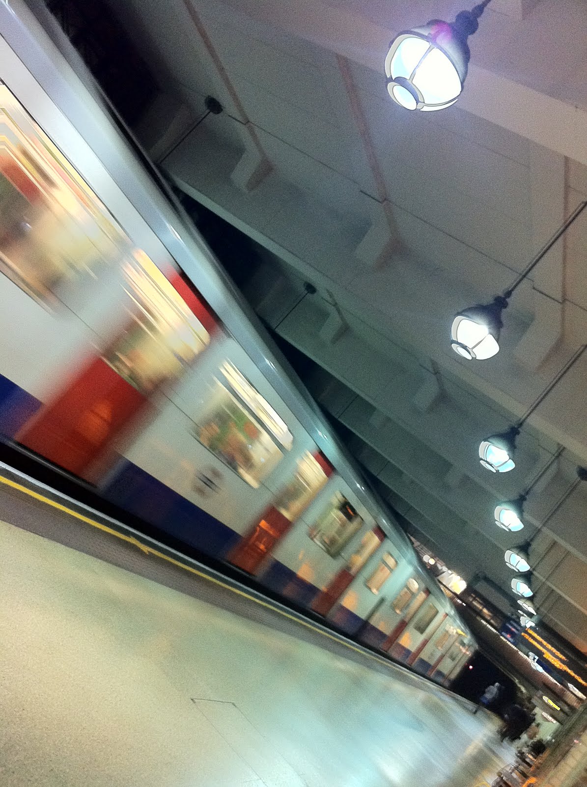
The final picture is of Gloucester Road Underground Station and was taken when waiting for a Richmond train late one night.

Clearly the sense of movement is important here but I also like the line of old-fashioned lamps and the near empty platform that gives a sense of stillness that contrasts with the train.

I took the picture at the angle that seemed to work best for the subject, especially the lamps.

I hardly take any photos vertically these days!


I do not claim that any of these pictures have any great merit but there is something that I like in all of them and I thought that was worth sharing.

23 November 2010

Opening the information floodgates

An unexpectedly quick return to the Royal Society was again caused by the word "information".

This time it was bundled up in the phrase "Opening the information floodgates: the technologies and challenges of a web of linked data", which is enough to get any geek moist with anticipation.

Rising to that challenge was Professor Nigel Shadbolt of the University of Southampton (which is where I learnt all the maths that I have now forgotten) who gave us a view of how the web is evolving to encompass structured data.

Along the way he gave us this illuminating star system for assessing connectivity:
  1. Put your data on the web (any format)
  2. Make it available as structured data, e.g. csv
  3. Use open, standard data formats
  4. Use URLs to point to your data (so that people and machines can get to it)
  5. Link your data to other people's data
This is the essence of the semantic web where the content has meaning allowing new deeper connections to be exploited. Some examples were given, such as the ASBOrometer iPhone app, but these were the familiar mash-ups of geographical data against one other set of data that have been around for years.

So far so good, but there is a big problem. And that's quality.

The example Professor Shadbolt gave us was the official data on the location of bus stops which has 5% error records in it.

This problem, while admitted, was rather glossed over with the enthusiastic claim that the crowd will fix the problem, as it has with matter-of-fact issues in Wikipedia.

But that is to gloss over the examples that go against this.

For example, if you Google "Slovak Currency" you are still told that "1 Slovak koruna = 0.0280875591 British pounds", almost two years after the Slovaks upgraded to the Euro.

And I've pointed out problems with map data previously.

Data interpretation, or Information Literacy if you prefer, is another big issue that has yet to be addressed too. Sharing data makes lots of assumptions about what it means, as anybody who has tried benchmarking knows.

For examples, to compare data about hospitals you need to know about any specialities that they have (more people die of cancer in hospitals that specialise in cancer simply because they take proportionally more cancer patients) and the catchment areas they serve (proportionally more people die in hospitals that serve unhealthy regions).

These concerns were obvious to the audience and most of the questions that were asked at the end were about quality or interpretation of data.

The semantic web sounds a good idea in principle but there is an awfully long way to go from PowerPoint to implementation.

27 October 2010

citycamplondon day three - collaborate

Day three of FutureGov's citycamplondon took us to the stunning work space of Hub King's Cross, just down the road from my usual office King's Place by, er, Kings Cross.

The familiar location meant that getting there for around 9am on a Sunday morning was less than a challenge it might have been and the coffee on arrival helped to set the scene for a busy working day.

The purpose of the day was to take the enthusiasm fired on day one (stimulate) and the ideas generates on day two (participate) to collaborate to produce concrete ideas that could be progressed.

Somehow this morphed in to me giving a rambling pitch for the loosely defined "what can I do?" idea from Saturday that somehow merged with some similar ideas and a group of about six of us looked at user generated information with a geographical context.


The popular service FixMyStreet explains the broad concept. This allows the public to report physical problems (pot holes and the like) to the appropriate authority but what we need to be able to do is to expand the scope of things that people can report (e.g. concerns for neighbours, noise, availability of babysitters, comparative prices in shops, etc.) and the scope of people to pass this information to, most notably to other residents.

What we were looking to do was to define some sort of framework (or infrastructure) that point solutions, like FixMyStreet, could use to build and share information about a neighbourhood.

I still think it's a great idea but it needs more time in the participate stage to add some specific details before moving on to collaboration.

So it was no surprise that our idea was not one of the ones chosen at the end of the day to move on to the next stage.

In fact, all the ideas that were taken forward were brought in to the process almost fully formed by one person with the vision to drive the idea forward. I'm not sure if this means that dictators beat crowds but there is a lesson there for me for the next time I attend a barcamp or unconference.

While I may have been a little disappointed in the structure and output of the day, any negativity there was more than offset by the opportunity to play in Hub King's Cross for a day.

Those of us stuck in offices with sterile rows of bland desks occupied by bland people can only imagine what it's like to work in a funky fun house with a variety of spaces defined by brick and wood in which to dwell, lurk and even work.

The beanbags and see-saw help too.

citycamplondon day three asked us to collaborate to demonstrate practicable solutions which we did but we needed leaders to control the process.

19 October 2010

Information theory meets writing

Somehow the Royal Society's programme of talks fails to inspire me and so my recent visit there was only my second. The last was two years ago to hear a discussion on Telling stories with numbers, telling stories with words.

The carrot this time was Information Theory laced with Writing, which last combined at a Gurteen event early last year.

Professor David MacKay's talk was well structured, content-rich and well delivered, revealing the speaker to be very comfortable with his subject area.

He opened with some basics of Information Theory which more-or-less comes to effective versus efficient. To make information efficient we reduce redundancy, e.g. "Mry hd a litl lmb", but to make it effective we add redundancy (check digits and the like) to improve its readability over poor quality communications.

The talk then went on to describe some of the obvious weaknesses with keyboards where we use our very flexible fingers to press keys that are either on or off.

This led us in to a demonstration of Dasher, which Professor MacKay described as a walk through a library containing every conceivable book.


Dasher guides the writer through text showing, at each stage, the letter (or punctuation mark) that is most likely to follow what has gone before.

Here we can see that "writ" has been selected and the most likely options are "e", "ing" and "ten". In this case the finger has scrolled down to select "ten".

The idea is simple and has its obvious attractions, particularly for those of us used to writing with one finger while standing up on the train or tube.

And it's a free iPhone App so it's easy to try for yourself.

I did so and found it harder than I expected (not that I tried it for that long, to be honest). Part of this is that I am not very comfortable with the alphabet and I found letters whizzing past me before I could find them. A touch of Dyslexia perhaps.

But my biggest problem with Dasher is it does not address the problem that we talked about at the start of the talk, the inherent redundancy in the English language. A (possibly) better input system does nothing to solve the issues of inconsistent spelling and words inflated in length well beyond their phonetic requirement.

The problem it does help to solve is to help people who do not have the flexible fingers that I mentioned earlier and the talk gave several examples of where new technologies have enabled even the very immobile to communicate.

The talk did not quite do what I expected but I did learn a lot and I am grateful for that.