Showing posts with label marvel. Show all posts

01 March 2021

Revisiting The Defenders after forty plus years

I have fond memories of reading Defenders in the mid 1970s so when several collected volumes turned up in a Comixology sale I bought a few of them, i.e. Marvel Masterworks The Defenders volumes 4, 5 and 6 which reprinted The Defenders issues 22 to 57 plus a few other related comics.

It was the later issues, all in volume 6, that I most wanted but my memories were fond enough to get the earlier two volumes two, especially as Steve Gerber was the main writer then.

Those first two volumes were bit of a struggle but not so much that I gave up on them.

The stories were pretty weird and shallow, brains being kept alive in jars and other such matters, and The Defenders were a pretty poor team with Dr Strange doing almost all of the heavy lifting using his standard fare like the Crimson Bands of Cyttorak, not really Sorcerer Supreme stuff (not that he was then, to be fair).

Nighthawk amused me the most as his only power was he got a little bit stronger when it got dark. Not particularly useful especially when you already have The Hulk in your team (for some reason).

It was off its time and quite readable, which is more than can be said for Deathlok which I also revisited.

Then, in volume 6, the creative team changed and we had (mostly) David Anthony Kraft on words with Keith Giffen on art with strong support from Michael Golden. These were the issues that I most enjoyed the first time round and I enjoyed them again this time.

And this art like this a comic always has a good chance.


Kraft was stuck with the poor team and I think that the only physical fight the The Defenders actually won unambiguously was against Scorpio's Zodiac warriors in issue 48 (June 1977). Still, I do not read comics for the fight scenes and I find the idea of super-humans throwing punches at each other somewhat idiotic, I read them for the stories and the art and these issues of The Defenders delivered on both.

14 January 2021

Daredevil by Ed Brubaker and Michael Lark is brilliant

I have read comics for most of the last fifty plus years or so but that does not mean all Marvel or DC comics for all of that time and there are some notable gaps, particularly when a young family put other demands on my time and pocket. 

Even so, I thought that I had Daredevil sorted as I was there for the legendary Frank Miller run which started in 1981. By the way, Frank Miller and I were born on the same day.

I was also there for the excellent Mark Waid and Chris Samnee run in 2014. More recently, prompted by reviews and sale offers, I filled in one of my gaps with the first volume of the Michael Bendis and Alex Maleev 2001 run. That was good but not good enough to tempt me to get the other volumes.

Then another sale brought me to Ed Brubaker and Michael Lark's take on Daredevil from 2006, which followed directly on from the Bendis run, and everything changed.

The Brubaker/Lark Daredevil is now my favourite Daredevil and one of my absolute favourite comics of all time. It really is that good.

Daredevil sits on the edge of the Marvel Universe and this is not a superhero comic, despite the presence of several caped heroes and villains. It is a story about Matt Murdoch and how he tries to regain some sort of life after being sent to prison and with several enemies conspiring against him.

It's a story that grips and twists like a good thriller, which is the domain that Brubaker now mostly writes in. There is action, quite a lot of it, but the fighting does not dominate the story, it is there because there and many things that Murdock needs to fight. Don't forget that his father was a boxer.

The story spreads over three collected volumes covering 39 issues (82 to 119 and 500). That's a lot of pages and I loved every one of them. The story swept majestically through some grand story lines and kept the relentless pace up with lots of little things along the way.

I had not come across Michael Lark's work before and it was a revelation! I could have picked almost any panel from any page as they are all as good as this one.


The detail of the background in wonderful and the grace of the movement of Iron Fist and Daredevil is gorgeous. There are a lot of scenes like this in the book and they are a thing of beauty. They also help to make Hells Kitchen one of the main characters in the story, which it should be as that is Daredevil's only natural territory.

The story goes international for a time and the scenes of, for example. a small town in Portugal are achingly good both in architectural accuracy and in the sunny mood of the place.

I cannot overstate how good this book is.

30 March 2020

The latest version of X-Men is astounding

I have been reading X-Men comics for over fifty years and they have gone through many changes, relaunches and different titles in that time, several of which I have commented on previously. The latest relaunch by Jonathan Hickman is something else again.

Other relaunches have changed the team membership or changed the base location but this relaunch changes everything and it is world building on a phenomenal scale. There are not just new characters or new civilisations, there are new hierarchies of civilisations and categorisations of artificial intelligence. These are explained in all text pages within the precursor limited series that Hickman also wrote.

This breathtaking world building, while of interest in itself, is just there to hold the stories and nine issues into the main title I am gripped by the stories.

X-Men is something of a flagship title for Marvel and one of the best writers of the day is ably supported by one of the best artists, Leinil Francis Yu. The drama in the page below speaks for itself.

It is comics like this that show how superhero comics can do far more than have heroes punching pantomime baddies. I have picked up some of those in ComiXology sales and titles like Uncanny Avengers did absolutely nothing for me and are why I largely stop reading the genre.

I do not know how long Hickman is committed to X-Men for but I will be there for the ride.


29 March 2020

The Might Thor by Walter Simonson is one of the best comics series ever

Walter Simonson's run on The Might Thor from 1983 to 1986 is one of the greatest series of comics ever. It is alongside, but not surpassed, by the likes of Frank Miller on Daredevil.

The comics that he both wrote and drew are collected in Thor Visionaries: Walter Simonson Volumes 1, 2 and 3, covering 33 issues from #337 to #369, a total of some 760 pages. It was a joy to read every one.

In my mind Simonson is more an artist than a writer and I have got many comics that he drew for other writers. I love his distinctive style and I greatly appreciated the opportunity to see so many pages of it again. It was very hard to pick just these two examples to try and explain why.

The writing surprised me. I remembered the some of the main these and some of the small scenes, such as the Executioner defending the bridge from Hel's realm that made it into one of the recent Marvel films, but I had forgotten just how much was going on at the same time in the stories and how much had been made of Norse mythology. It is a saga full of trolls, frost giants and a large cast of gods from Asgard.

There is also an incarnation of Thor from another planet (Beta Ray Bill below) and Thor as a frog thanks to Loki's mischief.

I was also impressed with the way that Simonson frequently used dialogue balloons to straddle panels. As a reader this helped the directional flow of the story and as a creator it gave Simonson more space to play with, i.e. the white gutters between the panels, which meant that he could use more words or, by moving them, more space for the art. It was a simple idea implemented effectively and I really appreciated it.

The Might Thor by Walter Simonson is a rich, unexpected and exciting story told with immense skill. Did I mention that I loved it?


26 March 2020

War of the Worlds

Spending a lot more time at home than usual is allowing me to hit my rather large comics backlog. I started with War of the Worlds.

The simple premise of the story is that the Martians from H. G. Wells' famous story, were not wiped out by bacteria and went on to win the war. A few humans remained free to fight them and Killraven was one of these.

I have several of the original comics in my attic (somewhere) but I had never read the full run before. It was always on my to-do list and I bought Killraven Masterworks Vol. 1 when it hit the ComiXology sales a while ago.

That 470 page volume included the 65 page Marvel Graphic Novel #7: Killraven: Warrior of the Worlds which I had previously bought a digital copy of to add to my existing paper one.

My driver to read the series was to enjoy the P Craig Russell artwork and this cover shows you why. It surprised me how much of the series had been drawn by other artists but as these included people like Herb Trimpe, Neal Adams and Gene Colan that was a bonus.

The story was constrained, as the helpful foreword explained, by not being allowed to end the War of the Worlds. The result was a series of encounters between Killraven and his small band with Martians and their human helpers. These encounters were fantastical and horrific with the Martians engaged in grotesque activities such as farming human babies for food.

The story telling style was very much of its time, early 70s, with a lot of text in addition to the dialogue. It was nice to revisit that style and I think that there is still a place for it.

What I had completely missed when first reading it was the racial sensitivities of that time and place, particularly the Deep South, and the first interracial kiss in comics was only allowed after much discussion at the highest levels within Marvel.

I liked the story and the way that it was written but, as expected, it was the art of P Craig Russell that I loved the most.

03 November 2017

Thor Visionaries: Walter Simonson Vol. 1

It was in 1983 that Walter Simonson began his legendary run on Thor with issue #337.

I was readying Thor at that time simply because I was reading everything published by Marvel and DC that was distributed in the UK and Simonson's work blew me away from the start.

I've culled my comics collection a couple of times since then but I have kept all the Simonson Thor issues. He kept on as both writer and artist until issue #367 and as a writer until issue #382.

When Marvel (through ComiXology) had a sale of every issue of Thor I had to get some Simonson issues just to read. The easy way to do it was to buy Thor Visionaries: Walter Simonson Vol. 1 which collects the first year, issues #337 to £348. That is 283 pages of comics genius for a pittance.

Indeed the money was not even a remote consideration. My only concern was whether I would ever find the time to read them again. I hope that I do.

In the meantime I am toying with the idea of buying the next volumes in the Thor Visionaries series. I am particularly keen to read issues #360 to #362, The Death of the Executioner, because that story has stuck with me for over thirty years.


Update: Writing the above left me with no option other than two buy the next two collected volumes which gives me the run from #337 to #369 to reread.

16 October 2017

The Incredible Hulk #189

With Marvel relaunching all their main titles (again) and returning to their legacy issue numbering they have been having a number of quick sales where every issue of the comic has been available.

This is proving to be moderately expensive!

Luckily for both my wallet, and my unread pile, not many of the collected editions of The Incredible Hulk were available and none from my Hulk Golden Age of reading black and while reprints in The Mighty World Of Marvel in the late 70s.

That left me with the options of buying s shed load of single issues which would have come to quite a price, even in a sale, or to buy just a few as a reminder of the good days.

In the end I went for just a single issue, #189. I wanted something with Herb Trimpe artwork and his run with writer Len Wein because of the humanity in those stories.

I remembered this story some forty years after first reading it so that was the one that I went for.

I very much enjoyed reading it the second time too.

01 March 2017

The Complete Steranko SHIELD Collection

I have written before about the comics legend that is Jim Steranko but that was mostly in relation to his Captain America work whereas it is Nick Fury Agent of S.H.I.E.L.D. that he is rightly most famous for.

I had read and bought various collections of his later episodes, and I may even have the occasional single issue in a comic box somewhere, but there was much of the run that I had not seen before, or even knew much about.

The ComiXology made me an offer that I could not refuse.


I am not sure what the occasion was but they had the completion collection in one of their sales and I did not hesitate to take the bait. The prize was almost 500 pages of comics for around £5.

Unexpectedly, and welcomely, the complete collection included complete copies of Strange Tales where Nick Fury Agent of SHIELD first appeared and which it shared with Dr Strange.

Both artists seem to have been told to try and emulate the styles of those that preceded them with Jim Steranko looking very like Jack Kirby (who did some of the layouts) and Dan Adkins like Steve Ditko. One of the joys of the comic is to see how the artists' styles evolved as they developed their own styles.


Elements of the Steranko style were there from the beginning, especially in the high-tech equipments, but it was a while before he was able to throw of the constraint of the six panel page to create stunning compositions.


The detailed line work with heavy contrasts that had been used sparingly became the signature of Steranko's work and why he is a legend.

The storytelling developed nicely too and I love the way that the panel above has no words, something that Warren Ellis also does very well. This is a marked contrast to Stan Lee who filled panels with lengthy speech balloons and explanatory texts. Comics were growing up then and Steranko was one of the people helping them to do it.

It is many years since I first came across Steranko's work and it still gives me a thrill. 

18 April 2016

I am loving the new Dr Strange

My relationship with Doctor Strange has been tenuous over the years and it has rarely been one of my regular books. Of course that is partially because it has not always been a regular book in its own right with Doctor Strange more often appearing as a supporting character in books like the Defenders.

When he has had his own title Doctor Strange has been reassuringly quirky rather than mainstream, more Tomb of Darkness or Werewolf by Night than Avengers and X-Men. This was particularly true in the late 70's when Tom Sutton was on pencils.

Now he is back in his own book as part of one of the many relaunches that Marvel and DC are doing these days. His reappearance has no doubt prompted by the upcoming film staring Benedict Cumberbatch which is giving this fringe character more publicity than ever before.

I subscribed to the new book, which means ordering a paper copy from Raygun Comics Richmond and then reading the free digital copy that comes with it on my iPad. I wish other publishers would follow Marvel's lead and let me have paper copies to collect and digital copies to read.

The main reasons that I subscribed were my historical interest in the character and the art work by Chris Bachalo who I have praised here a few times previously. It is written by Jason Aaron who has also been mentioned in dispatches before.


The result is every bit as good as I hoped it would be and I am loving every minute of it.

This is the Doctor Strange that I know, living on the edge of reality and being very comfortable there; he is the Sorcerer Supreme after all. He also deploys a lot of the old favourite spells from when he first appeared, spells to invoke the Crimson Bands of Cyttorak or to use the Eye of Agamotto. Fanboys like me like things like that.

The story is good too with the right mix of menace, weirdness and humour.

09 April 2016

Revisiting Jim Steranko's Captain America

Timed for the release of the second Captain America film, Marvel are having a sale of Captain America comics. I learned about this on Saturday morning via a tweet from ComiXology and went to their website to see what was available, hoping to pick up some Jack Kirby copies leading up to issue #200 which I bought when it came out in August '76.

I might still do that but my casual searching first uncovered the short Jim Steranko run (issues 110, 111 and 113) from 1969. I was not reading the original American comics then, only the black and white UK reprints in comics like Pow!, and I have only managed to acquire one tatty original for my collection. I have bought most of his work in some form or another since then, sometimes more than once, and this was an opportunity to buy his Captain America issues in a digital form.

A few clicks later then all I had to do was wait for them to download onto my iPad. So much easier than going up to the top floor to look for a pint copy in one of the bookcases, I did not even need to get out of bed.


Jim Steranko is a genuine comic book legend, despite working on so few comics, because of his distinctive and original drawing style. Even today these comics look fresh even though they were drawn almost fifty years ago.

The obvious things to note are the use of panels, cropping, varied viewpoints including at an angle, heavy shading and rich detailing of machinery etc.


One thing that has changed, and for the better, over fifty years is the storytelling. These issues, written by Stan Lee, are verbose (note the additional text in the top right corner of the page above) and the story is full of gaping plot holes, such as when all the baddies leave Captain America alone in the assumption that one robot would finish him off.

Perhaps with another artist the story's weaknesses would have made it unreadable now (it was good for its time) but the Jim Steranko artwork did more than rescue the books, it made them classics that I was delighted to read again. A wonderful start to the weekend.

25 October 2015

Karnak by Warren Ellis is sweetly dark and moody

I do not want to say that Warren Ellis is on a roll at the moment and that implies that the current form is unusual whereas he has become my favourite write of comic books by being consistently brilliant. However, his current crop of titles is right up there with anything that he has done.

Trees, which I wrote about earlier this year, is drawing towards the end of its second story arc and is still mightily impressive, not least because I do not have the slightest idea where it is going.

Injection, also published by Image Comics, also has a science fiction edge to it but here magic and folklore are the main ingredients. It is all terribly English (that's a compliment) and could have come from the pages of 2000AD. Obviously other people love it too and it is also coming back for a second series.

And now I have Karnak to enjoy too.

Karnak is/was a decidedly minor character in the Marvel Universe. He is one of the Inhumans who have generally only been a support act to people like the Fantastic Four and Karnak has generally been a support act to characters like Black Bolt and Medusa, even the Inhuman's dog Lockjaw has had bigger storylines.

Warren Ellis has taken Karnak away from the other Inhumans but left him in the main Marvel Universe, as the appearance by SHIELD's Agent Coulson quickly showed. He has also been elevated from a simple breaker of things seemingly unbreakable to a philosopher.

Karnak lives and studies in the Tower of Wisdom. It looks like this.


That opening page of the story, drawn by Gerardo Zaffino, sets the tone for the comic. It is dark, moody and mysterious, in much the same way that Ellis' run on Moon Knight was. The moods may be similar but the stories are very different, not least because the Moon Knight run was six single stories and Karnak #1 ends with "to be continued". It also ends with Karnak killing two people (violently) and disarming another all at the same time. He is still very good at breaking things.

In the middle we start to peer into a few mysteries about Karnak's mission and his philosophy which sees smiling as an insult and stones as more important than people. This is still an action comic, as the ending shows, but there is much more to it than that, as you would expect from Ellis.

Karnak is a mighty fine comic from a mighty fine writer.

06 April 2015

Hawkeye was a good read but not a great one

Hawkeye is one of those comics that I could have started reading earlier as it had got good reviews from the start and was written by Matt Fraction whose writing I had liked in Iron Man (among others). But things do not always work the way that they should and I let it slip.

What got me into the book was a snap sale on ComiXology, as is often the case these days. which offered the first few issues at 79p each. I bought the first five issues as they were the ones included in the first collected edition and so I knew that the story would end at a logical point.

This version of Hawkeye was less of the superhero fighting super villains with the Avengers and more a skilled man fighting petty criminals on the street. With a dog.

It felt very much like Daredevil to me and lacked originality and purpose because of that. The place to find Daredevil stories should be in the Daredevil comic.

There are other Marvel characters who could have fitted well into that world, people like Moon Knight and the Punisher, and I did not see the point of taking Hawkeye out of the Avengers and putting him on the streets.

Leaving aside my problems with the basic premise of the book, the stories themselves were neat and tidy. This Hawkeye was very human and far from the usual all-conquering superhero, he got himself into lots of scrapes and was beaten-up more than once. "It looks bad" was his catchphrase.

The artwork by David Aja, new to me, fit the gritty style of the book exactly. A little research tells me that he previously worked on similar titles like Iron Fist and, er, Daredevil.

I enjoyed the first five issues but the lack of originality in the scenario meant that I left it there and I have not bought any more issues.

17 January 2015

Andrea Sorrentino sparkles on the X-Men

I have been reading X-Men for a long long time simply because the characters and their stories interest me. Of the various Marvel teams they are the ones who have been to the more exotic places and done the wilder things.

Unfortunately the time I have available to read comics has decreased while the number of titles featuring the X-Men has increased so I have had choices to make and I now just read the Uncanny X-Men regularly. This has gone through many reincarnations and relaunches since I first started reading it in 1976 and is now being written by Brian Michael Bendis.

I like Bendis' style as it is in the Marvel tradition as started Stan Lee and then developed by the likes of Roy Thomas and Gerry Conway with long story arcs and strong characters. These are good simple stories, and I mean that as a compliment.

X-Men Annual #1 took a slight detour with the story of one of the newer mutants, Eva Bell, and her trouble with time travel.


It also introduced me to the art of Andrea Sorrentino which I found stunning. This was Eva's first time jump into an unknown future. The quality of the art clearly speaks for itself.

I had not read a full comic drawn by Sorrentino before but he had appeared a few times in my selected highlights of DC Comics Digital Sneak Peeks for his work on Green Arrow.

The 27 page comic only told the first part of the story so that I had to get All New X-Men Annual #1 too. Bendis writes All New X-Men too and this is not the first time that he has done a story cross-over like this and I've bought ten copies of the second title now to continue reading stories started in the first.


I was delighted to see that Sorrentino drew All New X-Men Annual #1 too. Here Morgana Le Fey is showing Eva her fractured future.

Bendis' story was fine, though when you've been reading comics as long as you will have seen some of the ideas used before, though not quite in the same way. What makes the story special is Sorrentino's artwork.

20 October 2014

Catching up on Original Sin and other Marvels

The long train journey from London to Barcelona, via Paris, was an excellent opportunity for me to dig some inroads into my comics backlog, and that was an opportunity that I took full advantage of.

I had around fifty comics on my iPad, possibly more,and I leapt in to them devouring titles like Trees, Uncanny X-Men, All-New X-Men and Daredevil. These were mostly Marvel comics because they do the buy the paper copy and get the digital one for free deal which, for a reader who also collects, is the ideal combination. The other titles, like Trees, were from Image comics and these I have only digital copies of.

One series that I read in its entirety was Original Sin, an eight part story from Marvel about the murder of The Watcher.

The writer was Jason Aaron who I knew from his involvement in titles like X-Men: Schism and Avengers vs X-Men. It was a functional script if lacking in surprises and it also included a few impossible machines like Nick Fury's flying car that could travel to the Moon in 5 minutes and the Black Panther's vehicle than could both drill to the centre of the Earth and fly in to space. Not even Thunderbirds could do all that in one machine. That silliness apart it was a very readable story.

What raised the standard was Mike Deodato's exceptional artwork.


I had also come across Mike's work before, notably on The New Avengers, but this time is blew me away. Photo-realism is one of his things these days and that shows here, especially in the Moonscape. What this double-page spread also shows is his ability to construct a page in exciting ways.

Original Sin was never going to set the comics world alight but it managed to do far more than a standard superhero comic does and that was enough to keep me gripped through all eight issues.

22 May 2014

Warren Ellis resurrects Moon Knight

A Warren Ellis comic is always something to look forward to and Moon Knight is no exception.

Moon Knight has been a fringe character in the Marvel Universe since 1975. Born by Egyptian magic his tales have always veered towards mystery and horror and that has kept him out of the mainstream, with the exception of a few cameo appearances. His has been the world shared with the likes of Ghost Rider, Iron Fist, Werewolf by Night, Moebius and Man-Thing.


The new incarnation of Moon Knight by Warren Ellis and Declan Shalvey goes back to the basics, which is something of a cross between Batman (rich crime-fighter with expensive gadgets), Punisher (fighting ordinary criminals) and Dr. Strange (magic).

The page above shows Moon Knight confronting ghosts and using special Egyptian tokens to do so. It also shows Warren's trade-marked low word-count that makes space for the pictures, space that Declan expertly fills.

Moon Knight is the right sort of comic for Warren as I think that he is at his best when doing single issue stories on a quirky book, previous examples include Transmetropolitan, Nextwave: Agents of H.A.T.E. and Planetary.

And that means that Moon Knight is a mighty fine comic.

27 December 2013

Nextwave: Agents Of H.A.T.E. Ultimate Collection

This Christmas I decided not to add to my read-pile, on the grounds that it was already embarrassingly large, but to use the holiday to make a serious dent in it. The first book that I tackled was Nextwave: Agents Of H.A.T.E. by Warren Ellis and Stuart Immonen.

Nextwave is firmly seated on the edges of the Marvel Universe and it reuses characters from Machine Man to the Mindless Ones and from Boom Boom to Devil Dinosaur.

It is part parody with S.H.I.E.L.D. becoming H.A.T.E. and Nick Fury becoming Dirk Anger.

The comic is a action-fest with a thick vein of humour. It is almost a lighter version of Global Frequency which Ellis wrote for DC Comics a couple of years earlier. Or it is Transmetropolitan (written for DC just before H.A.T.E.) with more action.

It also has several pages with no written words so this is definitely a Warren Ellis book.

Nextwave is constructed as six story arcs, each of two comics originally, that combine to make one bigger story. This contrasts with, for example, Global Frequency and Transmetropolitan both of which are a series of single issues.

Stuart Immonen, a long-time regular for Marvel, is the artist and he does a good job of combining the action and the humour, which is the point of the book. Having one artist reinforces the single story aspect of the book.


I like the book though I suspect that you need a good knowledge of the Marvel Universe to appreciate it properly. I have read both Machine Man and Devil Dinosaur but I suspect that not many people can say that.

Nextwave describe itself as being about things blowing up and people being kicked, and it is. So if you like films like The Expendables then Nextwave could be for you. Personally I found it just a little too light for my taste, especially when compared to the brilliant Global Frequency.

14 November 2013

New Avengers is cosmic

There are several Avengers books these days but I am just reading the two by Jonathan Hickman. These are Avengers and New Avengers.

The books tell separate stories but they share the common approach of giving the Avengers problems to solve that address the whole planet or even more than that.

This page sums it up for me. It is in space. It features two of Marvel's most cosmic characters (the Watcher and the Living Tribunal). And it is wordless.

It is obvious that this is a very serious situation that the Avengers have to deal with and not just the latest petty criminal who has invented some sort of unusual weapon.

The two Avengers books are proceeding at different paces too, they both started with new issue #1s at the start of 2013 and New Avengers has kept to the typical monthly schedule and is at issue #10 but Avengers has raced ahead and is now at issue #19. That difference in publishing schedule has helped to keep the two books apart.

The Avengers and New Avengers do come together for the current Infinity storyline, and I'll be saying more about that once it is over.

It is good to see both the Avengers and X-Men back on form (in at least some of their books). Let's hope the next Fantastic Four relaunch early in the new year can do the same for them.

03 November 2013

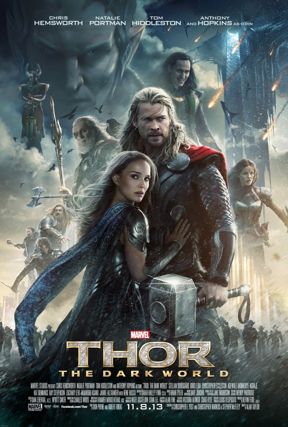
Thor: The Dark World

Thor: The Dark World follows on from the first film with all of the same ingredients intact.

It has the same characters and the same actors playing them. This time introductions are dispensed with in the safe assumption that everybody has seen the first film. This brings the action to the fore faster and so is a good thing.

The story is rooted in Norse mythology, that is the mood and characters of the myths rather than the actual stories.

This heritage is particularly helpful in building the city of Asgard which is both ancient and modern at the same time.

The modern dialogue and characterisation add a continual layer of humour on top of a world-threatening plot.

There is nothing heavy or difficult about the story and there are large chunks of it that have been seen before (alignment of celestial bodies, etc.) but it does enough to carry the film along while the little touches, like the dialogue, add the texture.

It is all very watchable and it easily kept me entertained for the best part of two hours. I could ask for no more though having seen it at the cinema I'll not be rushing out to get the DVD. I'll watch it again when it hits TV in a couple of years though.

31 October 2013

Battle of the Atom in landscape

If you read the same comic for fifty years or so then you expect some ups and downs. These ups can become iconic and I am proud to say that I was there for Frank Miller's run on Daredevil (started in 1979)and Walter Simonson's on Thor (1983), amongst many others.

Following teams and characters is harder now as all of the major players featured in several comics at the same time so it is no longer possible to say that, for example, the X-Men, are on a good run without specifying which of their title/s you are talking about.

Anyway, the X-Men are on a good run at the moment in the titles that I am reading which are Uncanny X-Men and X-Men. I was also reading Astonishing X-Men and X-Factor but both of those (good) titles have recently finished.

The current story line, Battle of the Atom, includes some issues of All-New X-Men and Wolverine and the X-Men so I have got those too.


Battle of the Atom is proving to be a good story though it is several years too early to say whether it is a classic.

It's another complicated time paradox story, as was the recent Age of Ultron in the Avengers, with the X-Men of the past (they have been in the present for a while in All-New X-Men) threatening the timeline and the X-Men from the/a future coming to stop them. Cue lots of time hopping and lots of claims as to what the real threat is.


Sometimes with cross-over stories like this some of the fringe issues let the side down with weaker script and/or, more commonly, weaker art. This is certainly not the case here and the whole saga has been a good ride so far.

It's a 10 chapter story, I've read the first 5 and have another 3 waiting for me on my iPad. The final parts are issued this week.


The other comment that I want to make, and which the sample pages above demonstrate, is the increasing use of landscape as the page format. These pages come from Uncanny X-Men #12 (by Bendis and Bachalo) and All-New X-Men #17 (by Bendis and Immonen).

This is not the natural format for reading comics on an iPad which in portrait mode is pretty much the same size as a standard Marvel/DC comic so in landscape mode the text and art is reduced in size. This still works, especially on the retina screen, and I suspect that the pages are designed for the iPad and then scaled up for the print version.

It has been said before by several people who know about these things that landscape is the natural shape of comics and I agree.

08 August 2013

Uncanny X-Men maintains the tradition

The X-Men have a long history and I have been there for most of it, especially since their relaunch with the famous Giant-Size X-Men #1 in 1975.

I had stopped reading comics for a while, as much as anything because they were very hard to get hold of regularly in Weymouth, and I started to read them again when at university at Southampton. The restart came on a long train journey home when I bought a few comics to read at the station, including a few issues of the X-Men.

As with all the Marvel titles, the X-Men stable has grown and changed a lot since then and where there was once just the one monthly comic there are now many of which I get four.

The latest incarnation of Uncanny X-Men has been around for less than a year, this is issue #9, whereas the previous version was, for a while, the main X-Men title and ran to 544 issues. I have most of these.

If you are going to read any X-Men books then Uncanny X-Men is an obvious one to pick as it is by the superstar team of writer Brian Michael Bendis and artist Chris Bachalo. I quite like Bendis' work but it can be a bit formulaic and obvious, not too surprising given how many books he writes each month, and so that's not the main reason that I read it - that's the Bachalo art work.

There is something almost cartoon like about the simplicity and roundness of the drawing, particularly the people, that is visually striking. The page layout is pretty striking too.


Uncanny X-Men is not at the dizzy heights achieved during Chris Claremont's long run, very few comics ever are, but the story telling is good (both words and pictures) and it deserves its place in the X-Men's exalted history.