Showing posts with label riba. Show all posts

31 January 2020

Beyond Bauhaus exhibition at RIBA

I worked in Central London for several years, lastly near Kings Cross, when it was fairly easy to get to exhibitions at RIBA, even if it meant taking a flexible view of how long a lunch hour lasts. That stopped when I started work in Teddington and I have struggled to pick the habit back up since retiring.

An exhibition on Modernism got me back there.

I made something of the trip walking up from Vauxhall, though walking around Buckingham Palace at Changing of the Guard was not one of my better ideas. Apart from that the walk went well and it was nice revisiting once familiar places like Berkley Square.

I hit another problem at RIBA with the cafe immediately on the right of the entrance and the one of the first floor both being out of action. I consoled myself by taking in the displays on the first and third floors which got me in an architectural mood.

Going back to the ground floor for the main exhibition I found where the cafe had moved to and was able to have a coffee and a toasted sarnie before going in.

The premise of the exhibition was that Modernism in Britain grew directly out of the Bauhaus movement with the relocation of some of the key players, notably Walter Gropius, from Germany to England, and this was the thread that the exhibition followed.

The staging of the exhibition was somewhat unusual, and I have mixed views on it. The extra space needed to display the photographs and drawings was created by adding pillars to the room but instead of mounting them on the outside they went inside and we peered at them through geometrically shaped openings, a bit like Play School. These shapes were included in the exhibition poster though I failed to determine their exact relevance.

That said, I am a sucker for architecture in general and Modernism in particular and I loved the exhibition. One favourite section was that on individual houses built for rich sponsors, often a good source for experimental architecture, and another was on industrial buildings.

In the post-Bauhaus section I was surprised to see several pictures of Eric Lyons' SPAN developments but none of their first on Parkley in Richmond, which is about 200m away from where I live. I cheekily raised this with one of the staff who was overseeing a tour group and she skilfully defended the curator's choice.

Other famous architects featured were Denys Lasdun (NT) and Erno Goldfinger (Trellick Towers) and there were other famous buildings by less famous architects which produced a peppering of works known to me amongst many that were not. Seeing both helped put the known into a wider context.

The exhibition confirmed my love of Modernism and of exhibitions at RIBA.

28 April 2015

In the Making – New Social Housing Projects by Karakusevic Carson Architects

A free lunchtime on a quiet day in the London office gave me another opportunity to walk to RIBA and visit one of their exhibitions. That is always a good thing to do as it feeds the mind and the body equally.

The walk there is about 2.5km, depending on the route, so it took me just under 25 minutes. As always I avoided the main roads (busy and ugly) but was forced to walk through Euston Station as the only way around it is a long way north, fine for just a walk but not so good when trying to get somewhere specific.

The subject of this exhibition was New Social Housing Projects by Karakusevic Carson Architects which interested me for several reasons. All architecture has some interest to me, new developments show the leading-edge of the profession and social housing is a sector that has been too quiet for too long (I blame Thatcher).

In RIBA terms, this was a minor exhibition using what was, essentially, corridor space around the atrium on the second floor (I think) and which is now branded as The Practice Space. It is an awkward space but this exhibition did a good job of using it with information boards on the outer walls of the meeting rooms and models around the atrium and in the open space by the windows.

I was delighted to see so many models as I find them the best way to appreciate buildings in context and the context of buildings is as important as it's appearance. Photographs are good for showing colours but for little else which, as an aside, is why property websites are a poor substitute for pounding the streets.


I did not know any of these schemes, nor any of the places that they were being built, but the models gave enough information about the locations for me to appreciate the character of the area. Most were standard East End (as "standard" is today) with large concentrations of social housing among Victorian streets and with plenty of open spaces.

As the hipsters move to places like Clapton because they cannot afford Camden those that used to live in places like Clapton are being forced further east or out of London altogether. New social housing can help to stem the exodus and so to keep the character that makes London London.

The schemes on show here were all different but tried to meet the same needs of producing good social housing that fitted neatly into the area. This was very different from most of our social housing stock that was built on either greenfield land or large areas of brownfield land created by post-war clearance.

The information boards were good in explaining how the designs had been arrived at and it was good to see the needs of residents at the heart of this. That may seem obvious but places like Battersea are full of blocks of towers that pay no attention to the needs of the people who live there, the insides of the flats may be good but there is nothing, no local shops or transport, outside of their doors.

I was not completely convinced by all the schemes, some seemed more solid and less permeable than I would like, but I am prepared to give the architects the benefit of any doubt by admitting that my views were based on a quick assessment of the limited information provided. Significant developments like these now come with colourful Design and Access Statements that run to over a hundred pages so it is unfair to expect a model to say everything about the development.

However, I was completely convinced about the quality of the exhibition. RIBA knows how to put on a good show that is informative and entertaining, even in a corridor.

31 March 2015

Charles Rennie Mackintosh at RIBA

It was something of a luxury to visit RIBA twice in one day but I like to spoil myself.

I had wandered over there during my lunch break to see the The Future City exhibition and then I took advantage of the late night opening to go back again after work, this time to see the main exhibition on Charles Rennie Mackintosh. This had been on my must-see list since it opened in February and I was more organised than usual in getting to see it in the middle of its run rather than in it's last week.

Going to RIBA twice in one day was also excellent for my step count, something that I think about a lot these days!


RIBA, like the V&A, can seem to do no wrong with its exhibitions and I always find them interesting and informative even if the subject does not appear to be one that would naturally appeal to me. There were no such reservations with Charles Rennie Mackintosh as a topic so the exhibition delightfully combined great content with great curation.

It is also worth pointing out that RIBA exhibitions are free. I love free things not because they save me money but because their freeness means that people can pop-in for just a short while, e.g. in a lunch break, and can do so repeatedly. I think that a little and often is the best way to absorb culture.

The Mackintosh exhibition was in the (newish) main exhibition at RIBA, on the ground floor adjacent to the reception desk. It has the advantage over the other exhibition spaces in that there are no windows. I love the windows at RIBA but the light coming through them can play havoc with displays, as can still be seen on the first floor exhibition area.

The exhibition had plenty of drawings, as expected, as I was pleased to see quite a few models too.

The only slight gripe, and this applies to many exhibitions, is that putting the drawings behind glass meant that I was always juggling with reflections. This can be seen clearly in the top picture which has a reflection of one of the models on the left edge. If RIBA cannot solve this problem (at a reasonable cost) then I suspect that nobody can but it does seem strange that nobody has invented a combination of glass and lighting that solves this problem. At the exhibition I was able to get around this by looking at the same piece from several angles but a single photograph cannot so this.


The drawings were as detailed and as lovely as I hoped that they would be. The things that they were drawings of were lovely too.

This was a meeting of art and architecture and I could appreciate the buildings for their aesthetics as well as for the ingenuity of their design that created wonderful spaces to live and work in.

A surprise was how few buildings Mackintosh was involved in. I thought of him primarily as an architect but the exhibition informed me that he became disillusioned with architecture and turned his hand to watercolours instead. I was glad that the RIBA exhibition focused firmly on the architecture as that was what I was there to see.

The lack of buildings in quantity did nothing to diminish the quality of the works on display and I spent a long time peering at each drawing and model, and then I walked around them all again to remind me of the best bits and to make sure that I had not missed anything.

Obviously the Glasgow School of Art was a highlight and it was nice to see this complimented with several more modest buildings, though none of them were that modest. Rich people often like to commission edgy architects to build distinctive and impressive houses for them and architecture on this scale manages to be both grand and human, a combination that brings the best out of the best architects. That is why we remember places like the Red House and Villa Tugendhat and it was good to see Mackintosh's forays into this field.

I can always spend time happily looking at architects' drawings and models and when the architect is Charles Rennie Mackintosh it is understandable that I spent a lot of time and was very happy.

The Future City exhibition at RIBA

The RIBA (Royal Institute of British Architects) headquarters building at 66 Portland Place is one of my favourite places in London because they hold many good exhibitions there, the building is grand and attractive, and the little cafe is a comfortable place to rest and recuperate.

The building also has the advantage of being about 2.5km away from my London office so it is a place that I can pop into at lunchtime for a quick architectural treat while also getting some good steps in.

And that is how I found myself at The Future City exhibition on a Tuesday lunchtime.

RIBA has various spaces in which it holds exhibitions, I can think of six, and most of these are spaces that were designed for other uses and which have exhibitions squeezed into them from time-to-time. Future City was up on the second floor spread along the corridor around the atrium. This is a space that is often used and while the space has obvious limitations it works well enough as an exhibition space.

Despite the restrictions, there was space for a townscape model and I always love to see townscape models.


The exhibition looked at how cities could evolve by considering themes like population and traffic.

The bulk of the exhibition, i.e. the thing that I spent most time looking at,  was the information boards on each theme that explained the history, challenges and some of the possible solutions.

This made it quite a wordy exhibition that was good for information value but less so for entertainment. I prefer models, maps and pictures as you can "read" then in any sequence you like and take as long as you like whereas text has a forced direction and a natural speed. I will also admit to being not much of a texty person, I have always preferred comics to novels and I very rarely read anything that it text-heavy these days.

It is no surprise, therefore, that one of the things that caught my attention the most was this cartoon on transport in the future. I like the visual impact of both the relentless tide of cars and the bleak blocks behind them. This is the sort of Future City that we do not want to see but which we may be heading towards.


This was only a fleeting visit and still it managed to tickle my intellect and spark some new thoughts. RIBA is a great resource and I should make more use of it.

24 April 2014

Delightful British architects exhibitions at RIBA

The Royal Institute of British Architects (RIBA) building in Portland Place is one of my favourite exhibition venues in London. This is because I am keen on their subject matter, architecture, and because they compliment the main exhibition with other smaller ones around the building.

This time the main exhibition was The Brits Who Built The Modern World, which was also a short series of programmes on BBC Four, and this was supported by New British Works and also by a display of all the RIBA Stirling Prize winners.

But first I had to get there and as the weather was good that meant a bit of walking and I took the opportunity to revisit the magnificent Carreras Cigarette Factory building on Mornington Crescent. Changing fashions meant that it was almost vandalised in the 60's but a tasteful makeover in the 90s brought it back to its former glory.


I went up to the secondary exhibition first but that was only because it was on the gallery on the first floor which is where I expected the main exhibition to be.

New British Works, as its name suggests, showcased some modern works by British Architects.

These were shown as models with brief descriptions. There were about a dozen of them and they were all nicely weird. I love modern architecture like that.

I then went downstairs to a space that I had not been in before to see The Brits Who Built The Modern World. It was not a deliberate plan but seeing the exhibitions in that order worked for me, having seen what British Architects are building today I then saw some of the history of how modern architecture like that was enabled by pioneers.


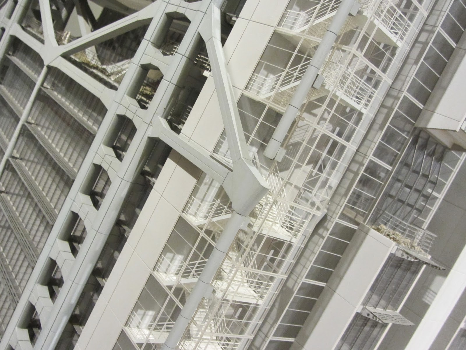
The exhibition space was stuffed with pictures, articles, posters and more and models. The largest and most impressive was of Sir Norman Foster's Hong Kong and Shanghai Banking Corporation building.I loved this corner with its abundance of metal and straight lines.


Another Foster building on display was the restored Reichstag in Berlin. That reinforced the point of the exhibition that this generation of British architects built some of the world's iconic buildings and had an enormous impact on the directions that architecture took.

As I have come to expect with RIBA, the exhibition was rich in detail, very informative and well presented. So much so that I went around it twice.

Among my favourites were some pictures from the early post-colonial era. Among these was a photo of Dubai when it had just one tower and that was not very tall. Bringing that story up to date there was also a map of Masdar City, a new green-zone in Abu Dhabi which Foster is involved in.

Foster may be dominating this article, another accident, but he did not dominate the exhibition and there was plenty of space given over to other architects like Richard Rogers.


Once I had seen the exhibitions I wandered up to the top floor and the roof terrace to have a look across London and of the BT Tower which looked as though it was part of the exhibition.

My final stop at RIBA was to the coffee bar on the ground floor for a well-deserved latte. I managed to resist the cake.

I do not get to RIBA as often as I would like, mainly because it is not that close to any of the theatres that I go to regularly, and that is a shame as they always do great exhibitions.

One of the staff told me that they were remodelling the exhibition areas so I am expecting even better things in the future.

26 July 2012

Four more exhibitions at RIBA

My visits earlier in the day to the Royal Academy and the Wallace Collection were mere appetisers for the main event, another visit to RIBA.

As with previous visits there was specific reason for going, there were two exhibitions that I wanted to see, but RIBA exceeded itself and provided four different and equally interesting exhibitions.

The first one was in the Library and covered the history and restoration of  in Brno.

I was disappointed to find the villa mid-reconstruction when I was in Brno in 2010 having walked out of town and climbed up the hill to find it. The display at RIBA almost made up for that.

The main display is in the Library itself and this is complemented (as the Library exhibitions usually are) by two display panels outside. And these tell you most of what you meed to know.

The four photos above show different aspects of the exterior of the house, there is the modest view from the road, two views from the garden that show how the house follows the slope down the hill and, finally, a view from the terrace area on the roof.

Other photos, like this one, show the immaculate interior.

The exhibition inside the Library tells the chronological story of the house from commission, abdication, desolation and now restoration.

The story is told through a series of period photographs with accompanying text. The two work together delightfully and the story flows like a story should and delivers a lot of information along the way.

The only down point is that photography is not allowed (they have a book to sell) and the Library was far to busy for me to accidentally forget that rule. I thought that I might buy the book instead, assuming that it would be little more than the collation of the photos and text, and while it was more or less that it was also about £12 so I left it alone.

I shall get back to Brno one day and next time I'll get a proper look at Villa Tugendhat.

Moving down from the third to the second floor, the spare landing space is used to tell us something about the legacies of major events in an exhibition called "After the Party".

Here the exhibition puts more emphasis on the words and each of the display boards has much to take in.

One of the facts that leaped out of me was that the Millennium Dome had 6.7m visitors in the year that it was open and was considered a failure and now, as the O2, it gets 2m visitors a year and is considered a success. That's the British media for you.

Elsewhere I learnt about bridges, arches, parks, regeneration, stadia and roads.

Among the stories told  was that of Crystal Palace. It's a story that everybody knows bits of and it was nice to be reminded of all the details, despite the unhappy ending.

Rounding this expedition off were maps and models of the London 2012 Olympic Park and surrounding area. This is a part of London that I do not know at all, the furthest east I have been is Canning Town and that was bad enough,so it was good to see hoe the main stadia relate to each other and to put that in the context of the Lee Valley.

The surprise exhibition was in the dinning room on the first floor.

Last time it was a display of Norwegian architecture and this time it was the Swiss who got a chance to show off.

This small exhibition is meant to be consumed casually by people with food and drink on their minds so we get lots of large photos and a few quickly read words.

The photos do what they are meant to do and that is grab your attention.

This is Alpine country and a lot of the architecture is suitably rugged, like this restoration of a chalet. Another scheme was a visitors' centre coloured white to match the snow that surrounds it. Inside the benches and tables are made from what look like unvarnished railway sleepers in recognition that all the visitors will be wearing ski boots and carrying skis, neither of which are particularly friendly to furniture and furnishings.

The one proper exhibition space, also on the first floor, held Design Stories. This told the story of the London 2012 stadia and was the main reason for my visit to RIBA.

I've come to expect a lot from RIBA exhibitions and this one was just as good as all the others, and for the same reasons.

They just get the level of detail and the mix of models, pictures and words right.

The centre of the room was filled with models of the main stadia and the boards on the walls provided further information.

On display are the fairly obvious Olympic Stadium, Aquatics Centre and the Velodrome, and these are joined by the Basketball Arena, Handball Arena, shooting venue, water polo venue and Eton Manor.

These are all individual buildings united in purpose and colour. Their designs vary greatly, however, as each sport has unique needs for the games area even if the supporters and services can be addressed in the same way.


One attention to detail that I liked was the use of Olympic Pink for the stands. This colour is now familiar on the underground and at railway stations.

The display boards had a common approach with each outlining the brief that the architects had and describing how they approached it.

The two recurring themes were legacy and sustainability. In some cases the legacy is to dismantle the stadium but even in this case the designs allow a lot of the parts to be reused in another building later on.

In some cases legacy means re-purposing, such as with the main Olympic Stadium whose future has yet to be determined.

One that is enduring in its current form is the Velodrome that manages to combine perfection of form internally with a sleek exterior.

And the display board gives you an idea of how they managed to do that.

So that was how RIBA managed to enrich a couple of hours of my life. They were four quite different exhibitions and each was curated expertly according to the content and the message that had to say.

I liked all of them and the Villa Tugendhat was marginally my favourite because I am a big fan of Mies van der Rohe - I have a Barcelona sofa in my living room. But the point is not that one exhibition was better that the other, it is that all four exhibitions work together to make an afternoon at RIBA something special.

05 May 2012

Contemporary Norwegian Architecture at RIBA

My visit to RIBA was cunningly timed to take in two of their exhibitions at the same time.

The main draw was A Place to Call Home but the prospect of combining that with an exhibition of contemporary Norwegian architecture was always going to appeal having spent some time there last summer enjoying buildings of all ages and especially the very modern opera house in Oslo.

With the possible exception of the front room on the first floor, RIBA lacks exhibition space so they make do with what they can and fill other spaces with models and drawings. There is always something to see on the pretty staircases between the first and fourth floors.

With A Place to Call Home claiming the main space and the Library, the Norway expedition had to find somewhere else.

One of the spaces it claimed was the middle of the restaurant.where it was housed on a collection of light blue boxes.

On these boxes were a series of models, some diagrams and a few words. Between the boxes were some large photographs.

The schemes on display here were all to do with improving the main tourist route through the country.

The country consists of a lot of solid rock carved in to exaggerated shapes by millennia of fast moving water and slow moving ice.This is scenery to admire and so places have been built to admire it from.

Some of these are plain scary with flimsy platforms suspended over drops that take you half an hour or more to drive down round equally scary hairpin bends.

Others were more sedate places for visitors to eat, rest and recover while still being able to appreciate the majesty of the rocks.

Obviously glass featured heavily, not only does it keep the views, it also looks fantastic when made to adopt unusual shapes.

A little surprising was the amount of open space that some of these places had. This is a country where the main road north-south is not clear of snow until May.


The exhibition continued on the second floor is what is really just a wide corridor around the central atrium. Here there were walls to put displays on as well as more tables with more models.

There was a slight change of mood to with some more familiar buildings such as a Centre Parcs like hotel with a number of buildings arranged so that none of them could see each other.

There were also examples of new buildings made with traditional materials, i.e. wood and stone, and designed to sit comfortable with their surroundings.

And there were more viewing platforms too, including this one that I have been on.

As you can see, the barrier is high with a rolled top that keeps you away from the very edge and while the water is white with fury the drop is not that far so the vertigo does not kick in.

It was a small exhibition squeezed in to a couple of unnatural spaces but the content won through and it was a great success.

The lesson from A Place to Call Home was we used to know how to build housing but we have given that ability away to the "free market". The lesson from Contemporary Norwegian Architecture is that other countries do it better. But then anybody who has been to mainland Europe recently knows that.

03 May 2012

A Place to Call Home

The Royal Institute of British Architects (RIBA) does exhibitions rather well.

Careful planning got me to London for opera in the evening with time to catch the last day of A Place to Call Home in the afternoon.

The exhibition was held in the room on the first floor which strikes me as being about the same size of a squash court (not that I've ever played squash).

It's not a very big room so it took some clever arranging of the display to fit everything in. This they did by putting the boards diagonally across the room and by putting them quite close together.

The downside of this was that it was quite difficult to walk around the exhibition because of all the other people getting in the way and the upside was that there was plenty of stuff to see.

The exhibition told the story of the British home chronologically through a series of smaller stories that explained how major changes came about.

The history was fascinating in revealing the various drivers for housing change (improvement) over the years.

The drivers include the obvious things like the post war era ("a home fit for heroes") and also public health, new building techniques and also changing demands for space, gardens, community, industry, transport and lifestyle.

Perhaps most obvious in this respect was the way that class was such a factor little over a century a ago with houses being clearly designed for specific classes and we even saw a railway poster advertising cheap tickets for the "working class".


The exhibition had a vibrant mix of words, pictures and models that made it informative, stimulating and interesting. You really wanted to spend your time reading and looking at everything.

There were many interesting facts strewn along the way and I've chosen this one as it makes two main points, the Netherlands has a higher population density (despite what Migration Watch etc. would have you believe) and our houses are much smaller.

The later fact will be obvious who lives in a mixed area and has had the chance to see inside houses from different ages.

We do not do housing at all well these days and it's all Thatcher's fault.

Most of the improvements in housing that I mentioned earlier were driven by the public sector, either through national government setting building standards or through local government building houses. Then Thatcher stopped councils from building houses and reduced building regulations.

It would be easy to swamp an exhibition like this with pictures and, to an extent, they did but they were all carefully selected for the message that they would give so that each one demanded attention.

It took something like an hour (slightly more I think) to progress through the room which shows just how much there was to see and how compelling it all was.

After a welcome cup of coffee and a flapjack in the bar downstairs it was time to head up to the third floor for the related High Society exhibition. This was a collection of photographs of some iconoclastic high-rise estates.

I did make one error in that part of the exhibition was in the Library and that is closed on Saturday afternoons.

Luckily the two estates that I wanted to see, The Alton Estate, Roehampton and Park Hill, Sheffield, were in the lobby outside of the library so I could see them.

The Roehampton flats are only a few miles away and can be seen from some distance so it was good to learn more about their history.

It also echoes the opening of the main exhibition, the cute street scene at the top is also from Roehampton.

This was another excellent RIBA exhibition, even by their high standards.

30 November 2011

Forgotten Spaces at Somerset House

Forgotten Spaces is just my sort of exhibition, and I came across it by chance.

I was planning a visit to RIBA recently and found out about Forgotten Spaces on their website. I could not see it when I went to the RIBA buildings because this is being held some distance away at Somerset House, which is worth a visit by itself.

And, even better than it, the exhibition is in disused tunnels and coals holes under the cobbles courtyard that now plays host to one of London's many ice-rinks.

I would have enjoyed exploring those spaces even if there had not been an exhibition on.

To add to the amusement and sense of exploration Somerset House does not exactly go out of its way to show how to get to the exhibition, or even that it is on.

For future reference you go to the entrance nearest the river and head downstairs. There you find a world of brick and dark corridors. Think Gormenghast.


In the Stygian depths there are spots of soft light to draw attention to posters and models.

These illustrate some of the forgotten spaces of London, the theme of the exhibition.

Each forgotten desolate and derelict space has the prospect of a bright useful and sustainable future and the posters and models show how this could be achieved.

One of the nice things about the proposals is their variety. There are spaces for bees, vegetables, games, walking, resting, sleeping and working.

One of my favourite ideas, and one I really want to see built, is for an Urban Climbing Tunnel in Clapham where you climb, or abseil, down a shaft then crawl your way back to the surface.


There is something especially delightful about seeing this idea when underground. It kind of makes the point of how attractive that space could be.

One of the ideas is to rebuild the former BR station at Highgate that sits above the underground station there.

This came as some surprise to me as on my few visits to Highgate this year I've used the tube without realising that a forgotten space was there.

But that's what being a forgotten space means.

The exhibition starts in former coal holes that sit on the edge of the courtyard but then it gets braver and heads into a broad tunnel that goes right under the courtyard.

In the tunnel there are further recesses that could have been coal holes but it is more exciting to think of them as former prison cells.


Large pipes, sturdy pillars and weak lighting hark back to the tunnel's industrial past. These spaces once had a real purpose much like warehouses did before loft living was invented.

The sunken passageway around the courtyard does its best to join the exhibition by showing you how a forgotten space like this can be brought to life.

Perhaps the most positive thing about the exhibition was the number of people who were clever enough and interested enough to find it.

The place was really busy, mostly with twenty-somethings, and that bodes well for the future of all forgotten spaces, not just those on display here.

Forgotten Spaces is an exciting exhibition housed in an exciting place and it tells a positive story of regeneration and reuse. This may be the best exhibition on in London at the moment.

22 November 2011

Art Deco and more at RIBA

RIBA is a place that I go to far too infrequently given that I love architecture and exhibitions about architecture.

I visit the small architecture display at the V&A regularly but I believe that this was only my third visit to RIBA. And one of those was for a Knowledge Management event.

The excuse this time was an exhibition on Art Deco and the enabler was a day off work.

RIBA has a relaxed friendly atmosphere and it feels a little odd to walk in to the building unchallenged by any of the uniformed staff on the front desk.

From there a wide staircases leads you up to the first floor where you'll find the cafe and dining room. The later was reserved for a graduation event which explained the large number of young people in gowns surrounded by their smarty dressed and proud parents.

A narrow elegant staircase takes you up to the second floor where the Art Deco exhibition began.

The gallery is a horse-shoe shape wrapped around the atrium and the outer walls were thick with black and white photographs of gorgeous Art Deco buildings, rooms and features.

Helpful notes explain when and where the photos were taken and often lead to thought along the line of "I must go there one day".

Of course a lot of the nice stuff has gone but the photos are there to remind us of what we've let go and what we have managed to keep.

The exhibition continued in the library on the floor above. The sign outside said that photo-id was required but smiling nicely, and not looking like a thief, vandal or terrorist, I was waived in.

Down the middle of the room old postcards and extracts from old books and magazines were presented under protective glass. That and the stern warnings and the CCTV cameras dissuaded me from taking any photos. You'll just have to trust me that it was worth the climb to see the pictures.

Heading back down and out I paused at Gallery 1 on the first floor.

This is across the front of the building and has large windows on to Regent Street.

There I found a simple exhibition on the RIBA Manser Medal 2011, a competition to find the best new house in the UK.

The large displays gave a great deal of information about the houses, their sites and the ideas behind their construction.

The gallery looks almost empty but there was a surprising among to see and read.

The houses were all very different, due to the uniqueness of each site, yet each had managed to take a sympathetic approach to their surroundings.

There were some models too.

This house is clearly barmy but if you want a floor with a window then this is the sort of thing that you have to go for.

Another house was similarly cantilevered which enabled it to get close to a river.

Normally when I look at pictures of houses there is a price tag on them somewhere and I would have loved to know how much some of these are worth just to see how far out of my price range they are.

RIBA manages to pack a lot of interesting things in to small exhibition spaces and is a wonderful place to wallow for an hour or two.

27 March 2011

Adolf Loos exhibition at RIBA

The Adolf Loos exhibition at RIBA hits a lot of my sweet spots.

I like architecture exhibitions. I always go the one at the V&A when I am there and I look out for other ones to go to. The exhibition in Brno Castle is a recent fond memory.

Adolf Loos was Czech so this also fits neatly in with my Czech/Slovak interests.

The exhibition is being staged at RIBA which is both convenient to get to and an interesting building in its own right. I was last there a few years ago for a Gurteen Knowledge Cafe and had broken several promises to go back.

There is a large public space on the first floor which is mostly a cafe and a restaurant but there is also a gallery which housed part of the Loos exhibition. The rest of it was spread thinly across small spaces on the next two floors and in the stairwell.

The exhibition takes us chronologically through some of Loos' major works going in to each one in some details with the story of the commission and particulars of the design approach and materials used.

These works date from the early 20th century and reflect the move towards modern styles with clean uncluttered lines.

There are lots of photographs to show you the interiors and some of the colour schemes are certainly quite brave! I'm not convinced that I would want a room with a green floor and bright orange pillars.

The colours come from wood and marble veneers, to which Loos paid a lot of personal attention to ensure that he got the final look that he was after.

Part of the exhibition shows how some of these buildings are being restored to their original glory, working from original documents, drawings and photographs. Through this painstaking work we can see how these rooms and buildings looked when Loos was working on them and so can appreciate them that much more.

Most of the exhibits are pictures and texts, original and contemporary, but there are a few objects too.

The picture above shows some of the tables and chairs designed by Loos but my favourite object is this model.

It is of the Villa Müller in Prague from 1928 to 1930 and is simply magnificent.

I like the common design of all the older buildings in Prague such that you cannot tell if a building is a block of flats, a school an office or a hospital. Only the people going in and out of it give you a clue.

This villa is a single property but could just as easily be a block of flats for several families. Because of this many of the mansions in Prague do not stand out against their lesser neighbours.

What does make the Villa Müller stand out is not its size but its modern design with clean lines and no decoration. A sharp contrast the the flowering Baroque excesses that fill most of old Prague.

Prague was the last stop on Loos' career, as featured in the main part of the exhibition, that started in Pilsen before moving on and up to Brno and then to Prague. The Villa Müller was completed just a couple of years before he died.

Moving up to the fourth floor we can see some of his work in Vienna for which he is more famous.

Principle among these is the Goldman & Salatsch Building overlooking Michaelerplatz in the heart of Vienna. This is acquired the name "Looshaus" such is the impact he and the building have.

From the same period and place we have an unexpected American Dinner which clearly drew of Loos' three years in the USA but which is equally clearly his work.

The exhibition runs until 3 May and I might well go again before it closes.