Showing posts with label art. Show all posts

18 August 2024

Grayson Perry: The Vanity of Small Differences

While I have enjoyed all of the Grayson Perry art that I have stumbled across at places like V&A I had never gone to one of his exhibitions before but this one was so easy to get to, just a simple 65 bus ride, so it would have been strange not to go. The extensive research I did beforehand told me that the exhibition was six large-scale tapestries, which was enough to get me to part with £6.60 (thanks to the Art Fund discount).

The venue was Pitzhanger Manor Ealing, a place I know well because I spend a lot of time in Walpole Park and the several other parks in that area. I had even been to the cafe there but that was the only place inside that I had been to; another good reason for going.

If I had done even the slightly bit more research I would have been even keener to go as The Vanity of Small Differences was inspired by William Hogarth’s A Rake’s Progress and the original paintings were bought by the wife of the architect of Pitzhanger, Sir John Soane, to be displayed at Pitzhanger. 

opens at Pitzhanger Manor & Gallery this July–December 2024. For the first time, this exhibition brings the Turner-Prize-winning artist’s six large-scale tapestries to a building where William Hogarth’s A Rake’s Progress, the inspiration behind Perry’s tapestries, were purchased for and displayed. The tapestries were most definitely at home.

For a description of the exhibition, I can do better than quote from the "Taking Hogarth’s famed series as a starting point, Perry’s tapestries depict a corresponding fable of class, taste and social mobility. Weaving the complex ‘class journey’ of the fictional protagonist, Tim Rakewell.".


This is just part of one of the tapestries and you can see how rich the picture is in symbolism; they make a big impact at a distance because of their size and colours and then as you get closer there is more and more to see. Each tapestry takes a little time to study and enjoy.

No spoilers, but the last tapestry is in a darkened room on its own with a content warning at the entrance.

I really enjoyed the exhibition and, as my sister wants to see it too, I will be seeing it again soon.

06 August 2024

Banksy in Kew

Hearing that Banksy had done a drawing by Kew Bridge was an opportunity that I was not going to miss and I had the opportunity to see it very quickly as I was meeting friends in that area, all I had to do was stay on the bus for a few more stops.

There was a decent crowd there all doing the same thing, having their photos taken with the Banksy behind them; so I joined in.


25 November 2023

Turner Prize 2023 at Towner Gallery Eastbourne

My long weekend in Eastbourne, unlike the recent one in Salisbury, was full of pleasant surprises. 

One of these pleasant surprises was Towner Gallery, part of an arts cluster right next to the famous tennis grounds.

Adding to the pleasant surprises was an exhibition by the contenders for Turner Prize 2023.

The piece by Jesse Darling (pictured right) was large and dramatic and while I quite like that sort of thing I have also seen quite a lot of this sort of thing in places from Tate Modern to Moderna Museet (Stockholm) and there seemed to be nothing remarkable about this.

I was very surprised when this won Turner Prize 2023.

What should have won it is Barbara Walker's Burden of Proof.


In Burden of Proof, Barbara Walker produced large copies of some of the many obscure documents that immigrants to this country produced in an effort to prove they had a right to remain here during the Windrush Scandal. On these documents she drew charcoal images of the people impacted by the scandal.

It was both artistically impressive and intellectually stimulating, just the sort of thing that deserves to win prizes.

21 March 2023

Hidden Mothers: Folklore in the Postmodern World

Not working in Central London any more (or anywhere else for that matter) I do not go to British Czech and Slovak Association talks as much as I used to but this one was unmissable.

I first discovered Czech artist Tereza Buskova approaching twenty years ago and have had a few memorable encounters along the way so I was very keen to see her being interviewed about her recent work.

These were three similar projects; Clipping the Church, Hidden Mothers and Little Queens. All of these were community projects with local people involved in the design and delivery of the events. They also all had a folklore tradition particularly with regard to the costumes, symbols and foods.

Tereza was interviewed about each of these projects and then we saw videos of them which was a delightful way to fill and hour and a half.

23 January 2020

Captivated by William Blake at Tate Britain

As soon as the William Blake exhibition at Tate Britain was announced I knew that I would go. This was despite seeing a lot of the collection several times before in the permanent display of his works in the same gallery.

It still took me several months to book to see it and I finally got there fairly early on a Thursday morning about a week before the exhibition closed.

I picked a 11am start as on my previous visit I had gone for 10am and that was bit of a rush with the museum opening at that time. The extra hour allowed the place to open properly, including the cloakroom where I left my Winter coat, and for me to have a coffee and a cake beforehand. The extra zip that gave me was most welcome.

The exhibition was held in the usual place just to the left of the main entrance but unusually the eleven rooms were described as just five in the small free guide. This made sense for the exhibition but confused my timing as I was never quite sure how much there was still to see, and that was after I made a dash to the end to see the extent of what was to come.

The exhibition was organised chronologically which made perfect sense as the work he did was governed by his changing commercial fortunes while the style stayed much the same throughout.

What surprised me the most was the size of many of his works. I had seen some of his smaller pieces before, typically illustrations for books, and there were many more of these here and several much smaller ones too.

The picture on the right is something like actual size and I struggled to read the text on most of these. The picture above is enlarged slightly.

There was a great deal to see, over 300 pieces, and everyone required careful consideration. This was not at exhibition that you could whizz through absorbing the highlights on the way.

And there were plenty of highlights.

It took me two and a half hours to get around and that was driven more by my capacity to consume art than by the amount on display. I did not exactly rush through the last couple of rooms but they certainly got less attention that some of the earlier ones. I also lacked the energy to go back and revisit my personal favourites.

The William Blake exhibition did everything that I hoped and more. There were no surprises on the content aside (apart from the two landscapes) and I was able to wallow in his familiar style savouring old favourites and many new items. I also read all the words and while a few of those were curator's licence on interpretation there was a lot of information that was new to me which helped to explain the man and his works.

Tate Britain knows how to put on a show and William Blake was my kind of show.

18 December 2017

Wallowing in Winnie-the-Pooh: Exploring a Classic at V&A


I had gone to V&A to see Opera: Passion, Power and Politics but it would have been stupidity to go all that way and not also see Winnie-the-Pooh: Exploring a Classic.

I needed a rest first and I went to the cafe, as I do on every visit to V&A, and had a nice bowl of comforting soup. One of the advantages of going during the week was that I was easily able to get a table in the William Morris room.

Rested, I went to the new entrance, it being the closest, and with not much difficulty managed to use one of the large self-service touch screens to buy a ticket for the first free slot to Winnie-the-Pooh, which was about an hour later. That gave me just the right amount of time to find (the hardest part) and visit the display Into the Woods: Trees in Illustration, and then return to the cafe for a coffee and some cake.

Winnie-the-Pooh: Exploring a Classic was in half of the main exhibition space which gave me an estimated visit time of an hour, long enough given what I had already done and my interest in the subject.

The exhibition was stuffed full of E.H. Shepard drawings of all types and stages from woodland scenes used for research through to drawings he added colour to when in his nineties. The drawings were every bit as charming as I remembered from the books, probably more so.

The text with the pictures helpfully explained the techniques and tools used, e.g. the different types of pencils he worked with and the way shading was used to produce different effects.

It was also fascinating to learn about the way that the illustrations were always designed to be embedded in the text with individual pages being design in the same way that pages in a comic are.

This being V&A there was a lot more to the exhibition than words and pictures; there was even a almost full-sized mock-up of the famous Poohsticks bridge that you could walk over and have your photo taken as if in a drawing, which a lot of people did.

If I had one minor gripe with the exhibition, it was that the focus was overwhelmingly on the E.H. Shepard and relatively little was said about the A.A. Milne words. It would have been good, for example, to read/hear some passages with some explanation of how they were constructed (rhythm, rhyme, etc.). That said, it was the illustrations that I had gone for and there were lots of them and they were all lovely.

Opera: Passion, Power and Politics at V&A

As a lover of both opera and V&A it was only a matter of time before I went to see the exhibition Opera: Passion, Power and Politics at V&A, though I did have to take a day's holiday to find that time.

Going on a work day meant that it was not sold out and I could get tickets on arrival. It also helped that it was towards the end of its long run. I treated myself to a decent lie-in first and after a leisurely breakfast and a decent journey in I arrived there just after 11:30am.

The exhibition was in the new Sainsbury Gallery and it was nice to have an excuse to see it.

The technology was the same as for Pink Floyd earlier in the year, headsets and a devise that played music (it was almost all music) according to where you were in the various rooms.

There were two helpful signs at the start, one said that photography was allowed and the second said that visitors should allow 70 minutes for the exhibition. One of those proved to be more true than the other.

The opera story was told as a series of dates, places and significant works connected to them. It started with Venice around 1600 and Monteverdi's Orfeo, moved on to London a century later with Handel's Rinaldo, and so on. It started off very historical with little in the way of passion, power or politics except for opera always being a rich person's activity and so it was entwined with them through its patrons.

That started to change with Marriage of Figaro which let servants get the upper-hand over their masters, something shocking in a period when workers never played important roles in art much less triumphal ones.

The passion reached its zenith with the closing aria from Richard Strauss' Salomé where a blood splattered Salomé embraced the severed head of Jochanaan much to the disgust of her step-father Herod. This was top-grade Sex and Violence.

The tour ended with Stalin's Russia and Lady Macbeth of the Mtsensk District by Dmitri Shostakovich, an opera unknown to me which featured some frenetic piano playing by the composer.

The final room was a sample of opera today with excepts from several contemporary works, including a few I had seen and I few more that I would like to.

The expected 70 minutes turned out to be 100 or more and that tells you how much there was to listen to, look at, read and watch, and how engaging it all was.

08 April 2017

Sumptuous Hockney at Tate Britain


I had been to a couple of Hockney exhibitions in recent years and that was more than enough to convince me to go and see another one. This time it was at Tate Britain.

Scheduling these things is always difficult and as the tickets were selling rapidly my choices were limited and becoming even more so. In the end it was easiest to go on a Saturday and add a theatre to the trip. I saw a matinee performance at Arcola Theatre and then headed to Pimlico for my 7:30pm date with Hockney. My Art Fund membership entitled me to a ticket for a very modest £8.85.

Time was a constraint and so my evening meal consisted of a sarnie from a Pret a Manger in Horseferry Road, Westminster, which was fine.

The Hockney exhibition was spread over a lot of rooms created within a rectangular space. Like IKEA, you had to go through all of the rooms one after the other and each room had a sequence to it which some people followed while others chose the easier option of moving to the least crowded spaces and taking the pictures in a random order. The exhibition was very busy but, generally, moving around was easy and the crowd did not get in the way of my enjoyment of the exhibition.


Photography was not allowed (they had a catalogue to sell) which was a mixed blessing; I would have loved to have taken lots of photographs (I managed just one sneaky one to prove that I was there) but then so would have everybody else and the circulation of people would have slowed dramatically and many of the more impressive pictures would have been swamped with people taking selfies.

What impressed me the most this time was the range of styles and materials he used. I was expecting, and saw, many large colourful paintings but these were complimented by sketches in graphite and iPad drawings that you could see being composed. I was reminded, as other exhibitions had shown me, just how good Hockney is technically.

It took me a couple of hours to navigate the exhibition simply because there was so much to see and I wanted to spend time appreciating each item. I am grateful that the fairly recent trend of having late openings for major exhibitions allowed me to see it.

11 July 2016

A Midsummer Night's Dream in art

One of the newest attractions at Glyndebourne is a White Cube gallery, a diminutive version of the franchise that can also be found in Bermondsey and St James's.

This seems to be something of a change of direction because for quite a while art at Glyndebourne meant statues, and some big ones. There was a large horse's head pointing nose down on the lawn by the lake for several years and then there was an equally large statue of Artemis the Hunter beyond the ha-ha among the sheep. The woman diving into the lake and the Henry Moore are still there, I am pleased to say, but the seasonal sculptures have gone.

Last year Glyndebourne's White Cube had pictures of shoes that failed to inspire anything in me but this years exhibition of three paintings by Raqib Shaw are very much my thing.

They are clearly Glyndebourne's thing as well and one of the paintings has been chosen as the cover for this year's programme, an honour shared with Hockney.


The fantastical works are inspired by A Midsummer Night's Dream and are set in Glyndebourne itself. The building on the horizon is the main house with the opera house next to it and the magical creatures are having a picnic in the garden.

I love the picture immensely because of its playful nature, vivid colours and great detail.

That combination reminded me of another picture from many years ago.


When I was young and rich (i.e. in the early 90s, before I had kids) I was seriously tempted to pay £14,000 for this version of A Midsummer Night's Dream by Sergei Chepik. It was in an exhibition of his work at the Roy Miles Gallery in Mayfair which I visited several times in my lunchbreaks when working at Logica in Great Marlborough Street.

I now regret not buying it but at least I had the good sense to keep the exhibition catalogue.

18 March 2016

Jeff Lowe: Object Lessons at Pangolin London

Pangolin London is one of the two galleries at Kings Place and is the one that I pass every time that I go in or out of the building. It has a prominent position at the front of the building and with its large windows it gives me a nice shot of art as I go past.

Of course I go in sometimes too and this tends to be during the day when events at work make a more intense shot of art a welcome boost. I visit the larger Piano Nobile Kings Place gallery on the lower ground floor for the same reason but their exhibitions are on for longer and so going there repeatedly gives diminishing returns.

And that is why I was in Pangolin London on this Friday afternoon. It was a bad day in the office and I had already decided that this shot of art would need to be followed by further shots of coffee and cake from Green & Fortune Cafe.

The current exhibition Jeff Lowe: Object Lessons had a mix of objects that could be broadly categorised as lines, blocks or lines and blocks.

The big pieces, like the one below, were all about lines and the joins between them. This piece looks like a pile of bent tubing that was found somewhere and welded together almost randomly whereas the similar sized piece on the floor next to it looked more like a large wire basket with thinner pieces of metal and everything in parallel straight lines.


There were several smaller pieces made of layers of metal welded together to make rectangular blocks which could have been models for modern buildings. But it was the large block piece that demanded attention as it filled most of the wall at the far end.

This single piece consisted of 36 cast iron plates arranged in a 3 x 12 grid that measured approximately 1m by 5m.

The designs on each plate reminded me of hieroglyphics but that was probably because I was going to see Akhnaten that evening. A closer inspection of the shapes suggests that at least some of them represent countries or territories, if you look at them upside down then the one in the middle appears to be North America and the one diagonally up and left from it is Africa.

This was my favourite piece because of the visual impact that it had from a distance and the images on the individual plates that drew me towards it.


The lines and blocks came together with a series of woodblocks. The structural lines from the metal work were repeated and the colouring of the spaces between them repeated the blocks.

I liked these too because I almost always like modern art that consists of simple shapes and a few colours.


Pangolin London is quite a small gallery which makes it ideal for a quick visit and there is always enough interesting stuff in there to make it a rewarding visit.

16 February 2016

Avedon Warhol at Gagosian Gallery


I would have discovered the new exhibition at Gagosian Gallery at some point anyway but it was a mixed pleasure to be notified of it through a Facebook friend who went to the opening evening. I do not get invited to things like that and so I make do with visiting it during a lunch break.

Gagosian Britannia Street, one of a few Gagosian galleries in London, is about a ten minute walk from our London office and is slightly hidden between Gray's Inn Road and Kings Cross Road.

The gallery had changed slightly since my previous visit with the introduction of a glass door between the reception area and the galleries. Like the glass door at the entrance this had somebody standing by it to open it for visitors. With two doormen and a watchful guard in each room there were about as many staff there as there were visitors when I arrived. I have no idea how their funding works.

I had heard of Andy Warhol, obviously, but Richard Avedon was a new name for me. I learned that they were put together because they were contemporaneous and their paths had crossed, one of the large Avedon photographs was of Warhol's crowd of friends and associates.

Some other Avedon photos were facial portraits, of people like Marilyn Monroe and Bridget Bardot, and so were similar in style to some of Warhol's paintings and this also helped to make the pair a good match.


The picture above of the largest room in the gallery shows how the works of the two artists were displayed alongside each other.

The Avedon photo on the left were individual pictures of a large family. They were all taken with the people standing and almost all were waist-up shots. The identical compositions made the pictures more interesting for me and it also drew my attention to the variances in the ways that the arms were posed.

The photo above also shows how powerful Warhol's portraits are and they stole the show for me. However, I was less impressed with some of his more abstract works, like Red Skull.

My favourite Warhol portrait was of Liza Minnelli but for some reason it was one of the few works in the exhibition that we were not allowed to photograph. What makes that doubly odd is that it is easy enough to find copies on official sites on the internet, such as the Sunday Times.

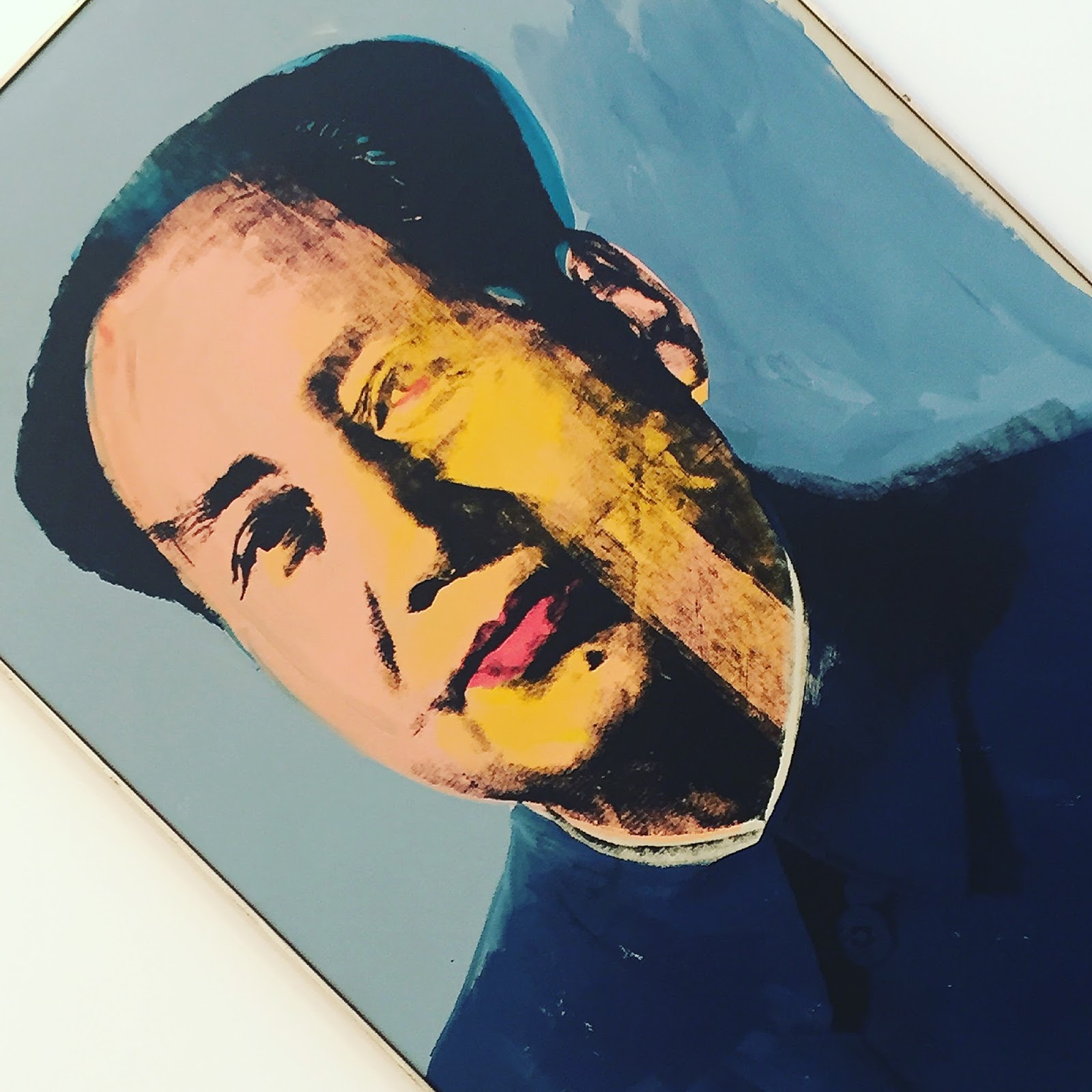
With Liza out of bounds I have chosen Mao to represent the portraits. I would like to have it in my house but it was not for sale and would have cost more than my house if it was. Mao was behind me when I took the picture of the room.

The only slightly annoying thing about the visit was that the pictures were not labelled on the walls and so I had to carry the two page laminated guide around with me. That was fine on my first two passes through the rooms when I was just looking at the pictures but was something of a hindrance on my third pass when I took the photos. I could have gone back to reception to return the guide but that would have meant going through the gallery door twice more and I would have felt awkward having it opened for me again.

The big positive for me in the exhibition was the number of Warhol portraits. I had seen several of them before in places like Tate Modern and the Rijksmuseum but never as many in one place. I also liked the way that Gagosian presented them with some in groups and then others, like Liza and Mao, on their own.

Avedon Warhol is on until the end of April so I shall be going back there for a refresher before it closes. That is what lunch breaks are for.

29 January 2016

Thomas Newbolt: Drama Painting - A Modern Baroque at Kings Place Gallery

Working in a building that houses two galleries is one of the reasons that I pull myself into Kings Place when I could just as easily work at home. They are both conveniently bite-sized and can be consumed as part of a lunch break or an afternoon tea break. They also provide emergency relief when work is going badly.

The main gallery, which now appears to be called Piano Nobile Kings Place, is mostly spread across the level below the entrance and cafe area. There is little on that floor other than the gallery and a large hole in the middle which is the atrium space for the concert hall level below. The gallery flows down to that level to occupy a corner of that space too.

The combination of the atrium and the high ceilings creates a space that can do justice to large works and the exhibitions generally take advantage of this.

The exhibitions also tend to be somewhat quirky and modern in a way that appeals to me greatly.


The latest exhibition is Thomas Newbolt: Drama Painting – A Modern Baroque, which runs until 13 May.

They are all pictures of women, or perhaps it is just one woman, dressed and posed as if going to the opera.

They are interpretive rather than figurative and it is the presence of the woman that matters, not the details of her figure. The focus is kept on the woman by keeping the background dark and featureless.

The simple backgrounds, the plain dresses and the lack of any movement make the pictures as much about the colours as the woman. As is often the case, I appreciated the abstract nature of the art, i.e. the way the colours interact and the visual impact that makes, as much, if not more, that what those colours represent.

Similarly, I appreciated them more from a distance where their scale could be appreciated and full impact of the colours could be felt. Moving closer and the details started to intrude until eventually it was the brush strokes that I saw and the "big picture" was lost. Of course for some works of art the details and the brush work are worth exploring but I felt much happier exploring Thomas Newbolt's at a distance.

This exhibition was not completely to my taste but it was close enough to it to encourage me to go downstairs to see it a few more times before it closes.

13 January 2016

Merete Rasmussen exhibition at Pangolin London

The Pangolin London gallery is by the entrance on the ground floor of Kings Place, which also happens to be the building that my office is in so I walk past in four times a day.

The large windows along the pavement (York Way) mean that I can see the exhibitions without having to go in. This is my (lame) excuse for not going in more often which is my error as I like art galleries even if sculpture is not my favourite forms.

I went in this time for less than artistic reasons. I was having a bad day at work, I do not respond well to micro-management, and wanted a short break. I had been to the exhibition in the Kings Place Gallery on the lower floors a few times so I went to Pangolin London instead. And I was glad that I did.

When looking at the sculptures on my way in and out of the building I had assumed that they were made from metal so I was surprised to learn that most of them were ceramic. Impressed by the technique I asked one of the helpful staff there about it and she explained to me how they were made. It was a complicated process and it included two layers of clay, one to form the shape and the second to hold the colour.


There were limits to the size of the kiln that restricted the size of the pieces and the largest piece, the red one at the top, was made of metal, so I was partially right after all. There were a few smaller metal pieces, similar in style to the twisted ceramics but with several stands rather than a single sheet and the blue piece in the top right corner is an example of this.

I found them interesting but more for the techniques and skills used to manufacture them than their artistic merit (art is an intensely personal thing).

My favourite piece, Morphogenesis - commissioned for this exhibition, is not pictured and was quite different. It looked something like packaging for tennis balls and it changed colour, from black to blue, and became less formal along its length. This was another ceramic work and had been made from three separate pieces because of its size and these were deliberately hung with a small gap between them to show how they were constructed.

Sculpture may not be my thing but my ten minutes or so walking around this small gallery a few times certainly perked me up and prepared me for the final session in the office.

07 December 2015

Ai Weiwei at the Royal Academy

Ai Weiwei could be the most famous artist at the moment but I knew very little about his work. Obviously I was aware that he was a prominent Chinese dissident (the BBC delights in telling us stories about dissidents in China and Russia while ignoring stories about our own) and I would have gone to see his work, Sunflower Seeds, at the Tate Modern Turbine Hall in 2010 if not for visitors being stopped from walking through it for health and safety reasons. That was not enough to make me want to go to the Royal Academy (RA) to see an exhibition of his work.

What swung it was the very positive reviews that I had seen, mostly via Twitter but also via the Art Fund app.

The popularity of the show meant that it was going to be busy whenever I went so I thought that I would go first thing (10am) on a weekday. I had some odd days of leave left to take and a day going to exhibitions was a good way to spend one of those days.

I took advantage of my Art Fund membership to get a ticket for £15.

The route to the RA was easy enough, bus to Richmond, District Line to Hammersmith, Piccadilly Line to Green Park and, finally, a short walk along Piccadilly. That takes about an hour without rushing so I was able to have bit of a welcome lie-in. On the day the lie-in overran slightly and I got to the RA around 10:15, still in good time for the first visiting slot for the exhibition.

The exhibition consisted of eleven connected rooms that I walked around once slowly and then went back around again to revisit my favourites. I took several pictures in each room and used a lot of self-restraint to pick just seven for this blog post.


Straight was in Room 3. The main story here was an earthquake in China which had killed a lot of people, including school children, and poor construction methods were blamed for causing many of the deaths. Ai Weiwei took the twisted and broken rebars (reinforcing bars) from the collapsed buildings, straightened them out and arranged them into this wavy pattern.

I deliberately took this picture with lots of people in it to show how big it was though, to be honest, it would have been impossible to take a picture like this without lots of people in it. It was busy and getting busier.

As with all of Ai Weiwei's work there were two aspects to it, the artistic impression and the political meaning behind it. I could appreciate Straight as a work of art but was unable to comment on the extent to which poor building construction caused deaths and even less able to comment on the Chinese government's role in this.


Next door in Room 4 were two pieces arising from a studio he built in Shanghai but which was never opened and was quickly demolished. Again, I've only heard Weiwei's side of the story so cannot comment on that meaningfully.

Souvenir from Shanghai was constructed from materials recovered from the demolished building. As with a similar piece in Room 1, I liked the way that the materials were put together to make something very solid and somewhat strange.


River Crabs, three thousand of them, represented the gallery opening after-party that happened despite the gallery not opening. I liked the absurdity of the piece and also the effort and skill that had gone in to making it.


Coloured Vases in Room 5 asked another set of awkward questions and again I was not entirely on Ai Weiwei's side. The questions were around antiquity and art, is an ancient vase improved if it is turned into modern art? In the most modest example, above, the vases were "improved" by painting them and in the most extreme one was "improved" by throwing it on to the ground to shatter as a piece of performance art.

I'm with antiquity on that one. If you want to destroy a vase then make a new one.


Room 7 had works made out of marble. In the background is Marble Stroller and the large piece on the floor is, unsurprisingly, Grass. As with others of his works, the construction was the thing that impressed me the most, then the appearance then the political point.


Possibly surprisingly after what I have said, one of the most overly political pieces was one that I liked the most. This was in Room 10. Ai Weiwei had been detained for dissent and he made six half-size models of this time.

Each of the cells had one small window on one side and another on the top so that we could look in. Each scene showed part of his simple daily routine, such as eating, having a shower or going to the toilet. Two guards watched him closely all the time.

The construction was, again, impressive but this time the political message shone through and seeing somebody incarcerated in a small room with two people watching over them was an easy message to understand.


The final piece, in Room 11, Bicycle Chandelier was the most approachable. It was what its name suggests, a chandelier made from parts of bicycles. It was commissioned for this exhibition and fitted the high domed room neatly.

The exhibition was very mixed in terms of the materials used, the sizes of the pieces and the motivations for producing them. Helping to make sense of all this was an audio guide and I made good use of this as I went round. There was a short audio for every piece which I listened to though I skipped the additional audio sections except for when I played them by mistake.

Ai Weiwei, for me, lacked the continual wow moments that the David Hockney exhibition had but there was plenty enough in there to demand an hour and a half of my time and to make me want to walk around for a second time to see some of them again. 

I am still not a great Ai Weiwei fan but the exhibition helped me to understand and appreciate his work, I also liked a lot of it. Straight was my clear favourite.

23 October 2015

Jonas Wood at Gagosian Gallery was bold and colourful

One of the very best things about working in London is the access that gives me to the arts, especially theatre in the evening and galleries at lunchtime.

I am currently working just north of Kings Cross Station which means that Gagosian London is just around the corner. It's a few corners actually and that is another good thing as a visit there gives me something of a walk too.

Gagosian Gallery is just my sort of gallery. It has big bright white spaces that are lightly filled with dramatic works of art. In that respect it is very much like the Saatchi Gallery but the Gagosian has the advantage of being smaller and so can be consumed in lunchtime sized chunks. Like the Saatchi, it is also free to enter so the experience can be repeated as often as you like.

On this visit I stumbled upon an exhibition by Jonas Wood who, the short guide tells me, was born in Boston in 1977 and lives and works in Los Angeles. That helped to explain why I had not heard of him before. That and my almost complete lack of knowledge of modern art. All I know is from exhibitions like this and I do not recall ever seeing any contemporary artist's work in two separate exhibitions.

Personally I like that lack of knowledge as it means that I have no preconceptions. If I knew beforehand that "Wood fuses artistic influences as diverse as the domestic interiors of Pierre Bonnard, Henri Matisse, and David Hockney to Chinese and Japanese still-life scenes, ancient pottery and the guileless textiles of Josef Frank" then expectations would have been set and missed.


There was certainly something of David Hockney in Wood's use of simple shapes and extravagant colours. The main difference was in the subject matter as Hockney makes me think of trees and fields and Wood presented busy interiors.

I always like art that has an abstract feel, that is you can appreciate just the use of colour without considering the subject as that gives an immediate hit, and also has detail in the subject that makes you want to look at the whole picture giving a longer and steadier pleasure.


I chose this picture for several reasons. It shows how that pictures were presented with each given plenty of space so as not to interfere with its neighbours. It also shows a series of paintings of pots that were different in style to the interior pictures. And, finally, it shows the complexity of some of his work.

The pot in the middle in particular had lots going on in it, such as the cycles, boats and aeroplane. I took photos of it close up to capture some of this detail but in doing so the context and scale of the rest of the painting and the pot were lost. I thought about posting three pictures of it with different levels of zoom but that would have swamped this post and unfairly highlighted one piece of work.

The pot in the middle was also the one most photographed by other people while I was there.


My final selection from the gallery is another interior. Despite the apparent simplicity and broadly grey feel, there is a lot going on here too from the complex roof to the banana packing cases and all the abandoned objects in between.

I spent an exhilarating half an hour in the gallery going around the rooms three times (context, detail, photos) before heading back to the office to resume battle with some spreadsheets. The brisk walk had exercised muscles and lungs while the exhibition had given my brain some playful exercise too. All lunch breaks should be like that.

21 October 2015

Greg Tricker: Revelation – Sacred Art, Sacred Music at Kings Place Gallery

An exhibition titled Sacred Art, Sacred Music was always going to struggle to appeal to somebody as unspiritual as me, and so it proved.

Kings Place Gallery (a.k.a. Piano Nobile Kings Place), is in the same building as the main office that I work in so I look at every exhibition whatever the subject.

Revelation made the sacred nature of the works by framing most of the stained glass pieces in what looked like church windows. I could appreciate the idea but was not convinced by the execution as I felt the frames were too prominent and so drew attention away from the pictures.

Understandably the subject matter was very sacred too and that had no interest for me. What I did like was some of the use of colour.

In trying to summarise what I liked about the exhibition I've chosen a picture of Noah in his arc. I've had to zoom in and crop the picture to hide the frame and I try to ignore the holy glow around Noah's head. What I do like is the bold red of the boat and the strong, blue, yellow and green that surround it.


Revelation – Sacred Art, Sacred Music was far from my cup of tea artistically but I would much rather have a gallery in my building that sometimes does art that I do not like than have no gallery at all and, besides, there is usually something for me to like in any work of art anyway.

26 June 2015

Sprayed at Gagosian Gallery was playful and provocative

There is something invigorating about modern art that makes me love it. The Shock of the New is part of the attraction but a good exhibition delivers more than that.

I also love the way that exhibitions, unlike scripted events such as plays and operas, let you enjoy the experience in any order and at any pace and with the opportunity to revisit sections.

On my most recent visit to the Gagosian Gallery (in Britannia Street by Kings Cross) I went around the exhibition three times; firstly to see how it was laid out and where I needed to spend most of my time, secondly to enjoy the art and thirdly to take some arty-farty photos of the pieces that I liked the most.

The title of the exhibition was Splayed which, their press release informed me, spanned four generations exploring the myriad ways in which artists have employed the impulsive yet de-personalised and non-gestural forces of spray.

I got off to a bad start by walking on the first one which had the utterly clear title Two Minutes of Spray Paint Directly Upon the Floor From a Standard Aerosol Spray Can. The floor it was sprayed on was just inside the entrance and I missed the attendant's warning because I still had my earphones in. Luckily I appeared to do no damage to it.


The gallery was not that large with just four rooms and the corridor that connected them. The works were presented as is the norm these days, far apart against white walls. It may be conditioning but that is how I like it.

Modern art needs big bright rooms but it does not need many of them, as places like White Cube also demonstrate. Big galleries, like Tate Modern and Saatchi, are great for days out and it is nice to also have a collection of smaller galleries available for shorter visits.

The pieces varied in form and format and it was the large paintings that had the immediate impact with me despite them being very different, they are both shown here. One was mostly black and arranged in horizontal lines (like a landscape) while the other was a riot of colour and curves.

To prove that it was not just the size that impressed me, the third large painting left me completely cold and to show how subjective art is that was the painting selected to advertise the exhibition.

Another surprise came from the inclusion of a small work by Paul Klee. This was little more than a few lines, something like a geometry lesson, but it was good to see it there. As if to make the point, on the wall next to it were some pieces drawn on graph paper. I liked those more.

There was little disputing the most popular pieces as almost of the pictures posted to Instagram of the exhibition, including mine below, were of the same ones. There was plenty of variety in the angle of the shots and the distance that they were taken from but they all included the remarkable inflatable animals trapped in stacking chairs, Seal Walrus (Chairs) by Jeff Koons, in front of swirling colours, Abhorrence by Albert Oehlen. Two works of art working as one.


I found Splayed to be a playful and provocative exhibition and Gagosian was an effective space for it. This is what lunch breaks are for and this is why I like working in London.


31 March 2015

Borderlands at GRAD was provocative and thrilling

GRAD (the Gallery of Russian Art and Design) is my sort of gallery. I have always found the exhibitions unusual and stimulating, and the gallery's location and size make it an ideal place to pop-in to during a lunch break.

And so it was that I found myself there on a Tuesday lunchtime.

The exhibition was called Borderlands and it looked at the boundary between art and political comment, something that the V&A has also been looking at recently in exhibitions like All of This Belongs to You, the difference being that this was from a Russian perspective and it is always good to see things from a different perspective.

The front of the exhibition space was dominated by a brick wall with wallpaper on one side. I've shown the wall paper side but viewed from the other side it was more obvious that the shape of the wall was that of Ukraine and that the section of bricks lying on the floor away from the wall was shaped like Crimea, the obvious point being that this part of the country had split away from the rest.

You could argue that Russia was in the wrong over the breakup of Ukraine, and many people have, so it was a provocative and brave act to include a piece like that in the exhibition. That was a good thing as art should be provocative and brave.


There was a series of photographs, displayed on lightboxes, of demonstrations in Moscow. These were made arty by the way that they were taken and presented. They were taken over a short period, 41 seconds apparently, and that gave them a smudged look as some of the elements of the picture smeared in dramatic lines.

Another effect, not that obvious here, was to squash parts of the photos along vertical lines in the way that things like Apple's Photo Booth do. In the big picture above this was done by the grey post on the left. I found the combination of the contrasting effects of smearing and squashing very effective.

The final element was the original scenes and and these were colourful and powerful because they were what they were, i.e. demonstrations with lots of people carrying banners in large public spaces.


I did not get the connection between these outfits and protest but that did not matter as I liked them anyway. I did get that these were not meant to be normal fashion outfits so there was a question there as to whether these were clothes, art, both or neither. I would call then Abstract Fashion in that they were Abstract Art produced using Fashion.

Treated as a form of Abstract Art it was easy to appreciate their use of shape and colour.

This was my fourth visit to GRAD in just over a year and I was thrilled every time. That's why I'll keep going there.