Showing posts with label exhibition. Show all posts

25 January 2025

NAOMI In Fashion at V&A

I had a few hours to fill before a theatre date and was with two women so we decided to fill the time with the NAOMI In Fashion exhibition at V&A. 

We were all members of V&A so we could just turn up and walk in, which we did having first taken advantage of members' privileges to drop out coats of in the cloakroom for free.

It was a fairly small exhibition, unlike say Alexander McQueen: Savage Beauty which had been on in the largest space and this was, appropriately, in the fashion space, as Wedding Dresses had been. That suited me as while I was not quite there under duress I do not think that I would have gone but for the external influences, unlike the other fashion exhibitions which I had definitely been up for.

I had not followed Naomi Campbell's career at all and only knew the things forced on me through the mainstream media. I probably could have learned a lot more about her life had I read more of the exhibition notes but it was not her life that I was interested in, it was the clothes that she had worn, and she had worn some incredible outfits (using "incredible" in several ways). 

I was also interested in the way that she had been photographed. There were plenty of outfits and photographs on display so that was good.

The common factor in the exhibition was Naomi and as that did not interest me I found the collection of clothes by many different designers to be a disjointed exhibition.

I was also surprised at how few of the outfits actually impressed me and it is telling that I have chosen an Alexander McQueen one. If I had to pick another it would have to be a Vivienne Westwood tartan outfit.

NAOMI In Fashion did not do a great deal for me but it did enough, and it was free.

It was also at V&A which meant that I could go and have a coffee and a cake in the Members' Room afterwards. A fair start to a busy day.

27 August 2024

The Biba Story at Fashion and Textile Museum

I was only vaguely aware of Biba at the time though the pull of its brand was enough to entice my sister up from Weymouth when she was still in her teens. Most of my awareness was to do with the branding and little to do with the fashion but the Fashion and Textile Museum has a good habit of telling interesting stories about fashion so I was keen to see this exhibition.

The simple plan for the day stumbled a little at the start as I was going to have lunch at their cafe but I forgot that it had been closed and the space converted to something else. Luckily there was plenty of choice nearby and I settled on Al’s Cafe where I rejected the option of a veggie breakfast because it came with chips and, instead went for Al's Breakfast which was much the same but without chips. It was very much a working person's cafe but the knew to do poached eggs and smashed avocado. It hit the spot perfectly and I would go there again.

As usual, Fashion and Textile Museum crammed quite a lot into a fairly small space and it was a slow walk around the exhibition looking at all of the garments (it was mostly garments) and reading the stories behind them.

The fashion exhibitions that I usually see, mostly at V&A, are on high-end fashion, e.g. Alexander McQueen, and in contrast to that I found most of the fashion uninspiring, though it was interesting to see some very period outfits. A lot looked like they could have come from M&S but that probably tells you more about what I know about fashion than it does about Biba.

Amongst the fairly average dresses and suits were a few stunning outfits. My favourite was a unisex trouser suit which a psychedelic pattern and widely flared trousers. I like to think that I have the courage to wear something like that. There was also a spider dress, so called because it looked as though it was covered in webbing, that was distinctly glamorous.

Biba's style changed quite a bit over the years and the texts listen all sorts of influences so there was little commonality across the outfits other than they were designed for tall thin women with few curves.

It was a fashion exhibition so while it mentioned the designs of the various shops there was only one photo of one and I do not recall reading anything about the production process, other than the sourcing of fabrics. The high turn-over of designs suggests something like today's fast fashion but that was an untold story.

On nice thing about the exhibition was that many people had clearly dressed for the occasion and the visitors were almost as interesting as the exhibits. One was even wearing a Biba trouser suit and I took the opportunity to say how much I admired it.

My simple metric for exhibitions is how long I spend there and this one occupied me for all but an hour which, given the size of the venue, was quite an achievement.

18 August 2024

Grayson Perry: The Vanity of Small Differences

While I have enjoyed all of the Grayson Perry art that I have stumbled across at places like V&A I had never gone to one of his exhibitions before but this one was so easy to get to, just a simple 65 bus ride, so it would have been strange not to go. The extensive research I did beforehand told me that the exhibition was six large-scale tapestries, which was enough to get me to part with £6.60 (thanks to the Art Fund discount).

The venue was Pitzhanger Manor Ealing, a place I know well because I spend a lot of time in Walpole Park and the several other parks in that area. I had even been to the cafe there but that was the only place inside that I had been to; another good reason for going.

If I had done even the slightly bit more research I would have been even keener to go as The Vanity of Small Differences was inspired by William Hogarth’s A Rake’s Progress and the original paintings were bought by the wife of the architect of Pitzhanger, Sir John Soane, to be displayed at Pitzhanger. 

opens at Pitzhanger Manor & Gallery this July–December 2024. For the first time, this exhibition brings the Turner-Prize-winning artist’s six large-scale tapestries to a building where William Hogarth’s A Rake’s Progress, the inspiration behind Perry’s tapestries, were purchased for and displayed. The tapestries were most definitely at home.

For a description of the exhibition, I can do better than quote from the "Taking Hogarth’s famed series as a starting point, Perry’s tapestries depict a corresponding fable of class, taste and social mobility. Weaving the complex ‘class journey’ of the fictional protagonist, Tim Rakewell.".


This is just part of one of the tapestries and you can see how rich the picture is in symbolism; they make a big impact at a distance because of their size and colours and then as you get closer there is more and more to see. Each tapestry takes a little time to study and enjoy.

No spoilers, but the last tapestry is in a darkened room on its own with a content warning at the entrance.

I really enjoyed the exhibition and, as my sister wants to see it too, I will be seeing it again soon.

12 July 2021

Delighted by Alice: Curiouser and Curiouser at V&A

Once upon a Time the V&A was my favourite place on the planet and I went there so often it felt like a second home. Then I stopped working in Central London and then covid-19 happened and unexpectedly I had not been there for two years. 

I could have been away for even longer but for the chance to use a corporate booking to see all three of the current exhibitions. A previous medical appointment meant that I had no time for Bags: Inside Out and I chose to go to Alice: Curiouser and Curiouser first.

I arrived at South Kensington in good time and with the V&A cafe sadly still closed I had a mid-morning boost, coffee and cake, at Brown & Rosie.

I was not sure what to expect from the exhibition, I rarely do, and I was pleased to discover that it largely focussed on the iconic imagery and little was said about the text, other than putting it in the context of the time it was written.

I had a copy of the classic book as a child, and it is probably still in the library room somewhere, so I have known the original John Tenniel illustrations for over fifty years. It was interesting to read how this writer and this artist worked together, something I am familiar with from comics, and also to see other examples of Tenniel's work.

A large part of the exhibition then showed how these iconic (I know I used the word earlier and I repeat it to make the point) characters and images have been included and adapted in popular culture from then to the present day.

The story has been retold many times and in many forms. Notable film versions include Tim Burton's Alice in Wonderland (2010) with Johnny Depp and Alice's Adventures in Wonderland (1972) with just about everybody around at that time including Peter Sellers and Dudley Moore.


There were also posters from plays, album covers, books of foreign adaptations and quite a few other things that I paid too little attention as I rushed round in the little time that I had (about an hour).

Several images struck me hard in a good way, like the Japanese Lolita outfit in black, and the standout image for me was this from the Pirelli 2018 calendar shot by Tim Walker and styled by Edward Enninful.

And that's why I love the V&A, I never expected to be see, let alone be delighted by, a photo from a Pirelli calendar.

Alice: Curiouser and Curiouser was as excellent as I have come to expect a V&A exhibition to be and I might well go again before it finishes at the end of the year.

I had planned to also see Epic Iran and had a ticket for entry between 1;30 and 1:45. I got there at 1:35 to find the exhibition closed. There were a couple of other people there with tickets and after some discussion we were allowed in but told that we had to be out again by 2pm, which then became 1:55. That gave me 20 minutes to try and absorb what I could but this did not work as what I saw was quite wordy, unlike Alice, and there was little of the architecture and decorative tiles that I was hoping to see. It was very disappointing and I saw nothing to tempt me back for a proper look.

Things got better when I went back to Brown & Rosie for some lunch and a beer in the sunshine.

31 January 2020

Beyond Bauhaus exhibition at RIBA

I worked in Central London for several years, lastly near Kings Cross, when it was fairly easy to get to exhibitions at RIBA, even if it meant taking a flexible view of how long a lunch hour lasts. That stopped when I started work in Teddington and I have struggled to pick the habit back up since retiring.

An exhibition on Modernism got me back there.

I made something of the trip walking up from Vauxhall, though walking around Buckingham Palace at Changing of the Guard was not one of my better ideas. Apart from that the walk went well and it was nice revisiting once familiar places like Berkley Square.

I hit another problem at RIBA with the cafe immediately on the right of the entrance and the one of the first floor both being out of action. I consoled myself by taking in the displays on the first and third floors which got me in an architectural mood.

Going back to the ground floor for the main exhibition I found where the cafe had moved to and was able to have a coffee and a toasted sarnie before going in.

The premise of the exhibition was that Modernism in Britain grew directly out of the Bauhaus movement with the relocation of some of the key players, notably Walter Gropius, from Germany to England, and this was the thread that the exhibition followed.

The staging of the exhibition was somewhat unusual, and I have mixed views on it. The extra space needed to display the photographs and drawings was created by adding pillars to the room but instead of mounting them on the outside they went inside and we peered at them through geometrically shaped openings, a bit like Play School. These shapes were included in the exhibition poster though I failed to determine their exact relevance.

That said, I am a sucker for architecture in general and Modernism in particular and I loved the exhibition. One favourite section was that on individual houses built for rich sponsors, often a good source for experimental architecture, and another was on industrial buildings.

In the post-Bauhaus section I was surprised to see several pictures of Eric Lyons' SPAN developments but none of their first on Parkley in Richmond, which is about 200m away from where I live. I cheekily raised this with one of the staff who was overseeing a tour group and she skilfully defended the curator's choice.

Other famous architects featured were Denys Lasdun (NT) and Erno Goldfinger (Trellick Towers) and there were other famous buildings by less famous architects which produced a peppering of works known to me amongst many that were not. Seeing both helped put the known into a wider context.

The exhibition confirmed my love of Modernism and of exhibitions at RIBA.

23 January 2020

Captivated by William Blake at Tate Britain

As soon as the William Blake exhibition at Tate Britain was announced I knew that I would go. This was despite seeing a lot of the collection several times before in the permanent display of his works in the same gallery.

It still took me several months to book to see it and I finally got there fairly early on a Thursday morning about a week before the exhibition closed.

I picked a 11am start as on my previous visit I had gone for 10am and that was bit of a rush with the museum opening at that time. The extra hour allowed the place to open properly, including the cloakroom where I left my Winter coat, and for me to have a coffee and a cake beforehand. The extra zip that gave me was most welcome.

The exhibition was held in the usual place just to the left of the main entrance but unusually the eleven rooms were described as just five in the small free guide. This made sense for the exhibition but confused my timing as I was never quite sure how much there was still to see, and that was after I made a dash to the end to see the extent of what was to come.

The exhibition was organised chronologically which made perfect sense as the work he did was governed by his changing commercial fortunes while the style stayed much the same throughout.

What surprised me the most was the size of many of his works. I had seen some of his smaller pieces before, typically illustrations for books, and there were many more of these here and several much smaller ones too.

The picture on the right is something like actual size and I struggled to read the text on most of these. The picture above is enlarged slightly.

There was a great deal to see, over 300 pieces, and everyone required careful consideration. This was not at exhibition that you could whizz through absorbing the highlights on the way.

And there were plenty of highlights.

It took me two and a half hours to get around and that was driven more by my capacity to consume art than by the amount on display. I did not exactly rush through the last couple of rooms but they certainly got less attention that some of the earlier ones. I also lacked the energy to go back and revisit my personal favourites.

The William Blake exhibition did everything that I hoped and more. There were no surprises on the content aside (apart from the two landscapes) and I was able to wallow in his familiar style savouring old favourites and many new items. I also read all the words and while a few of those were curator's licence on interpretation there was a lot of information that was new to me which helped to explain the man and his works.

Tate Britain knows how to put on a show and William Blake was my kind of show.

25 February 2018

Rebecca Louise Law: Life in Death exhibition at Kew Gardens

I had gone to Kew Gardens for the orchids but I had heard good things about the Rebecca Louise Law: Life in Death exhibition in Shirley Sherwood Gallery of Botanical Art so I strolled along to that.


The gallery is in one of the quieter and least attractive parts of the garden, on the path between Victoria Gate and Lion Gate and I had not been there before.

It is a modest sized gallery with half a dozen room containing several small exhibitions. Rebecca Louise Law: Life in Death was in Room 5 and, unlike the rest of the gallery, operated a one-way system through it.

The exhibition consisted of several thousand dried flowers suspended on threads from the ceiling. They were hung such that a narrow path weaved through them. This took you right up to the flowers though we were instructed to take care not to touch any of them. Dried flowers are somewhat delicate after all.

It sounds like a simple concept and it probably looks it from the photographs to but to walk through it was an amazing experience, and one I took very slowly so that I could savour it for longer.

There was a great variety among the flowers and grasses that were suspended for our pleasure and I stopped to look at many of the threads individually as well as enjoying the cumulative effect of being in a room full of them.


The exhibition closes on 11 March and I hope that I will get the chance to see it again before it does.

18 December 2017

Wallowing in Winnie-the-Pooh: Exploring a Classic at V&A


I had gone to V&A to see Opera: Passion, Power and Politics but it would have been stupidity to go all that way and not also see Winnie-the-Pooh: Exploring a Classic.

I needed a rest first and I went to the cafe, as I do on every visit to V&A, and had a nice bowl of comforting soup. One of the advantages of going during the week was that I was easily able to get a table in the William Morris room.

Rested, I went to the new entrance, it being the closest, and with not much difficulty managed to use one of the large self-service touch screens to buy a ticket for the first free slot to Winnie-the-Pooh, which was about an hour later. That gave me just the right amount of time to find (the hardest part) and visit the display Into the Woods: Trees in Illustration, and then return to the cafe for a coffee and some cake.

Winnie-the-Pooh: Exploring a Classic was in half of the main exhibition space which gave me an estimated visit time of an hour, long enough given what I had already done and my interest in the subject.

The exhibition was stuffed full of E.H. Shepard drawings of all types and stages from woodland scenes used for research through to drawings he added colour to when in his nineties. The drawings were every bit as charming as I remembered from the books, probably more so.

The text with the pictures helpfully explained the techniques and tools used, e.g. the different types of pencils he worked with and the way shading was used to produce different effects.

It was also fascinating to learn about the way that the illustrations were always designed to be embedded in the text with individual pages being design in the same way that pages in a comic are.

This being V&A there was a lot more to the exhibition than words and pictures; there was even a almost full-sized mock-up of the famous Poohsticks bridge that you could walk over and have your photo taken as if in a drawing, which a lot of people did.

If I had one minor gripe with the exhibition, it was that the focus was overwhelmingly on the E.H. Shepard and relatively little was said about the A.A. Milne words. It would have been good, for example, to read/hear some passages with some explanation of how they were constructed (rhythm, rhyme, etc.). That said, it was the illustrations that I had gone for and there were lots of them and they were all lovely.

Opera: Passion, Power and Politics at V&A

As a lover of both opera and V&A it was only a matter of time before I went to see the exhibition Opera: Passion, Power and Politics at V&A, though I did have to take a day's holiday to find that time.

Going on a work day meant that it was not sold out and I could get tickets on arrival. It also helped that it was towards the end of its long run. I treated myself to a decent lie-in first and after a leisurely breakfast and a decent journey in I arrived there just after 11:30am.

The exhibition was in the new Sainsbury Gallery and it was nice to have an excuse to see it.

The technology was the same as for Pink Floyd earlier in the year, headsets and a devise that played music (it was almost all music) according to where you were in the various rooms.

There were two helpful signs at the start, one said that photography was allowed and the second said that visitors should allow 70 minutes for the exhibition. One of those proved to be more true than the other.

The opera story was told as a series of dates, places and significant works connected to them. It started with Venice around 1600 and Monteverdi's Orfeo, moved on to London a century later with Handel's Rinaldo, and so on. It started off very historical with little in the way of passion, power or politics except for opera always being a rich person's activity and so it was entwined with them through its patrons.

That started to change with Marriage of Figaro which let servants get the upper-hand over their masters, something shocking in a period when workers never played important roles in art much less triumphal ones.

The passion reached its zenith with the closing aria from Richard Strauss' Salomé where a blood splattered Salomé embraced the severed head of Jochanaan much to the disgust of her step-father Herod. This was top-grade Sex and Violence.

The tour ended with Stalin's Russia and Lady Macbeth of the Mtsensk District by Dmitri Shostakovich, an opera unknown to me which featured some frenetic piano playing by the composer.

The final room was a sample of opera today with excepts from several contemporary works, including a few I had seen and I few more that I would like to.

The expected 70 minutes turned out to be 100 or more and that tells you how much there was to listen to, look at, read and watch, and how engaging it all was.

08 April 2017

Sumptuous Hockney at Tate Britain


I had been to a couple of Hockney exhibitions in recent years and that was more than enough to convince me to go and see another one. This time it was at Tate Britain.

Scheduling these things is always difficult and as the tickets were selling rapidly my choices were limited and becoming even more so. In the end it was easiest to go on a Saturday and add a theatre to the trip. I saw a matinee performance at Arcola Theatre and then headed to Pimlico for my 7:30pm date with Hockney. My Art Fund membership entitled me to a ticket for a very modest £8.85.

Time was a constraint and so my evening meal consisted of a sarnie from a Pret a Manger in Horseferry Road, Westminster, which was fine.

The Hockney exhibition was spread over a lot of rooms created within a rectangular space. Like IKEA, you had to go through all of the rooms one after the other and each room had a sequence to it which some people followed while others chose the easier option of moving to the least crowded spaces and taking the pictures in a random order. The exhibition was very busy but, generally, moving around was easy and the crowd did not get in the way of my enjoyment of the exhibition.


Photography was not allowed (they had a catalogue to sell) which was a mixed blessing; I would have loved to have taken lots of photographs (I managed just one sneaky one to prove that I was there) but then so would have everybody else and the circulation of people would have slowed dramatically and many of the more impressive pictures would have been swamped with people taking selfies.

What impressed me the most this time was the range of styles and materials he used. I was expecting, and saw, many large colourful paintings but these were complimented by sketches in graphite and iPad drawings that you could see being composed. I was reminded, as other exhibitions had shown me, just how good Hockney is technically.

It took me a couple of hours to navigate the exhibition simply because there was so much to see and I wanted to spend time appreciating each item. I am grateful that the fairly recent trend of having late openings for major exhibitions allowed me to see it.

11 March 2017

Josef Frank Patterns Furniture Painting at Fashion and Textile Museum


It was not much of a loose end but I had a few hours to fill between theatre appointments in Shoreditch and so I made another visit to the Fashion and Textile Museum (FTM) in Bermondsey, a short hop on the Northern Line from Old Street to London Bridge with a refreshing walk at either end.

Any visit to a museum starts or ends with a coffee and some cake. This time it started that way.

All I knew about Josef Frank beforehand was what FTM had shown me in their regular emails which was enough to tempt me to the exhibition but did little to inform me about the man or his works so I went in with some expectations and a lot of curiosity.

I soon earned that Josef Frank was Austrian by birth but moved to Sweden in middle-age to escape anti-Jewish persecution where is work in architecture extended to other forms of design.

Those expectations were quickly met too with large displays of fabrics in the style of the poster. The scale of the patterns with their large repeats and their lack of symmetry made them quite different from the floral patterns that I was familiar with from the likes of William Morris and Liberty. Somewhere along the line I remembered that I had some Ikea chairs with a pattern not unlike these, perhaps it a Scandinavian style.

Upstairs was something of a surprise as it was mostly paintings. Frank liked painting but was not terribly good at it, his cars looked very amateurish and his sense of perspective was unusual. That said, he often painted interesting scenes and their natural beauty and interest survived his artistic interpretation.


The paintings and other displays were interesting but it was the fabrics and furnishings that made the show special for me and there were lots of them to enjoy even in the relatively small space that is the FTM. I had to walk past them all again as I came back downstairs to leave and I enjoyed seeing them the second time almost as much as I had the first. It was a slow and pleasant exit.

The FTM is a remarkable place simply because it continually does exhibitions as stimulating this one.

06 May 2016

Missoni Art Colour exhibition at the Fashion and Textile Museum

My sister was staying with me in London for a couple of days and I suggested a few things that we might fill the days with and while she was not so keen on going to the theatre she was interested in the Missoni exhibition at the Fashion and Textile Museum because she had not been there before and had three Missoni scarves.

Getting there was fairly straightforward but slowish; a bus to Richmond passing through some road works, a bit of a wait for a train to Waterloo, a trek across the station to the Jubilee Line to get to London Bridge and a final walk under railway lines in Bermondsey to get to the museum.

After that minor ordeal we started off in the cafe where I had a fruit juice called something like a Zesty Zandra and a toasted goat's cheese sandwich. All very nice if a little pricey at the best part of £10. It did the job and I was refreshed and ready for the exhibition.

My Art Card gave me a 50% discount for the exhibition so I only paid £4.50 to get in. That was good value however you look at it and even better when compared to the lunch.

I do not own any Missoni scarves so I went in with few preconceptions, the only clue I had on what to expect was the poster above with its bars of different colours. I had seen similar samples at the Sonia Delaunay exhibition at Tate Modern and I had been intrigued, and impressed, by the careful planning of colours and how they work together.

It came as a surprise that the exhibition began with some pictures, i.e. proper art. They were there to explain the context of the Missoni work in fashion by showing how similar themes were being explored in mainstream art. This started in the '50s when abstract art with its reliance on shape and colour was becoming more prominent, though it had started a few decades earlier. One reason that fashion had lagged behind painting was that fashion is generally more conservative and another is that, as one of the videos explained, the technology was simply not there. In Missoni's early days machines could only weave stripes and the more complex ideas appearing in art could simply not be copied.


The extent to which this was experimental was shown by the many sheets of paper where colours and patterns were carefully tested.

I had seen similar experimental work by artists at other exhibitions and I love the way that they show the artist's working out of things such as which colours go well with others. Here as well as a multitude of colours there were simple patterns and next to them more complex ones where the straight lines of triangles had been bent into experimental curves.

The importance of this design phase in the work is shown by the exhibitions logo (at the top) which consisted of coloured lines and made no reference to the fabric made using them.

These geometric designs featured throughout the exhibition and were most notable in the collection of wall hangings in the main room.

A small section of one of these is shown below. It is an almost ridiculous collection of lines and colours that combine to make something striking. This was a very large piece overall and looked as though it belonged on the stairway of a grand mansion. It certainly needed somewhere the size of the main room to contain it, let alone to show it off fairly.


The main element in the main room was a collection of mannequins (below). This was a clever display but it took me most of the afternoon to work out how clever. It is not that obvious from this angle (that is my excuse) but the mannequins were dressed in stripes of colours that ran diagonally from bottom-left to top-right. The orange mannequins are the best clue and the stripe in front of them is green. These stripes were obvious, once spotted, from the right angle on the ground floor.

It also took me a while to work out that the lighting that I complained about was part of the effect and different elements of the display were lit in a cycle as a clock ticked somewhere in the background. Once I realised this all I had to do was wait for the phase when all the lights were on to take my picture.


What did surprise me was how timid most of the colours were and because of that how subdued most of the garments were. It took some close inspection to identify some outfits that looked sensible in today's eyes. One of these was the checked coat worn by the mannequin with the blue hat at the top-right of the collection.

There were other rooms and other things to see. There were some videos running on continuous loops, some carpets that looked rather like ones that I grew up with and more paintings by contemporary artists. It was not a vast exhibition, he Fashion and Textile Museum is not a big place, but there was plenty to see and much of it warranted spending some time looking at, particularly in the detail of the patterns and the colours used.


I return to another sample sheet for my final image. These samples are in fabric rather than paint and the patterns are more complex which shows how much the ideas and technology evolved. I could find somewhere in my house for this particular display even though it is just a collection of samples as the combination of shapes and colours is arresting. I returned to this display several times.

While I have never been that interested in fashion (as my wardrobe testifies) a well curated exhibition will always interest me, much as In our Time does whatever Melvyn Bragg is discussing, and I found plenty to stimulate and entertain me in Missoni Art Colour.

18 March 2016

Jeff Lowe: Object Lessons at Pangolin London

Pangolin London is one of the two galleries at Kings Place and is the one that I pass every time that I go in or out of the building. It has a prominent position at the front of the building and with its large windows it gives me a nice shot of art as I go past.

Of course I go in sometimes too and this tends to be during the day when events at work make a more intense shot of art a welcome boost. I visit the larger Piano Nobile Kings Place gallery on the lower ground floor for the same reason but their exhibitions are on for longer and so going there repeatedly gives diminishing returns.

And that is why I was in Pangolin London on this Friday afternoon. It was a bad day in the office and I had already decided that this shot of art would need to be followed by further shots of coffee and cake from Green & Fortune Cafe.

The current exhibition Jeff Lowe: Object Lessons had a mix of objects that could be broadly categorised as lines, blocks or lines and blocks.

The big pieces, like the one below, were all about lines and the joins between them. This piece looks like a pile of bent tubing that was found somewhere and welded together almost randomly whereas the similar sized piece on the floor next to it looked more like a large wire basket with thinner pieces of metal and everything in parallel straight lines.


There were several smaller pieces made of layers of metal welded together to make rectangular blocks which could have been models for modern buildings. But it was the large block piece that demanded attention as it filled most of the wall at the far end.

This single piece consisted of 36 cast iron plates arranged in a 3 x 12 grid that measured approximately 1m by 5m.

The designs on each plate reminded me of hieroglyphics but that was probably because I was going to see Akhnaten that evening. A closer inspection of the shapes suggests that at least some of them represent countries or territories, if you look at them upside down then the one in the middle appears to be North America and the one diagonally up and left from it is Africa.

This was my favourite piece because of the visual impact that it had from a distance and the images on the individual plates that drew me towards it.


The lines and blocks came together with a series of woodblocks. The structural lines from the metal work were repeated and the colouring of the spaces between them repeated the blocks.

I liked these too because I almost always like modern art that consists of simple shapes and a few colours.


Pangolin London is quite a small gallery which makes it ideal for a quick visit and there is always enough interesting stuff in there to make it a rewarding visit.

16 February 2016

Avedon Warhol at Gagosian Gallery


I would have discovered the new exhibition at Gagosian Gallery at some point anyway but it was a mixed pleasure to be notified of it through a Facebook friend who went to the opening evening. I do not get invited to things like that and so I make do with visiting it during a lunch break.

Gagosian Britannia Street, one of a few Gagosian galleries in London, is about a ten minute walk from our London office and is slightly hidden between Gray's Inn Road and Kings Cross Road.

The gallery had changed slightly since my previous visit with the introduction of a glass door between the reception area and the galleries. Like the glass door at the entrance this had somebody standing by it to open it for visitors. With two doormen and a watchful guard in each room there were about as many staff there as there were visitors when I arrived. I have no idea how their funding works.

I had heard of Andy Warhol, obviously, but Richard Avedon was a new name for me. I learned that they were put together because they were contemporaneous and their paths had crossed, one of the large Avedon photographs was of Warhol's crowd of friends and associates.

Some other Avedon photos were facial portraits, of people like Marilyn Monroe and Bridget Bardot, and so were similar in style to some of Warhol's paintings and this also helped to make the pair a good match.


The picture above of the largest room in the gallery shows how the works of the two artists were displayed alongside each other.

The Avedon photo on the left were individual pictures of a large family. They were all taken with the people standing and almost all were waist-up shots. The identical compositions made the pictures more interesting for me and it also drew my attention to the variances in the ways that the arms were posed.

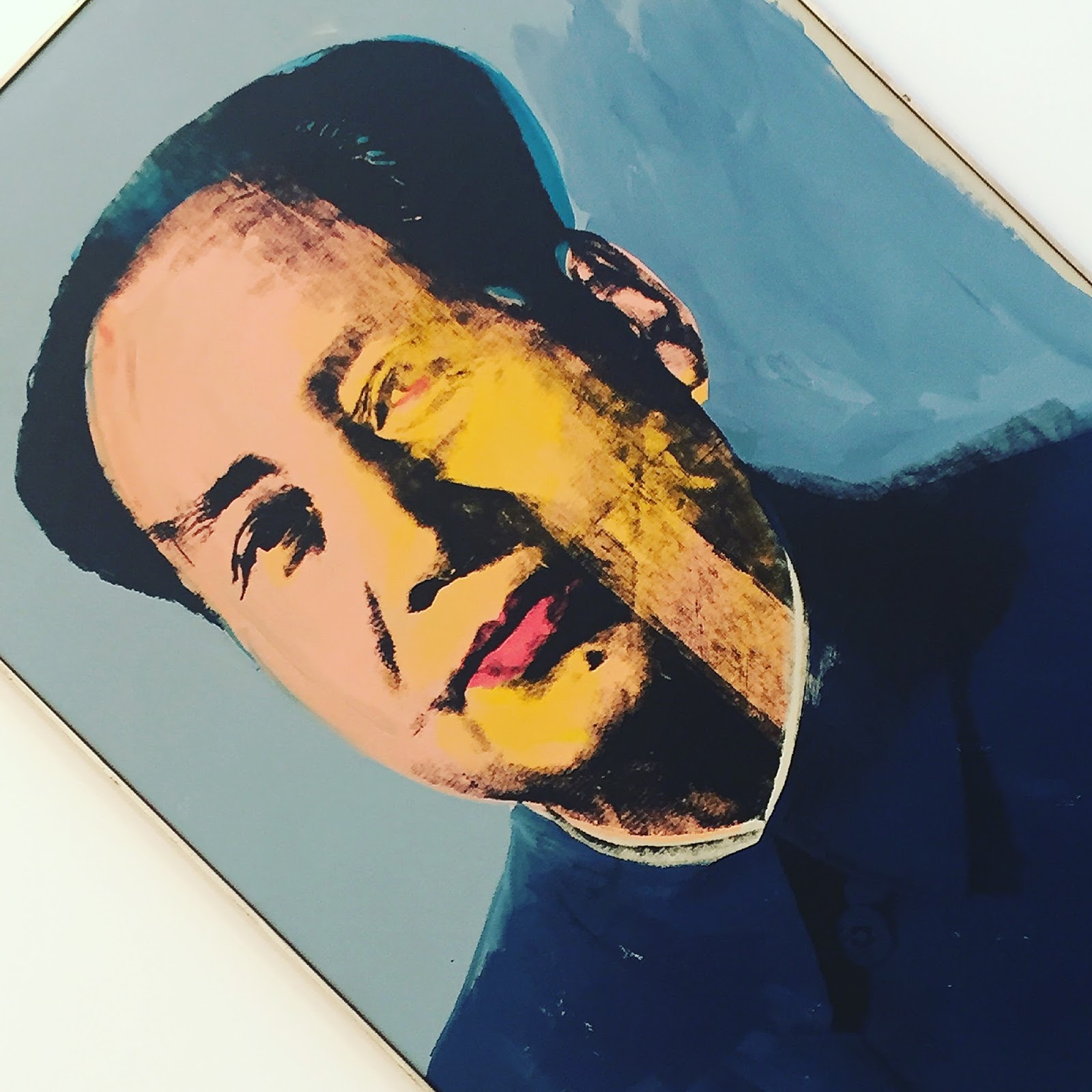
The photo above also shows how powerful Warhol's portraits are and they stole the show for me. However, I was less impressed with some of his more abstract works, like Red Skull.

My favourite Warhol portrait was of Liza Minnelli but for some reason it was one of the few works in the exhibition that we were not allowed to photograph. What makes that doubly odd is that it is easy enough to find copies on official sites on the internet, such as the Sunday Times.

With Liza out of bounds I have chosen Mao to represent the portraits. I would like to have it in my house but it was not for sale and would have cost more than my house if it was. Mao was behind me when I took the picture of the room.

The only slightly annoying thing about the visit was that the pictures were not labelled on the walls and so I had to carry the two page laminated guide around with me. That was fine on my first two passes through the rooms when I was just looking at the pictures but was something of a hindrance on my third pass when I took the photos. I could have gone back to reception to return the guide but that would have meant going through the gallery door twice more and I would have felt awkward having it opened for me again.

The big positive for me in the exhibition was the number of Warhol portraits. I had seen several of them before in places like Tate Modern and the Rijksmuseum but never as many in one place. I also liked the way that Gagosian presented them with some in groups and then others, like Liza and Mao, on their own.

Avedon Warhol is on until the end of April so I shall be going back there for a refresher before it closes. That is what lunch breaks are for.

29 January 2016

Streets Ahead: The future of London's Roads at the Building Centre

Having escaped the office because of technical problems there I had an afternoon to fill and so one of the places that I went to was the Building Centre just off Goodge Street.

It somewhere that I go to fairly regularly, like RIBA, because it is easy to walk to at lunchtime and there is always much to see there. There were three exhibitions on at that time and I could have spent hours looking at all of them but I only had time to look at Streets Ahead, which had only just opened.

As with other things I had seen there, the exhibition was comprehensive, detailed, well structured and made good use of graphics and photographs. Because of that I learned a lot in a little time.

What I learned was a mix of good news and bad news. Very little progress had been made on improving London's streets for pedestrians and cyclists in recent years, despite the obvious success of Ken Livingstone's plan to create a walkway along the south bank that connects Trafalgar Square to St Pauls, but some small trial schemes were starting to show what could be done and there were examples in the rest of the world that London could learn from.

One thing that I would dearly love to see is some of Central London's main roads either buried out of site or just closed to cars altogether. An obvious place to do this would be on the north bank between Westminster Bridge and Blackfriars Bridge where a dual carriageway create a physical and emotional barrier between the city and the river.

The exhibition showed how Boston and Madrid had both managed to remove cars and to replace large roads with linear parks. This is the sort of city that I want to live and work in.


The river featured again on another of my favourite topic boards, on bridges. Looking at a map shows that there are quite a few bridges over the Thames but these are clustered with significant gaps between some of them, some are rail bridges so cannot be used by pedestrians and some of the road bridges are either quite narrow for pedestrians or are unpleasant to use because of the proximity to traffic.

It is no coincidence that the wonderful route from Trafalgar Square to St Pauls that I mentioned earlier has two new pedestrian bridges, the vastly extended Hungerford Bridge at one end and the iconic Millennium Bridge at the other.

We need more bridges like that and there are several good suggestions for them. One idea is to connect Rotherhithe with the Isle of Dogs, two peninsulas that are isolated by the river that almost surrounds them.

We do not need the Garden Bridge, however. It connects nowhere to nowhere, would be closed at night and for private functions, is not much of a garden and would interrupt the existing views from places like Waterloo Bridge.


There is scope to make London a much nicer place to be but it takes the imagination and leadership of somebody like Ken Livingstone to deliver it. All that Boris has given us is the fantasy cable car and the threat of the unnecessary and unwanted Garden Bridge.

I think that London needs to be a much nicer place too as it is dragging behind other major cities in creating nice spaces and pleasant routes between them.

A Taste of Honeysett at the Cartoon Museum

I was aware of the A Taste of Honeysett exhibition at the Cartoon Museum and was trying to find the time to see it when technology came to my rescue.

I was working in the London office on a Friday afternoon when we suddenly lost all communications, telephone and computer network. After half an hour or so it became clear that they were not coming back and so there was no point staying in the office unable to work. So I went out.

The Cartoon Museum is about twenty minutes walk away and so this was the ideal opportunity to go there.

I had been a Honeysett fan for many years. As a young lad I used to read all the cartoons in Punch and it was the Honeysett ones that made the biggest impact, I can still remember the double page spread on doctors holding their surgeries in pubs which included a drawing of a doctor lying on the floor and the nurse informing the waiting room that he was now only seeing foot disorders. Similarly there was one with two old men in a pub talking about a third who was lying on the floor unconscious. This was before a drinking competition and one of the men said to the other that he was surprised that the third man had collapsed so quickly as he had done well in the lunchtime practise session.

Admission is normally a paltry £7 but I got in for free with my ArtFund card. The Honeysett exhibition was on the ground floor with the usual exhibition upstairs.


The Cartoon Museum has an enlightened view of photography and bans close-ups as they infringe copyright but allows general shots, like this one, that give a general view of the galleries. From this you can see that it was, unsurprisingly, full of cartoons.

It was not a large rooms but the addition of a few partitions created more wall space and there were a lot of cartoons to look at. Of course cartoons cannot just be looked at, they need to be read and I read every one of them which took me the best part of an hour.

Like the cartoons that I remembered from Punch they were mostly of domestic situations, the one at the top (this is the cover of the exhibition catalogue) was typical, though politics did sneak in sometimes. There was one political cartoon that I would have photographed if allowed and that was a large coloured work commenting on the way that free capital was ripping up the Japanese landscape to build inappropriate skyscrapers. Where Japan led London is following.

The Cartoon Museum is a lovely place for anybody interested in comics or cartoons and I really should go there more often. I'll make even more of an effort to do so when they put on exhibitions as good as A Taste of Honeysett.

Thomas Newbolt: Drama Painting - A Modern Baroque at Kings Place Gallery

Working in a building that houses two galleries is one of the reasons that I pull myself into Kings Place when I could just as easily work at home. They are both conveniently bite-sized and can be consumed as part of a lunch break or an afternoon tea break. They also provide emergency relief when work is going badly.

The main gallery, which now appears to be called Piano Nobile Kings Place, is mostly spread across the level below the entrance and cafe area. There is little on that floor other than the gallery and a large hole in the middle which is the atrium space for the concert hall level below. The gallery flows down to that level to occupy a corner of that space too.

The combination of the atrium and the high ceilings creates a space that can do justice to large works and the exhibitions generally take advantage of this.

The exhibitions also tend to be somewhat quirky and modern in a way that appeals to me greatly.


The latest exhibition is Thomas Newbolt: Drama Painting – A Modern Baroque, which runs until 13 May.

They are all pictures of women, or perhaps it is just one woman, dressed and posed as if going to the opera.

They are interpretive rather than figurative and it is the presence of the woman that matters, not the details of her figure. The focus is kept on the woman by keeping the background dark and featureless.

The simple backgrounds, the plain dresses and the lack of any movement make the pictures as much about the colours as the woman. As is often the case, I appreciated the abstract nature of the art, i.e. the way the colours interact and the visual impact that makes, as much, if not more, that what those colours represent.

Similarly, I appreciated them more from a distance where their scale could be appreciated and full impact of the colours could be felt. Moving closer and the details started to intrude until eventually it was the brush strokes that I saw and the "big picture" was lost. Of course for some works of art the details and the brush work are worth exploring but I felt much happier exploring Thomas Newbolt's at a distance.

This exhibition was not completely to my taste but it was close enough to it to encourage me to go downstairs to see it a few more times before it closes.

23 January 2016

The White Cube in Bermondsey disappoints

In looking to see how to get to the Fashion and Textile Museum I discovered that it was in the same street (Bermondsey Street), and was very close to, the White Cube gallery and so it made sense when planning the day to allow time to go to both.

I had heard of the White Cube but had never been there before, though I had been to its smaller cousin in Mason's Yard, St James and had been impressed by that so was looking forward to going to see the larger original. I was made even keener when the Art Fund app told me that it was the biggest commercial arts space in Europe which conjured visions of something even bigger and even better than the Saatchi Gallery, which I love.


Checking the gallery's website on the morning I learned that it was the last day of the Gilbert and George The Banners exhibition, which I had heard them talking about a few weeks previously on the magnificent podcast of the Robert Elms show on BBC Radio London.

I am not a massive fan of Gilbert and George's work but then I had only seen the odd example of it, such as one work at the Tate Modern and another in Cologne. Still, it was a good enough reason to go to the gallery.

The Banners were displayed in the White Cube itself, a gallery measuring 9m by 9m by 9m and called, imaginatively, 9x9x9. They were simple slogans written on what looked something like street signs with "Gilbert and George say:" at the top rather than the Borough name.

The slogans were first written in pencil and then gone over with ink. There were ten different slogans and several posters with the same slogan but all painted individually and so all original. I have no idea what they were selling for but signed prints were £10 each, though you can pay £50 for one on eBay if you are a mug.

I must admit that I could not see the point and The Banners did nothing for me.


There were two other gallery spaces, both of which were quite large and had interior partial walls to make for even more hanging space, unlike Saatchi which uses just the main walls. I prefer the Saatchi approach as the sense of the large open spaces is part of my enjoyment of the experience.

I prefer the art that I have sen at the Saatchi too. There were a couple of pieces that I quite liked, and some that I liked a lot, but not enough of them to make me think that I need to get back to the White Cube any time soon, though I will pop-in next time I am in the area, it is free to go in after all.

Liberty in Fashion exhibition at the Fashion and Textile Museum


I had not heard of the Fashion and Textile Museum before, otherwise I might well have paid it a visit, and once again I had the Art Fund iOS app for alerting me to it. It remains my main source of information about exhibitions that are on and this time it told me about Liberty in Fashion. Anybody who knows me remotely well will know that is an exhibition that I wanted to see.

National Rail had other ideas and closed the main line from Richmond at Clapham Junction and so another popular app of mine, CityMapper, advised me to take the District Line to Monument and walk from there. So I did.

That walk took me over London Bridge, through the redeveloped area around More London and then under the grimy railway arches in upper Bermondsey. The area got markedly better as I moved south along Bermondsey Street with some trendy cafes and craft shops appearing.

I was expecting the museum to be easy to find as my limited research (on the day) told me that it was a bright orange building in the Morocco style but it played a trick on me. The building is set back slightly from the usual building line thus hiding the orange frontage. What I could see from some distance was the pink entrance but I was not expecting that so it was a nice surprise to suddenly find myself there.

A lesser surprise was to find a cafe there, it is just to the right of picture, which is where I had a late lunch of a vegetarian quiche and two salads from a choice of four. It was a tasty treat and I hope that it was not responsible for the severe tummy troubles the next day.
The Art Fund helped again when I bought my ticket, giving me a 50% discount, so I paid just £4.50.


The museum is an unusual space and the exhibition was strung along several rooms on two floors. The layout of the rooms meant that it was hard to see the full extend of the exhibition (perhaps I should have accepted one of the guides!) and that added to the delight as each new display was a surprise.

The exhibition was a broadly chronological display concentrating on the fashion themes of each period and the main creators working with them for Liberty at that time. It was like walking through the Liberty shop as it moved through history, a pleasure doubled.

The final room, at least on the route that I took through the exhibition, was the study room that had displays of the original fabrics rather than clothes made from them. It was in that room that I took the pictures of the Bauhaus curtains above and the fabric samples below.

My parents had Bauhaus curtains in the front room when I was a teenager though that was in a less brash colour-way with more brown and less yellow. I have a tie that matches it.

The clothes on display in the rest of the rooms and corridors were mostly top-end fashion items, which is understandable as even the basic Liberty items, like shirts and ties, are not the clothes of everyday wear for most people. As a long-time Liberty wearer I sometimes forget that.

Obviously a lot of the clothes looked painfully dated, just because of their age, but that was always down to the cut and not to the fabric. So while this dress very much is of its time it is still easy to appreciate the way that touches of Ianthe have been woven into it and how well the jacket compliments it.

There were dozens of outfits to look at lovingly,  mostly dresses with a few jackets for me. There were a couple of outfits that I would have loved to have, and would have worn today despite their age. I particularly liked one with a Nehru collar, I had looked for something like that in India but had failed to find anything close. Luckily enough I am quite happy with my generous collection of Liberty shirts and ties.


When I bought my ticket I asked the friendly woman on the desk how long it would take to get around the exhibition and she advised that it would take about half an hour. On my way out a full hour later I was able to tell her how much I had loved it.