Showing posts with label design. Show all posts

11 March 2017

Josef Frank Patterns Furniture Painting at Fashion and Textile Museum


It was not much of a loose end but I had a few hours to fill between theatre appointments in Shoreditch and so I made another visit to the Fashion and Textile Museum (FTM) in Bermondsey, a short hop on the Northern Line from Old Street to London Bridge with a refreshing walk at either end.

Any visit to a museum starts or ends with a coffee and some cake. This time it started that way.

All I knew about Josef Frank beforehand was what FTM had shown me in their regular emails which was enough to tempt me to the exhibition but did little to inform me about the man or his works so I went in with some expectations and a lot of curiosity.

I soon earned that Josef Frank was Austrian by birth but moved to Sweden in middle-age to escape anti-Jewish persecution where is work in architecture extended to other forms of design.

Those expectations were quickly met too with large displays of fabrics in the style of the poster. The scale of the patterns with their large repeats and their lack of symmetry made them quite different from the floral patterns that I was familiar with from the likes of William Morris and Liberty. Somewhere along the line I remembered that I had some Ikea chairs with a pattern not unlike these, perhaps it a Scandinavian style.

Upstairs was something of a surprise as it was mostly paintings. Frank liked painting but was not terribly good at it, his cars looked very amateurish and his sense of perspective was unusual. That said, he often painted interesting scenes and their natural beauty and interest survived his artistic interpretation.


The paintings and other displays were interesting but it was the fabrics and furnishings that made the show special for me and there were lots of them to enjoy even in the relatively small space that is the FTM. I had to walk past them all again as I came back downstairs to leave and I enjoyed seeing them the second time almost as much as I had the first. It was a slow and pleasant exit.

The FTM is a remarkable place simply because it continually does exhibitions as stimulating this one.

06 May 2016

Missoni Art Colour exhibition at the Fashion and Textile Museum

My sister was staying with me in London for a couple of days and I suggested a few things that we might fill the days with and while she was not so keen on going to the theatre she was interested in the Missoni exhibition at the Fashion and Textile Museum because she had not been there before and had three Missoni scarves.

Getting there was fairly straightforward but slowish; a bus to Richmond passing through some road works, a bit of a wait for a train to Waterloo, a trek across the station to the Jubilee Line to get to London Bridge and a final walk under railway lines in Bermondsey to get to the museum.

After that minor ordeal we started off in the cafe where I had a fruit juice called something like a Zesty Zandra and a toasted goat's cheese sandwich. All very nice if a little pricey at the best part of £10. It did the job and I was refreshed and ready for the exhibition.

My Art Card gave me a 50% discount for the exhibition so I only paid £4.50 to get in. That was good value however you look at it and even better when compared to the lunch.

I do not own any Missoni scarves so I went in with few preconceptions, the only clue I had on what to expect was the poster above with its bars of different colours. I had seen similar samples at the Sonia Delaunay exhibition at Tate Modern and I had been intrigued, and impressed, by the careful planning of colours and how they work together.

It came as a surprise that the exhibition began with some pictures, i.e. proper art. They were there to explain the context of the Missoni work in fashion by showing how similar themes were being explored in mainstream art. This started in the '50s when abstract art with its reliance on shape and colour was becoming more prominent, though it had started a few decades earlier. One reason that fashion had lagged behind painting was that fashion is generally more conservative and another is that, as one of the videos explained, the technology was simply not there. In Missoni's early days machines could only weave stripes and the more complex ideas appearing in art could simply not be copied.


The extent to which this was experimental was shown by the many sheets of paper where colours and patterns were carefully tested.

I had seen similar experimental work by artists at other exhibitions and I love the way that they show the artist's working out of things such as which colours go well with others. Here as well as a multitude of colours there were simple patterns and next to them more complex ones where the straight lines of triangles had been bent into experimental curves.

The importance of this design phase in the work is shown by the exhibitions logo (at the top) which consisted of coloured lines and made no reference to the fabric made using them.

These geometric designs featured throughout the exhibition and were most notable in the collection of wall hangings in the main room.

A small section of one of these is shown below. It is an almost ridiculous collection of lines and colours that combine to make something striking. This was a very large piece overall and looked as though it belonged on the stairway of a grand mansion. It certainly needed somewhere the size of the main room to contain it, let alone to show it off fairly.


The main element in the main room was a collection of mannequins (below). This was a clever display but it took me most of the afternoon to work out how clever. It is not that obvious from this angle (that is my excuse) but the mannequins were dressed in stripes of colours that ran diagonally from bottom-left to top-right. The orange mannequins are the best clue and the stripe in front of them is green. These stripes were obvious, once spotted, from the right angle on the ground floor.

It also took me a while to work out that the lighting that I complained about was part of the effect and different elements of the display were lit in a cycle as a clock ticked somewhere in the background. Once I realised this all I had to do was wait for the phase when all the lights were on to take my picture.


What did surprise me was how timid most of the colours were and because of that how subdued most of the garments were. It took some close inspection to identify some outfits that looked sensible in today's eyes. One of these was the checked coat worn by the mannequin with the blue hat at the top-right of the collection.

There were other rooms and other things to see. There were some videos running on continuous loops, some carpets that looked rather like ones that I grew up with and more paintings by contemporary artists. It was not a vast exhibition, he Fashion and Textile Museum is not a big place, but there was plenty to see and much of it warranted spending some time looking at, particularly in the detail of the patterns and the colours used.


I return to another sample sheet for my final image. These samples are in fabric rather than paint and the patterns are more complex which shows how much the ideas and technology evolved. I could find somewhere in my house for this particular display even though it is just a collection of samples as the combination of shapes and colours is arresting. I returned to this display several times.

While I have never been that interested in fashion (as my wardrobe testifies) a well curated exhibition will always interest me, much as In our Time does whatever Melvyn Bragg is discussing, and I found plenty to stimulate and entertain me in Missoni Art Colour.

29 January 2016

Streets Ahead: The future of London's Roads at the Building Centre

Having escaped the office because of technical problems there I had an afternoon to fill and so one of the places that I went to was the Building Centre just off Goodge Street.

It somewhere that I go to fairly regularly, like RIBA, because it is easy to walk to at lunchtime and there is always much to see there. There were three exhibitions on at that time and I could have spent hours looking at all of them but I only had time to look at Streets Ahead, which had only just opened.

As with other things I had seen there, the exhibition was comprehensive, detailed, well structured and made good use of graphics and photographs. Because of that I learned a lot in a little time.

What I learned was a mix of good news and bad news. Very little progress had been made on improving London's streets for pedestrians and cyclists in recent years, despite the obvious success of Ken Livingstone's plan to create a walkway along the south bank that connects Trafalgar Square to St Pauls, but some small trial schemes were starting to show what could be done and there were examples in the rest of the world that London could learn from.

One thing that I would dearly love to see is some of Central London's main roads either buried out of site or just closed to cars altogether. An obvious place to do this would be on the north bank between Westminster Bridge and Blackfriars Bridge where a dual carriageway create a physical and emotional barrier between the city and the river.

The exhibition showed how Boston and Madrid had both managed to remove cars and to replace large roads with linear parks. This is the sort of city that I want to live and work in.


The river featured again on another of my favourite topic boards, on bridges. Looking at a map shows that there are quite a few bridges over the Thames but these are clustered with significant gaps between some of them, some are rail bridges so cannot be used by pedestrians and some of the road bridges are either quite narrow for pedestrians or are unpleasant to use because of the proximity to traffic.

It is no coincidence that the wonderful route from Trafalgar Square to St Pauls that I mentioned earlier has two new pedestrian bridges, the vastly extended Hungerford Bridge at one end and the iconic Millennium Bridge at the other.

We need more bridges like that and there are several good suggestions for them. One idea is to connect Rotherhithe with the Isle of Dogs, two peninsulas that are isolated by the river that almost surrounds them.

We do not need the Garden Bridge, however. It connects nowhere to nowhere, would be closed at night and for private functions, is not much of a garden and would interrupt the existing views from places like Waterloo Bridge.


There is scope to make London a much nicer place to be but it takes the imagination and leadership of somebody like Ken Livingstone to deliver it. All that Boris has given us is the fantasy cable car and the threat of the unnecessary and unwanted Garden Bridge.

I think that London needs to be a much nicer place too as it is dragging behind other major cities in creating nice spaces and pleasant routes between them.

23 January 2016

Liberty in Fashion exhibition at the Fashion and Textile Museum


I had not heard of the Fashion and Textile Museum before, otherwise I might well have paid it a visit, and once again I had the Art Fund iOS app for alerting me to it. It remains my main source of information about exhibitions that are on and this time it told me about Liberty in Fashion. Anybody who knows me remotely well will know that is an exhibition that I wanted to see.

National Rail had other ideas and closed the main line from Richmond at Clapham Junction and so another popular app of mine, CityMapper, advised me to take the District Line to Monument and walk from there. So I did.

That walk took me over London Bridge, through the redeveloped area around More London and then under the grimy railway arches in upper Bermondsey. The area got markedly better as I moved south along Bermondsey Street with some trendy cafes and craft shops appearing.

I was expecting the museum to be easy to find as my limited research (on the day) told me that it was a bright orange building in the Morocco style but it played a trick on me. The building is set back slightly from the usual building line thus hiding the orange frontage. What I could see from some distance was the pink entrance but I was not expecting that so it was a nice surprise to suddenly find myself there.

A lesser surprise was to find a cafe there, it is just to the right of picture, which is where I had a late lunch of a vegetarian quiche and two salads from a choice of four. It was a tasty treat and I hope that it was not responsible for the severe tummy troubles the next day.

The Art Fund helped again when I bought my ticket, giving me a 50% discount, so I paid just £4.50.


The museum is an unusual space and the exhibition was strung along several rooms on two floors. The layout of the rooms meant that it was hard to see the full extend of the exhibition (perhaps I should have accepted one of the guides!) and that added to the delight as each new display was a surprise.

The exhibition was a broadly chronological display concentrating on the fashion themes of each period and the main creators working with them for Liberty at that time. It was like walking through the Liberty shop as it moved through history, a pleasure doubled.

The final room, at least on the route that I took through the exhibition, was the study room that had displays of the original fabrics rather than clothes made from them. It was in that room that I took the pictures of the Bauhaus curtains above and the fabric samples below.

My parents had Bauhaus curtains in the front room when I was a teenager though that was in a less brash colour-way with more brown and less yellow. I have a tie that matches it.

The clothes on display in the rest of the rooms and corridors were mostly top-end fashion items, which is understandable as even the basic Liberty items, like shirts and ties, are not the clothes of everyday wear for most people. As a long-time Liberty wearer I sometimes forget that.

Obviously a lot of the clothes looked painfully dated, just because of their age, but that was always down to the cut and not to the fabric. So while this dress very much is of its time it is still easy to appreciate the way that touches of Ianthe have been woven into it and how well the jacket compliments it.

There were dozens of outfits to look at lovingly,  mostly dresses with a few jackets for me. There were a couple of outfits that I would have loved to have, and would have worn today despite their age. I particularly liked one with a Nehru collar, I had looked for something like that in India but had failed to find anything close. Luckily enough I am quite happy with my generous collection of Liberty shirts and ties.


When I bought my ticket I asked the friendly woman on the desk how long it would take to get around the exhibition and she advised that it would take about half an hour. On my way out a full hour later I was able to tell her how much I had loved it.

24 January 2014

Paul Smith and more at the Design Museum

The Design Museum in its current location, somewhat to the east of Tower Bridge, is a little off any of my normal routes so I have only been there when I have had another cause to be in that area, i.e. a theatre.

This time it worked well as the show that I was going to see was not enough to get me to go to that part of London by itself but when combined with the museum the two made a good bill.

The main show at the Design Museum was Hello. My name is Paul Smith. I was only mildly interested in this as a topic but I had faith in the museum to make a silk purse from a sow's ear, if necessary, so it seemed a reasonable thing to go and see.

My expectation was rows of men's suits which just goes to show how little I knew of Paul Smith or his work beforehand.

The exhibition was as much about Paul Smith's life and working methods as it was the actual works.

Part of this was a mock-up of his main office in Covent Garden which looks like a burgled garage but which is actually a collection of colours and shapes that are used to inspire.

That approach to design, taking inspiration from anywhere, meant that there was not a uniform style to his works but there were some themes, such as stripes. These appeared on clothing, either as the main theme or as little flashes, and also on a range of other items, including an original Mini.

What surprised me was the range of things that Paul Smith put his name to and clothing was a small part of the exhibition. There were lots of things to do with cycles, shoes, pottery and even a Dunny.

There was also a feature on his shops around the world. He has taken the exact opposite approach to that of Apple etc. and every shop is deliberately very different.


There was some clothing, of course, and while I liked some of it there was more that I did not see the point of and there was nothing that I could identify as a Paul Smith style or meme.

One of the more interesting rooms was a large room full of prints, pictures and photographs from Paul Smith's private collection.

As elsewhere in the exhibition, these said more about the man than his work and given my views on his work it is probably not surprising that I found this room one of the more interesting.

Here there were some repeating themes among the chaos, such as the several photographs and drawings of airplanes.

The Paul Smith exhibition occupied the first floor of the Design Museum which is a reasonable but not large space. It took me about an hour to get around and that included a couple of stops to watch videos, I especially liked the one on the show during Paris Fashion Week in 2013 though that did nothing to convince me that bright pink trousers are a good idea.

With some time to spare I headed up to the second floor and the exhibition on Extraordinary Stories about Ordinary Things which used objects from the museum's collection to tell the stories of familiar objects like the anglepoise lamp, road and rail signs and plastic chairs.


There was much to enjoy here with dollops of good design mixed in with interesting stories and a dollop of nostalgia.

I loved the Imperial Airways map for its historical view of the British Empire and, in particular, for the detailed route map across Africa where Dad flew in the 1950's.

Closer to home there was a display on the early days of modernism in London which featured the Finsbury Health Centre (Lubetkin, 1938) and Highpoint in Highgate (Lubetkin, 1935).

Included in the display was furniture and other items from one of the flats as it was originally. Lovely stuff.

Also in this exhibition were other icons such as a Sinclair C5, a telephone box, an Apple iMAC G3. These were all good things to linger over.

The final exhibition, also on the second floor, was In the Making which, as its name suggested, showed the making of a diverse range of objects including a tennis ball, a coloured glass marble, a London Olympic torch, a cricket bat an a £2 coin.

There was a short film showing the part of the manufacturing process for each and there were eight showing at once so it was easy to watch the more interesting ones and skip the rest, but I think that I watched all of them at least once.

In the display section was an example of each of the objects as they were during that stage of the manufacturing process shown in the film. For example, there was a column of glass with coloured paint in where a marble had been formed at one end and was almost ready for separation.

This was a small but engaging exhibition and between them the three exhibitions kept me in the Design Museum until the staff started to ask people to leave as it was closing time. I could ask for no more.

19 May 2013

David Bowie is ... in the best selling show ...

... and it's easy to see why.

Bowie has been a prominent figure in British cultural life for over forty years and the V&A has pulled all the stops out in collecting and curating material relating to his life in music and on stage.

I bought my tickets months ago and even then I had to settle for a 10am slot on a Sunday morning.

TfL did not help by cancelling trains west of Earls Court that day and I had to risk the rail replacement bus service. I was relieved to get to the V&A only a few minutes late for my timed slot.

The V&A seemed to have learnt some lessons from the also-sold-out Hollywood Costumes exhibition which was, at times, too packed to enjoy easily. Perhaps being in the first slot of the day helped.

Another change was the technology. This time we all got clever audio guides that did not have the usual numbers to call up the voice, it used proximity instead so you only had to walk up to one of the exhibits and the headset automatically spoke or sang to you. This was a little spooky at times and I found myself looking around for the video that was lip-synced to what I was listening too.


Costumes featured heavily and there were outfits on display from many of the album covers and major tours. No prizes for spotting the Pin-Ups suit here.

I found myself strangely entranced by the costumes, when I had not expected to. I especially liked the Alexander McQueen frock-coats from the Earthling album and tour. And that hints at one of the exhibition's strengths, it drew on the full range of Bowie's career and did not play safe and just draw on the big periods like Ziggy. There was even some Tin Machine stuff in there.


Other things on display included song lyrics, album covers, stage designs and interviews, such as one with a hopeless Russell Harty who referred to the new single as "Golden Tears" before asking Bowie to introduce it himself.

Of course there were lots of video clips too and I caught more than one person singing out loud. A highlight was the final large room (above) which had several large screens and lots of seats too. There I watched a number of songs from live performances and at one point there were two versions of Heroes playing and which one you heard depended on where you were in the room. It was magic and I'd probably still be in there if it was allowed.

The V&A are seriously good at curation and when they combine those skills with a popular subject then they know that they have got another big hit on their hands. I absolutely loved it and I think that all the people grabbing the merchandise in the shop on the way out did too.

05 February 2012

Terence Conran at the Design Museum

The Design Museum had been on my list of places to go to for a while but its slightly out of the way location (it's to the East of Tower Bridge on the south bank of the Thames) had kept me away.

Then an evening at the theatre gave me an afternoon in London and the opportunity to explore a part of the city that I had only been to fleetingly before.

The current exhibition, Terence Conran: The Way we Live Now, was of interest because the Conran name is well known in the design world, especially for Habitat, and in my younger richer days I had bought some furniture from his flagship store in the Fulham Road, Chelsea.

Conran hit my consciousness in the 70s, that is when I bough a large black ash desk from Habitat, but he started work long before that (he worked on the Festival of Britain in 1951) and this is reflected in the exhibition where some of the work looks interesting but seriously dated.

The 50s feel to the furniture and fabrics is unmistakable yet the nearest pattern also has a touch of the modern about it.

The furniture is just horrible but must have seemed revolutionary at the time when most houses had little furniture in them other than the basic table and chairs. Wall units were new once!

In telling the story of Conran's life, the exhibition reveals much about his approach and philosophy.

My main learning here was regarding his interest, background and skill in the manufacturing side of the process, as summarised in this quote.

One of the exhibits was a large chest of immaculate woodwork tools and there were several photographs of the furniture factory that was Conran's first major enterprise.

It was interesting to see that some of this was flat-packed which must also have seemed revolutionary once.

Habitat features heavily in the exhibition and has a large area dedicated to this period. Some of the more eye-catching displays include a selection of Habitat mail order catalogues (I remember getting those) and a pile of bright red tea-pots.

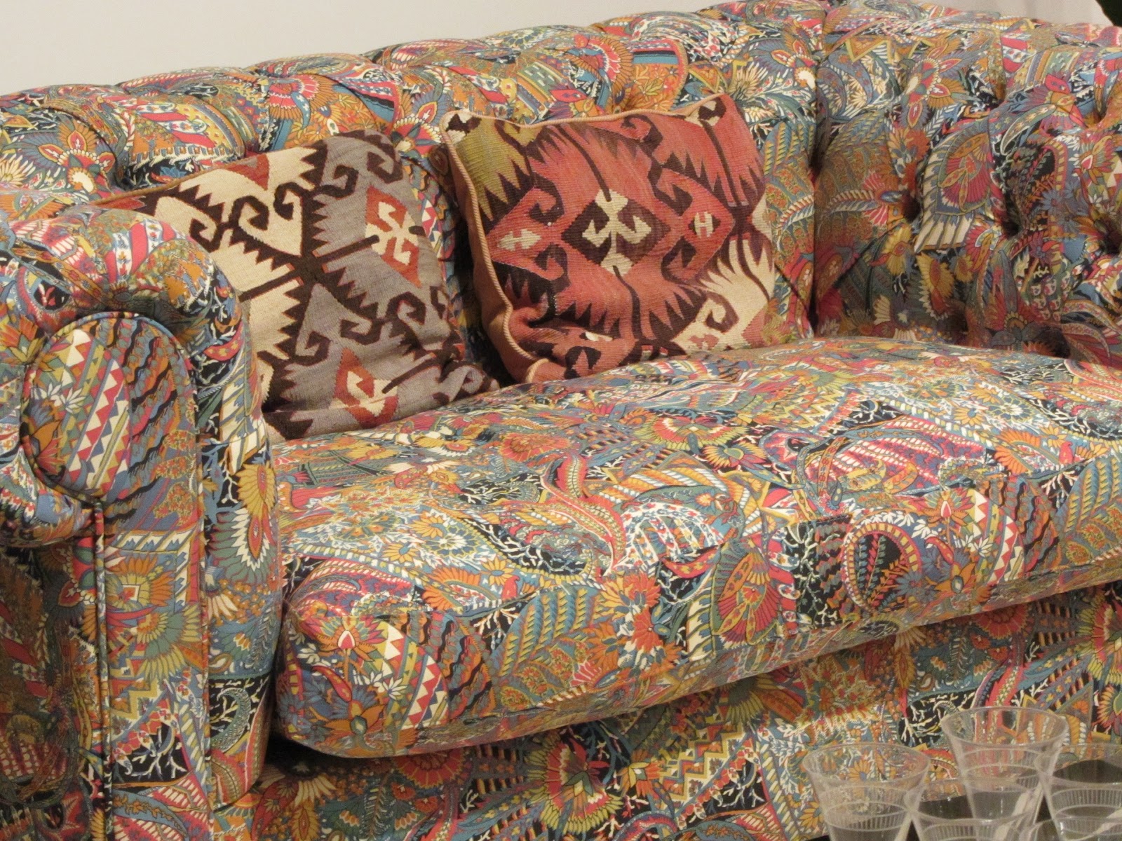
And this sofa.


I used to own a sofa something a little like this but not as impressive. The Bauhaus influence is strong, and there is absolutely nothing wrong with that.

The other fabrics in the Habitat room were nice too.

Again the Bauhaus style can be seen in some of the geometric shapes and some of the other motifs look familiar too.

To be fair, I am not sure if that is because I remember them from the time, they copy designs that I know or other designs that I know copied them.

The chicken and egg problem is a real one in design and it is often impossible to be certain where a particular idea started. Who wore the first stripped, hooped or flowery outfit?

There is some real furniture as well as pictures and this chair is simple and very attractive.

Unfortunately it is an exhibit so sitting on it is not allowed but it looks comfortable though it may take some getting used to something as low down as this.

It might also be hard to get in to and out of, much like a sports car that is only a foot off the ground.

More practical are the wide arms while the Mackintoshesque cuts in the back make it beautiful too.

I knew that Conran had been involved in restaurants though I have never been to one and do not expect to either.

What I did not know is how many restaurants he had been involved in or the extend to which the design extended, e.g. it included all of the crockery and glassware as well as the furnishings and furniture.

There is a simple but effective cameo of each restaurant which has a place setting, a dining chair and a photograph of the interior.

I found this to be a neat way to present all of the designs and, as a result, I spent more time than I expected looking at forks.

The Conran exhibition was an informative and rewarding experience and was a fair reward for the walk from Tower Bridge to get there.

I may well head back there for another exhibition before too long but in future years this will become easier as the Design Museum is moving to the former Commonwealth Institute building on Kensington High Street.

That's just a tube ride away from me and it's close to the V&A too. That makes it a good move.

10 December 2011

William Morris at Two Temple Place

The temptation to go to the William Morris Gallery has been there for some years but it is in a part of London, Walthamstow, which my version of the A-Z leaves blank apart from the warning "here be dragons".

Actually, if I believed the dragons story I would have gone but I take it as a metaphorical warning rather than a literal one and that is still good enough to keep me away.

Deprived of the primary source of matters William Morris I have had to settle for the Arts and Crafts section at the V&A and the fabrics department at Liberty.

Then a stroke of luck.


The William Morris Gallery is closed for a while for refurbishment and some of the exhibits have been moved to Two Temple Place. As the name suggests, this is next to Temple station (District Line) in central London on the north bank of the Thames and so is easy to get to. And so I got to it.

Two Temple Place is a late Victorian mansion built by William Waldorf Astor and while its ownership and role has changed a few times over the years the original grand designs are still very apparent.

The Gothic revival is clearly at play on the outside. Inside the theme continues with lashings of wood lining the walls and decorating the rooms.

This is also redolent of Liberty which has its own beautiful staircases.

The house has two large rooms along the riverside of the house and these make ideal galleries. Also helpful is the way that the other rooms link so that you can walk from one to the other without having to repeatedly return to the hall or landing.

The inaugural exhibition at the recently revived building is William Morris: Story, Memory, Myth and is on until 29 January 2012.

This showed several sides of William Morris' work that were completely unknown to me having previously associated him almost exclusively with fabrics and wallpapers.

What we see spread through the house are tapestries, ceramics and books as well as the expected designs for furnishings.

The other surprise for me was that a lot of this work was done in collaboration with Edward Burne-Jones who I also love and who also has a notable presence at the V&A.


The title of the exhibition, Story, Memory, Myth, gives a good clue of what is on display. All the images presented to us are from stories and these are usually based on myths.

A stunning example hit you in the first room with the depiction of Love Leading the Pilgrim through the Briars which is taken from the Morris/Burne-Jones tale The Romance of the Rose. Like many of the exhibits, this is large and rich in detail and so a photograph does it little justice. You need to be in the room with it, stand back to comprehend the full scope of the picture (there are more figures in the scene) and stand close to appreciate the detail of the craftsmanship.

The smaller rooms shows us some ceramics and the familiar floral designs. What is nice that many of these are shown as work in progress with, for example, only some of the patterns coloured.

The Great Hall upstairs has some more large tapestries including my absolute favourite, Pomona, the goddess of fruits and harvests.

A google search reveals that this is a figure that Morris/Burne-Jones interpreted more than once. The figure (Burne-Jones) is the same but the background (Morris) varies significantly.

Also in the Great Hall were some illistrated books. Not only was Morris responsible for the typography and illustrations but he did the words too.

One of the books of poetry was in its fifth edition so they must have been popular at the time.

Another, The Volsunga Saga, a translation by Morris of a 13th century Icelandic epic poem could yet find its way on to my Christmas list (I'd like the copy on display but an ebook is more practicable).

William Morris: Story, Memory, Myth is a sumptuous exhibition that surprises and delights in equal measure.

28 January 2009

Great fabrics at MoDA

When buying some shorts in Liberty recently I was reminded of the unexpected discovery that I made of the Museum of Domestic Design & Architecture (MoDA) on what was meant to be a trip looking at art deco railway stations.

MoDA is somewhere near the top of the Piccadilly Line (I needed a guide to find the place) so is not the easiest place for me to get to, but it is worth the effort.

The museum building is quite small, as is the main exhibition area, but that is not why you go. The gem at the heart of the museum is collection which includes interesting quirky things like catalogues from plumbers' suppliers.

But what really got me excited was the collection of fabrics and wallpapers, some of which are shown here.

I was trying to find exact matches for some of my Liberty fabrics when I found these and while they are not quite the same they are clearly from the same period and style.

If Liberty did make shirts in these fabrics then I'd buy them.

09 January 2009

The shirt event. I'll repeat that…the shirt event*

When it first opened, Liberty was described by Oscar Wilde, a friend of founder Arthur Liberty, as “the chosen resort of the artistic shopper”.

I agree.

My sadly limited collection of Liberty shirts is not getting any younger and some of them are seriously showing signs of years of wear and adoration.

The worn ones get relegated to very casual wear, then to gardening wear and only when devoid of any colour are they reluctantly put in the fabric recycling bank.

So it was time to make another pilgrimage to Liberty, fortuitously coincident with their Winter Sale.

Liberty menswear department has been ringing the changes in recent years as it has moved out of the Regent Street section and moved away from its Gentleman's Outfitters appearance (which I loved) and has adopted the standard modern shop look with lots of space and not many clothes.

Sadly there has also been a move away from the beautiful swathes of traditional Liberty fabric that used to adorn shirts, ties, pyjamas, underwear, and almost every other form of male clothing.

I have never gone as far as underwear but I do have loads of ties, a rugby shirt (the other one died), some polo shirts and more handkerchiefs than any man has a right to own.

I went to Liberty hoping to find three new shirts but not really expecting to be able to do so.

But Liberty came up trumps and I left joyously with three gorgeous new shirts that shout "Liberty" at you from 50m. That's what I call a successful shopping trip.

*No clues where the title comes from, you really should know.

04 December 2008

Back to the V&A

Events conspired to take me to South Kensington so I jumped at the opportunity to pop in to the Victoria and Albert Museum (V&A), as I always do.

I headed first for the Madejski Garden because I knew that there was a new audio-visual display there. This is Forever and is by Universal Everything.

It was very cold so I was one of the few people who ventured outside to fully appreciate the work. I liked the way that the patterns of light changed, the way that they were reflected in the water and the contrast with the traditional architecture of the garden square.

The music that accompanied the lights was electronic ambient, which is good because I like electronic ambient.

The Madejski Garden is meant to be an oasis of tranquillity in what is typically a bustling museum and it succeeds admirably.

One section that I always visit is the small architecture display. I also used to visit the Frank Lloyd Wright room (which was very hard to find) but this has been mothballed to make room for something else. I hope it comes back one day.

Off the small architecture room is an even smaller room that is used for exhibitions. I was delighted to find that it currently hosts The Olympic Stadium Project - Le Corbusier and Baghdad.

This display examines one of the last projects by Le Corbusier, begun in 1957, his fascinating design for a sports stadium in Baghdad. The stadium was to be part of a larger complex of sports facilities, originally the basis of Baghdad's bid for the 1960 Olympics.

With specially commissioned models and several drawings and sketches, it gives a sense of what this marvellous structure would have looked like had the project come to fruition.

With some free time left I then went on a general explore. At one point I found a room full of musical instruments which I do not recall seeing before and am not sure that I could find again.

At its best the V&A combines the elements of Gormenghast and Hogwarts to bring a sense of grandeur, vastness, magic and mystery. It would be a truly wonderful place even if it was empty.

But it is not empty and it has, amongst many assorted things, a collection of silverware, including this fierce statue.

Silverware is not really my thing but, for me, the V&A gets it just right with a display that is not too large and contains an eclectic mix of items.

It's the unexpected surprises at both the macro level (finding a new room) and the micro level (individual items) that makes such a constant joy for me. I'll be back soon.

23 October 2008

An average Aida at ENO

My only previous visits to the ENO had been to see rarely performed operas (Nixon in China and Satyagraha) but I was tempted to take the family to see Aida at the ENO because it was some months since the Glyndebourne season ended (I went three times this year), even longer since we had all gone to the opera together (The Bartered Bride at ROH in 2005) and I was intrigued by the prospect of Zandra Rhodes’ designs.

In the best tradition of beauty contests, I’ll comment on the various aspects of the production in reverse order.

Easily the worst part of the evening was the audience which was inconsiderate, noisy and rude. Around me people spoke during the performance, frequently unwrapped sweets, clapped during the music, left a mobile phone on and ran for the exit as soon as the performance ended.

It’s hard to image a worse audience at an opera so that gets a score of 0/5.

The theatre itself does little to enhance the evening. It was too warm throughout, there is less legroom than on a budget airline, the seats are uncomfortable and the pitch between the rows is insufficient for the height people are today. (2/5)

The solo singing was mixed at best. We were warned beforehand that several of the cast were suffering from seasonal ailments but if they were not well enough to perform then understudies should have been used or the performance cancelled. Deliberately offering up below par singing is unforgiveable. Some of the soloists seemed uninflected by the dreaded lurgy and the Ethiopian king and the High Priest gave commanding performances. (2/5)

The direction was limited and very formal. For a love story set during a war there was very little emotion on stage. The soloists were stationary for most of the time and usually singing directly to the audience rather than to the objects of their passion. (2/5)

The ensemble scenes were much much better. Whether it was the priests singing at the trial or the triumphal procession after the initial skirmish with Ethiopia, the stage was full of singing and movement.

I am not sure that we needed the acrobats but they did no harm and the scene they were in was the liveliest and helped to kick momentum in to an otherwise fairly flat performance. (4/5)

But easily the best part of the performance was the Zandra Rhodes designs. The sets were fairly simple but brightly decorated with Egyptian symbols in turquoise and orange. The same colours were used in the costumers and in, er, the elephant! I especially liked the Anubis headdresses worn at the celebration and the large Eye of Horus symbol on the prison bars. (5/5)

On balance, the ensemble singing and the designs saved what could have been a poor evening and made it one that was worth going out for (3/5).

However, I already know that I will be going to Glyndebourne several times next year but I am unlikely to be going back to the ENO in a hurry.

24 June 2008

A glorious day in London

I am trying to live up to my mantra that we pay for being in London through our house prices etc. and so we should make the effort to reap the benefits of London that we have paid for.

So last weekend I took the scenic route to the BCSA Garden Party which started, predictably enough, at the V&A. This is always a joy and always offers up unexpected pleasures, mainly because the whole place is such a delightfully confusing mess that you always find yourself somewhere that you are pretty certain was not there the last time that you looked.

This time I caught the new construct in the garden (pictured), buzzed around the architecture section, marvelled at the section on 100 years of structural engineering, and skipped through the section on iron work which was not on my original plan but would have been if I had know that it was there and what was in it.

After that I took a stroll along Exhibition Road that was filled with artefacts and people,but no cars. Being a happy tourist for the day, I took a few photos for the scrap album.

19 June 2008

From Atoms to Patterns


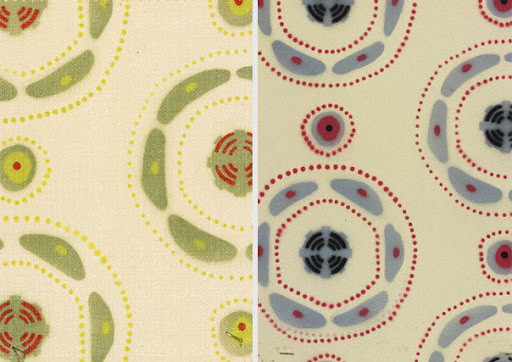
I was in the Wellcome Collection building for a Logica meeting and took the opportunity afterwards to browse the collections there. From Atoms to Patterns looks at the way that designs for the British Exhibition in 1951 were influenced by the latest understanding of molecular structures. The striking patterns shown here are based on haemoglobin.

19 March 2008

Simplicity is a virtue

This shows quite clearly how many of us get the design wrong when we are building new systems :-)


Read more stuff like that here.

18 February 2008

I love the V&A

The V&A is comfortably my favourite museum/gallery/place in London, simply because it to so quirky. I had a bit of time to kill in London recently so I walked down there to have a mooch around. I started with the (small) Architecture section on the third floor up by the entrance, a place I often go, and then just took a few random turns along corridors and stairs to look at whatever lay that way.

For me the great strengths of the V&A are that is has such a diverse, and eclectic, collection and that this collection is spread seemingly randomly throughout was was several buildings that have never quite been convinced that they should behave as a coherent whole. This means that there is a surprise around every corner and lots of corners. You also see a lot of people standing there looking at the map with confused expressions :-)