Showing posts with label dc_comics. Show all posts

06 March 2023

Supergirl: Woman of Tomorrow

I get most of my comics news from Twitter these days and it has been obvious for sometime that Tom King is a very popular writer with critical acclaim and two  Eisner Awards for best writer to prove it. That tempted me to try volume 1 of his Batman ran and also Mr Miracle and while I enjoyed both I had plenty of other things to read and I left my exploration of his works.

Then a mate in the pub recommended The Sheriff of Baghdad set during the allied occupation of Iran, which Tom King was a part of. That was excellent. It mixed geopolitics, action and characterisation neatly and, being based on a real-world situation, was unlike most things I read. I was ready to explore more Tom King.

My next adventure was Strange Adventures Volume 5, a title dating back to 1950 and a home for Adam Strange a space adventurer who first appeared in 1958). That shared some of the themes of The Sheriff of Baghdad, this time the sheriff was Mr Terrific who is hyper intelligent and knows everything, and was also excellent.

That led me inexorably to Supergirl: Woman of Tomorrow which has also been highly praised.

Yes, it is a Supergirl story but it is not about superheroes and is not set on Earth. It's a Space Fantasy story that happens to have Supergirl in it.

At it's core, the story is about revenge with a young woman Ruthye chasing the killer of her father across galaxies and enlisting Supergirl's help to do so. A lot of the interest in the story comes from Ruthye's character, the interactions between the two women, alien civilisations and the banalities of the chase, such as the sleeping passenger on a spaceship. 


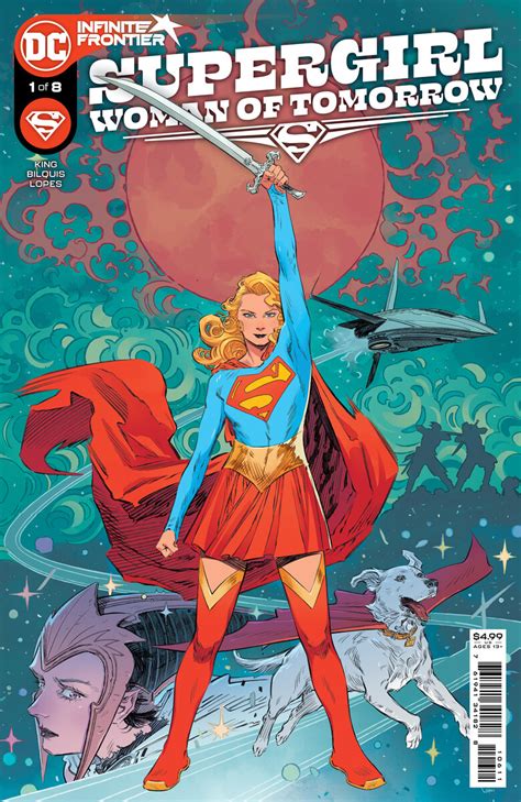
The story is good and well told but what makes the book really really special is the art work by Bilquis Evely.

I had not come across her work before and that is a mistake that I will be trying to make up for. Her style is very suited to Space Fantasy, it is both technical and fantastical and also very detailed, but you can see that.

I could have picked any number of examples that show just how talented she is and in the end I had to settle for the cover above and the single panel below.


This is ridiculously good for a single panel and the level of detail and styling reminds me a little of Philippe Druillet, which is most definitely a compliment.
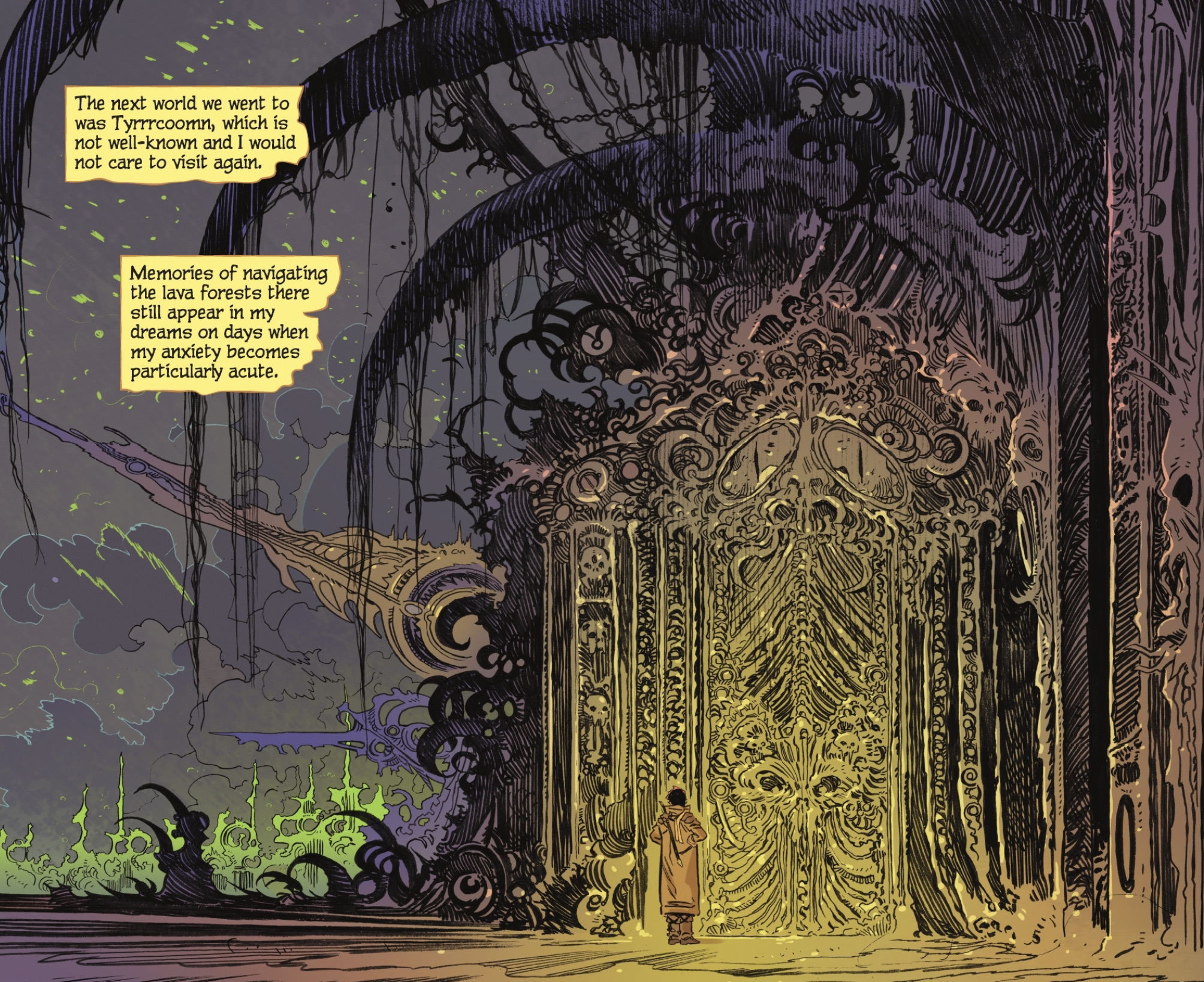
I bought Supergirl: Woman of Tomorrow for Tom King and I loved it for Bilquis Evely. When words and pictures combine like this the result is astonishing.

03 January 2020

Joker: Killer Smile is exceptional

I do not read many traditional superhero comics these days but I do most certainly read comics written by Jeff Lemire and drawn by Andrea Sorrentino so I had to give Joker: Killer Smile a try.

As you would expect from that team this is not a traditional superhero comic and it is also very good.

I think that it is fair to say that the Batman and Joker world has been milked for all it is worth in the last few decades and while a few stories have stood out, obviously Killing Joke is one of these, the rest have disappeared in a vast sea of sameness. In such a large sea only the exceptional can stand out.

I think that Joker: Killer Smile is exceptional.

There are only two main protagonists, Joker and his psychotherapists  Dr Ben Arnell. Batman makes a brief appearance, because he had to, but makes no material contribution to the story. This is about Joker, not Batman.

The psychotherapist thinks he can cure Joker and spends hours talking to him in Arkham Asylum. Not surprisingly these conversations do not go the way that Dr Arnell hoped but their consequence is a genuine surprise. It's a tight noir tale that grips from the start and drags you into dark unexpected places.

The story is a good one (so far, I have read two of the three chapters) and the storytelling is excellent. Both Jeff Lemire and Andrea Sorrentino are masters in their fields, with the awards to prove it, and as a team they are even better.

Joker: Killer Smile shows how superhero comics can tell great, and scary, stories without relying on people punching each other.

06 March 2019

Much to love in Green Lantern

I have never been a big reader of DC comics and these days I hardly read any superhero comics from any company so it took something special to get me reading Green Lantern.

That special thing was the creative team of Grant Morrison and Liam Sharp, both British as it happens.

I have had mixed experiences with Grant Morrison and while I would not call myself a fan as such I really loved his long run on New X-Men and have enjoyed several other of his books.

Liam Sharp having been around for a few years has suddenly burst to the top of the mainstream at DC starting with Wonder Woman and then with The Brave and The Bold. I have loved all of his work.

This page is fairly typical. The flow is imaginative and the detail is incredible.

Also typical is the wordiness, this is clearly not a Warren Ellis comic! But this is good fluid wordiness and not the panel filling wordiness of the early days when authors thought that they had to explain what the artist had drawn. It's a typical Morrison story too and it needs some attention paid to it, which is effort well spent.

We are five issues in now and I understand that there will be 24 altogether. It is going to be a good couple of years.

18 July 2018

The Brave and The Bold is beyond beautiful

I am not a big DC fan these days and have never read their mainstream books (Batman, Superman, JLA, etc.) consistently, tending to dip in and out for specific stories and/or creators. I still keep an eye on what is happening in DC Land so I was aware of the buzz created around Liam Sharp's Wonder Woman in 2016 and experimented with the first issue. The art impressed me but the story did not and I left it there.

Then I heard that Liam was working with Wonder Woman again this time with Batman in tow in the revamped Batman team-up comic The Brave and The Bold. I experimented again, was even more impressed by the art and liked the story too so I stayed with the book.

This panel helps to show why.


The detail is frightening and the subject is fantastic. The story is steeped in Celtic mythology and that is reflected in the design of the pages. The book is beyond beautiful.

The only shame is that it is a six part limited issue series.

31 December 2014

Revisting Batman Hush

I first read Batman Hush in 2002/3 when it first came out as a twelve issue story arc in the monthly Batman comic. I am not a great reader of DC comics but this was something of a relaunch by the then, and now, superstar combination of writer Jeph Loeb and penciler Jim Lee.

Hush lived up to expectations and has been a best selling graphic novel ever since.

Unexpectedly it was a conversation on Rolls Royce cars in the pub that led me return to it and a ridiculous digital price of £2.99 that made me buy it there and then.

That same ease of purchasing has recently tempted me to buy old collected editions of things like Swamp Thing, American Flagg, Dreadstar, Dan Dare and Federal Bureau of Physics. More on these late as and when I get around to reading them (don't hold your breath).

I'm not sure how we got on to Rolls Royces but we did and tales were told of driving them, getting lifts in them and famous people we had seen in them. That led me to repeat the story I had been told of Ben Kingsley apparently deciding which Rolls to take his children to school in according to the colour of the suite he was wearing that day, e.g. brown suit meant the brown Rolls. On reflection, if you have to make a choice like that then using what you are wearing to make it seems sensible, it is just not a problem that many of us face.

And that led me to think of Batman Hush.


Here we see Batman and Robin in Batman #615 (part 8) about to go after The Riddler who had just stolen an armoured car with $11 million in it. Obviously they need the Batmobile.


Then Batman reminds Robin that they have a whole host of Batmobiles to choose from. And in doing so, Loeb and Lee produced a simple explanation for why the Batmobile keeps changing in each new incarnation of Batman in comics, tv and film; it's not THE Batmoible, it's A Batmobile.

The simple idea shows why Loeb is a good, if inconsistent, writer and the double-page spread shows why Lee is such a good artist for superhero comics.

Having bought Batman Hush (again) to illustrate a point about Rolls Royce cars, I'll now have to read it (again), which is a bonus!

07 August 2014

The Dark Knight Returns (again) to make me happy

It is difficult to remember who much an impact The Dark Knight Returns had when it came out in 1986 because the hard Batman persona that brought in has become standard since then.

But if you consider the camp 60's TV series you get some idea where the transformation started. Of course he was not still camp by 1986 but at that time a lot of emphasis was on the detective side of his character and the stories were about his brain power not his physical prowess.

I, of course, bought the books when they came out and now I have them safely bagged and boxed. Somewhere. I just do not know where that somewhere is.

When DC put 750 digital Batman comics on sale and that included the four issues of The Dark Night Returns at only 69p each then I bought them again just to read them again.

I have always liked Frank Miller's artwork (possibly because we were born on the same day)  and I still found it visually striking after the best part of thirty years. Other artwork from that period has aged much less well.

The story is also familiar now but was fresh then. Superheroes had gone bad (that was mostly Batman and Green Arrow) and had disappeared when they were no longer seen as heroes. Some had been locked up. In the meantime the world had gradually become a worse place and heroes were needed.

There are other nice themes running through the book like the hopeless American President (based on the then President Raegan) having to deal with a Cube-like crisis.

Two Face and the Joker play significant roles but the story is really about Batman dealing with general lawlessness rather than supervillains. And he deals with it using extreme physical force and psychology. He hurts people to make his point. That means that is return is seen as a double-edged sword, some think he is doing good in tackling crime while others think that he is the criminal.

I had not read the book for a couple of decades but large chunks of it had stuck with me. A lot of it had gone though and that made the rereading almost as much fun as it had been the first time.

One scene that had stuck with me was the confrontation between Batman and Superman in the fourth and final book. One of the tricks Batman had was some synthetic Green Kryptonite. I wonder where that came from?


I really liked the idea that Batman had put so much effort in to preparing for a fight against Superman, even when they were friends and colleagues.

The Dark Knight Returns was a great book in 1986 and it still is.

18 December 2013

DC Comics Digital Sneak Peeks: 18 December 2013


Ringing the changes on the stylistic Batman cover of the week with Man-Bat this time.


The interior art is by Romano Molenaar from Birds of Prey #26. I like the classic style of the figures with the more modern panel arrangement.

11 December 2013

DC Comics Digital Sneak Peeks: 11 December 2013


This week's mandatory stylistic Batman cover comes from, er, Batman. It speaks for itself.


This is a promising interior page from Justice League 3000 #1 drawn by Howard Porter. I like the strong lines in the art, rather like John Byrne, the flow of the action through the page and, most of all, the cat-like aliens in the background.


Federal Bureau of Physics has a habit of being picked. This time it is for the colours, especially the contrasting pink and teal.

04 December 2013

DC Comics Digital Sneak Peeks: 4 December 2013


Superman leads off this week with a standard hero v monster composition delivered nicely. I like the rock monster and the way it divides the cover in to two differently coloured parts.  I also like the way the it is the monster that dominates the cover and not Superman.


There seems to be a stylistic Batman cover every week at the moment and this week it comes from Batwing (again).


Batman makes a second appearance with Detective Comics mostly thanks to all the bats.


Hinterkind, on the Vertigo label, is not a superhero comic, and it shows with its unusual water colour effect and sci-fi/fantasy cover. It is strikingly different.


27 November 2013

DC Comics Digital Sneak Peeks: 27 November 2013


One of the things that I liked about Alan Moore's run on Swamp Thing is that the man of moss grew to realise that he was connected to the plant world and that made him very powerful. We get a hint of that power in this dramatic cover.


I seem to feature a dark Batman picture every week, and this is no exception. There is power in the action yet the scene feels as if it could be almost silent and the lack of colour matches the lack of sound.

20 November 2013

DC Comics Digital Sneak Peeks: 20 November 2013


An unusual choice this week, a cover and an interior from the same comic but chosen for separate reasons. The cover is a simple striking Batman delivered in two colours to match the villain's two faces.


Colour comes to the fore in the splash page which is also strikingly simple in composition. This helps to focus attention on the bat-signal that has been defaced in two-face's trademark style.

13 November 2013

DC Comics Digital Sneak Peeks: 13 November 2013


I've lost track of what has happened to Batgirl in the New 52 and the snippets that I have read in DC Comics Digital Sneak Peeks have not persuaded me to find out more. I can still appreciate the artwork though.

The three different parts of the cover work excellently together; the modern buildings in the background announce that the story is set in the real world, the gargoyle and bats in the foreground say that this is a weird Gothic corner of the real world and the figure in the centre is clearly well prepared for the weirdness.


This cover takes both minimalism and darkness to new levels. Somebody must have been thinking about the Metallica Black Album, and why not?

06 November 2013

DC Comics Digital Sneak Peeks: 6 November 2013


Choosing something by Andrea Sorrentino has become something of a habit and with covers like this it is easy to see why, though the previous examples have been interiors.

The composition has everything, the forceful but patient hero, the dark threat above, the grimy setting neatly set at a slight angle, and the subdued colouring.


Jim Lee is DC's superstar artist and he fits firmly in the superhero tradition that started with Jack Kirby. That style can be a little simplistic for my tastes but sometimes simple is good as it is with this picture of Lex Luthor playing with a Superman doll.

30 October 2013

DC Comics Digital Sneak Peeks: 30 October 2013

A very easy choice this week.

The Sandman Overture was one of the most anticipated comics in recent years. It is almost twenty years since Neil Gaiman finished the original Sandman saga which ran through 75 issues from 1989 to 1986, since when he has made something of a name for himself.

But this is a post about the artwork so I'll leave saying more about the Sandman until I have read a few issues.

The artwork was another cause for the anticipation.

Like a lot of people I suspect, I discovered J H Williams III when he drew Alan Moore's Promethea (1999 to 2005).

Promethea was a mythical story and the art work matched the magic and grandeur of the words. Sandman Overture, from what I have seen of it so far, has much the same feel to it and that is a good thing. Moore guided Gaiman on writing comics and the similarity in their styles means that they suit similar artists.

This interior page is typical of the comic and shows why I am looking forward to reading it so much. The bad news is that DC are milking it a little and the six issues are coming out bimonthly so I've got ten months to wait for the complete story. I'm sure that it will be worth it.


23 October 2013

DC Comics Digital Sneak Peeks: 23 October 2013


I've always had a soft spot for Jonah Hex. It is a fringe comic, that is it does not have superheroes in it, and that means that the writing and drawing can be less mainstream and, therefore, more interesting. It used to be a weird western comic but it is a little different now that Jonah is in the present age.

I picked the cover not for the story inside but for the its tense composition and the grainy feel to the artwork.


This cover was an easy choice. Again the composition is the main point with the combatants falling quickly from a great height. Talon's tattered cape is the best clue to this.

Two more things make the picture stand out. The yellow artificial light from the office gives great contrast to the figures and the bat signal in the background adds another point of interest.

16 October 2013

DC Comics Digital Sneak Peeks: 16 October 2013


Either this was not a good week or I am getting more fussy, I suspect that it is a touch of both, and that means that there is just one page in my selection this week. This is the splash page from Rogues Rebellion #1.

It is a not unfamiliar post disaster scene that is elevated from the normal by the use of colour (a dark foreground against a red background) and the brilliant light blue shaft that one of the rogues is carrying. The next two pages in the preview are equally well composed and coloured.

09 October 2013

DC Comics Digital Sneak Peeks: 9 October 2013


I am not convinced by the Willy Wonka figure in the foreground but the steam punk machine attacking him is wonderful and that's enough to get this cover included in my weekly selection.


Just to be contrary, having decried the central figure in the first cover I have then picked this cover because it has one. There is more to this picture than a confident Catwoman though, there are nice things like her long curving whip, the Batman shadow and the airships. I like the colouring too.

02 October 2013

DC Comics Digital Sneak Peeks: 2 October 2013


Green Arrow is looking good at the moment so it gets featured again. This is an interior page from #24 by Andrea Sorrentino that has a neat structure and a nice use of just two colours.


The Witching Hour in the Vertigo line is another new title and this one promises "nine tales of divine horror". That sounds good and this page from the story Birdie looks good too. Coincidentally it also has some circular panels and, as with Green Arrow above, they contribute pleasingly to the page structure.


Finally there is another iconic Batman cover. I love icons and I love Batman so it is understandable that I love covers like this one. OK, so it says Batwing rather than Batman but the argument is the same.

25 September 2013

DC Comics Digital Sneak Peeks: 25 September 2013


Villains' Month at DC has produced another set of strong covers this week and it has taken some will power to select just one. Killer Croc #1 wins for the violent eruption of bones around the violent figure and for the bemused turtle caught up in this.


The cover of Parasite #1 did not impress me greatly but this inside page by Aaron Kuder does because of its vertical composition and flow. I also like the sense of calm, the truculent weather and the coloured speech balloons. There is a great deal to designing a page of a comic and it is only when all of them work together that you get a page that works as well as this.

18 September 2013

DC Comics Digital Sneak Peeks: 18 September 2013


The wow-factor from the front page of Justice League America #7.3 (a.k.a. Shadow Thief #1) comes from the view point with the city laid out below the falling figure. I don't think that the promise of the first page is carried through the rest of the comic but that does not matter to me as I am just looking for single pages with visual impact and this one has that.


Another internal page, this time from Fables #133 by Mark Buckingham. The colours hit first with the blue/green story panels flanked by the contrasting yellow/orange borders. The next point is the progression of the three panels which grow in size as the page heads towards its climax. Finally, it is the style of the artwork with its simple construction and strong lines building on the tradition of Jack Kirby and, personal favourite, Keith Giffen.


DC is all about villains at the moment and I think that is working very well. Each cover has a dominant baddie and I've chosen this one of The Penguin because he has often been portrayed as a comedy villain but here he shows real malevolence.