Showing posts with label royal_academy. Show all posts

07 December 2015

Ai Weiwei at the Royal Academy

Ai Weiwei could be the most famous artist at the moment but I knew very little about his work. Obviously I was aware that he was a prominent Chinese dissident (the BBC delights in telling us stories about dissidents in China and Russia while ignoring stories about our own) and I would have gone to see his work, Sunflower Seeds, at the Tate Modern Turbine Hall in 2010 if not for visitors being stopped from walking through it for health and safety reasons. That was not enough to make me want to go to the Royal Academy (RA) to see an exhibition of his work.

What swung it was the very positive reviews that I had seen, mostly via Twitter but also via the Art Fund app.

The popularity of the show meant that it was going to be busy whenever I went so I thought that I would go first thing (10am) on a weekday. I had some odd days of leave left to take and a day going to exhibitions was a good way to spend one of those days.

I took advantage of my Art Fund membership to get a ticket for £15.

The route to the RA was easy enough, bus to Richmond, District Line to Hammersmith, Piccadilly Line to Green Park and, finally, a short walk along Piccadilly. That takes about an hour without rushing so I was able to have bit of a welcome lie-in. On the day the lie-in overran slightly and I got to the RA around 10:15, still in good time for the first visiting slot for the exhibition.

The exhibition consisted of eleven connected rooms that I walked around once slowly and then went back around again to revisit my favourites. I took several pictures in each room and used a lot of self-restraint to pick just seven for this blog post.


Straight was in Room 3. The main story here was an earthquake in China which had killed a lot of people, including school children, and poor construction methods were blamed for causing many of the deaths. Ai Weiwei took the twisted and broken rebars (reinforcing bars) from the collapsed buildings, straightened them out and arranged them into this wavy pattern.

I deliberately took this picture with lots of people in it to show how big it was though, to be honest, it would have been impossible to take a picture like this without lots of people in it. It was busy and getting busier.

As with all of Ai Weiwei's work there were two aspects to it, the artistic impression and the political meaning behind it. I could appreciate Straight as a work of art but was unable to comment on the extent to which poor building construction caused deaths and even less able to comment on the Chinese government's role in this.


Next door in Room 4 were two pieces arising from a studio he built in Shanghai but which was never opened and was quickly demolished. Again, I've only heard Weiwei's side of the story so cannot comment on that meaningfully.

Souvenir from Shanghai was constructed from materials recovered from the demolished building. As with a similar piece in Room 1, I liked the way that the materials were put together to make something very solid and somewhat strange.


River Crabs, three thousand of them, represented the gallery opening after-party that happened despite the gallery not opening. I liked the absurdity of the piece and also the effort and skill that had gone in to making it.


Coloured Vases in Room 5 asked another set of awkward questions and again I was not entirely on Ai Weiwei's side. The questions were around antiquity and art, is an ancient vase improved if it is turned into modern art? In the most modest example, above, the vases were "improved" by painting them and in the most extreme one was "improved" by throwing it on to the ground to shatter as a piece of performance art.

I'm with antiquity on that one. If you want to destroy a vase then make a new one.


Room 7 had works made out of marble. In the background is Marble Stroller and the large piece on the floor is, unsurprisingly, Grass. As with others of his works, the construction was the thing that impressed me the most, then the appearance then the political point.


Possibly surprisingly after what I have said, one of the most overly political pieces was one that I liked the most. This was in Room 10. Ai Weiwei had been detained for dissent and he made six half-size models of this time.

Each of the cells had one small window on one side and another on the top so that we could look in. Each scene showed part of his simple daily routine, such as eating, having a shower or going to the toilet. Two guards watched him closely all the time.

The construction was, again, impressive but this time the political message shone through and seeing somebody incarcerated in a small room with two people watching over them was an easy message to understand.


The final piece, in Room 11, Bicycle Chandelier was the most approachable. It was what its name suggests, a chandelier made from parts of bicycles. It was commissioned for this exhibition and fitted the high domed room neatly.

The exhibition was very mixed in terms of the materials used, the sizes of the pieces and the motivations for producing them. Helping to make sense of all this was an audio guide and I made good use of this as I went round. There was a short audio for every piece which I listened to though I skipped the additional audio sections except for when I played them by mistake.

Ai Weiwei, for me, lacked the continual wow moments that the David Hockney exhibition had but there was plenty enough in there to demand an hour and a half of my time and to make me want to walk around for a second time to see some of them again. 

I am still not a great Ai Weiwei fan but the exhibition helped me to understand and appreciate his work, I also liked a lot of it. Straight was my clear favourite.

30 March 2014

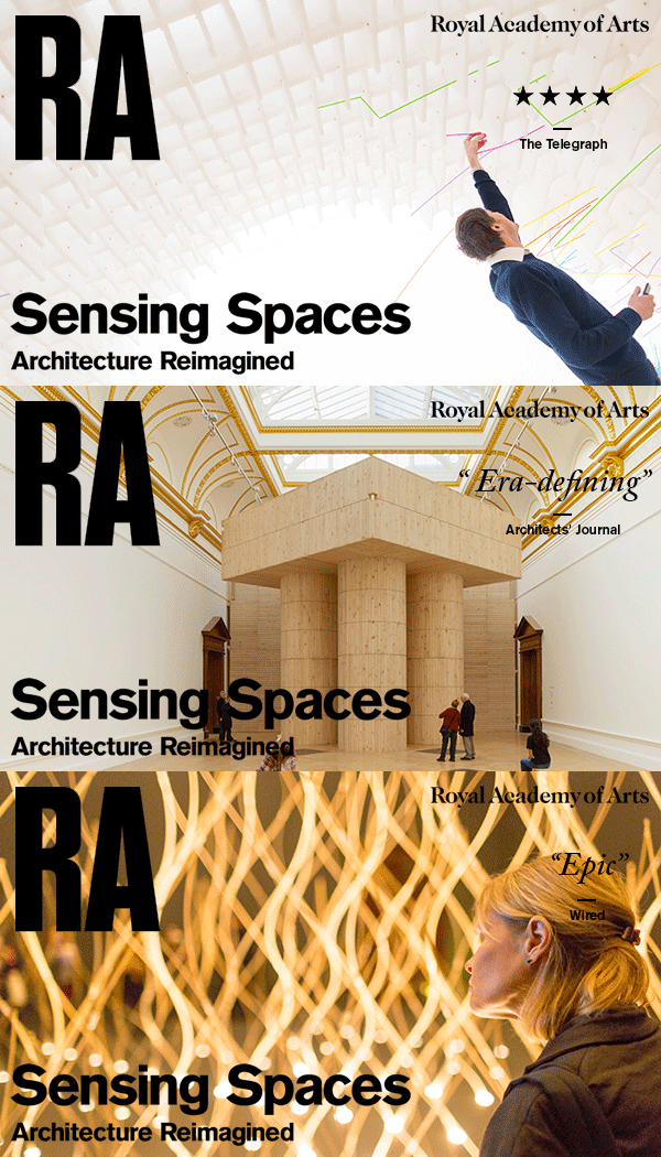
Sensing Spaces at the Royal Academy


Architecture is a long-term interest of mine though this is entirely as a consumer and I would not claim any expertise in the technicalities of the work, e.g. how stresses are calculated or joints designed. Basically I like looking at interesting buildings and getting to see inside them if I can.

And so it was only going to be a short matter of time before I went to see Sensing Spaces at the Royal Academy.


Sensing Spaces was a collection of very different spaces spread across the RA's main exhibition rooms.

In concept and execution it was something like Architects Build in Small Spaces that was on at the V&A in 2010, which I loved.

The first construct was a platform supported by four cylindrical legs which also acted as staircases (two up and two down to avoid conflict).

The crispness of the wood was a real pleasure and the children loved the peep-holes in the walls.

Having climbed up one of the staircases I then discovered that there was another way up/down, a very gentle ramp hidden by a floor to ceiling wall made from the same wood.

I would love to have this in my garden. I'm sure I could make the logistics work out somehow.


In two dark rooms there were spot lights on the floor with fibre-optics cables leading from them to make 3-dimensional patterns of light. The arrangements of lights and the cables were both curved so the patterns they made shifted as I walked around the installations.


The most successful space, at least for the children but not just them,

It was a tunnel made out of some sort of plastic that had a grid of holes in it which visitors were asked to push long coloured straws in to.

I did my bit, I felt a moral obligation to do so, and pushed a few single straws in. Most people were more adventurous and twisted and platted the straws in to interesting shapes before attaching them to the tunnel.

Others decided to keep the interesting things they had made and to take them home with them.

Others missed the point of the exhibition entirely, and the polite notices, and decided that it would be better to take a bundle of fresh straws home and to make something out of them there.

The tunnel part of the exhibition fooled me and it took a while after I walked through it to realise that I had emerged in to a separate room.


The same trick was played in the next construct.

The first part was a series of corridors with walls made out of neat sticks and floors of illuminated glass.

The corridors were something of a maze and there were even a couple of side rooms to hide in.

The crunching sound that pulled me through the maze came from the final room which had a pebbled floor and a mirror along one wall. Most people took photos of themselves, and so did I. That's me in the corner holding a camera at an odd angle.

The combination of sticks, pebbles and mirror worked well and I had a few happy minutes crunching around and enjoying the space before moving on to the next rooms.


The last two rooms that I went to (the rooms could be visited in any order, I just chose to go clockwise) contrasted light and dark.

Of course the human eye, and the camera, easily adjust to different lights and so I had to move between the two rooms a few times to get the impact. This was rather like the coloured rooms in Light Show at the Hayward Gallery.

The lighting of the two rooms was reinforced by the shaped ceilings, that's  light at the top and dark below it on the right.

There were some other things to see but these were the main attractions and after seeing them all once I went around all the rooms again to take even more photos.

The use of different materials and shapes made the exhibition a series of distinct experiences and my reaction to these were mixed. I loved the platform and the maze (perhaps it was because of the wood that they were both made out of), found the curved lights and the light/dark rooms interesting but the straws did little for me other than the childish pleasure of playing with the straws.

Overall it was an stimulating event and that was largely because it was possibly to interact directly with all of the pieces rather than, say, looking at drawings or models of them. And that is clearly the best way to see whether spaces work.

24 July 2012

The Weird, the Wacky and the Wonderful at the RA

Clearly I was not going to miss an exhibition on architecture with the title The Weird, the Wacky and the Wonderful, especially when the image used to promote it was this colourful and wonky apartment block in Austria.

My first problem was finding the exhibition.

It was listed as being in the "Architecture Space" but nothing on the RA website gave any clue where that was. still, I have been to architecture exhibitions at the RA before so I was pretty certain that this was the small gallery on the top floor.

I was wrong.

It is, in fact, a short stretch of corridor on the ground floor that leads to the restaurant. The walls had been lined with what looked like acoustic absorption material in to which about twenty circular glossy but not very detailed photos had been inserted. Each had a brief description that told you little more than its name and the city it is located in.

Not quite what I was hoping for given that I had set aside between one and two hours for the exhibition. I could have done it in five minutes easily but I wanted to get my money's worth and I managed to drag it out to ten.

I managed to take ten minutes over it because I do like the weird, the wacky and the wonderful and the exhibition certainly had that.

There was the Spirit Hotel in Bratislava that looked like a scrapheap.

I was determined to stay there the next time I went to Slovakia until I looked it up and discovered that the spiritual theme of the hotel is as weird as the building.

In Tirau, New Zealand, we can find two commercial buildings that look like a sheep and a dog. Wonderful indeed.

Nautilus in Mexico is a house that looks as though it was designed by Roger Dean with its psychedelic mushroom shapes.

But my favourite was the Macedonian Monument from KruĊĦevo, simply because it looks like a teddy bear. And that's definitely weird, wacky and wonderful.


14 March 2012

David Hockney at the Royal Academy

The Royal Academy did an excellent job in their pre-publicity for this event and they managed to persuade me to buy a timed ticket before it opened despite me not being a great fan of Hockney or even a regular visitor to traditional galleries.

And so I found myself at the Royal Academy at 3:30 on at Saturday afternoon walking past the long queue and then fighting my way through the shop to get in to the exhibition.

Inside it is the familiar arrangement of rooms except that a few ropes mean that you can only pass through it in one direction. Rather like Ikea except with things you want in it.

I think that it is fair to say that the exhibition starts slowly and the first couple of rooms have some interesting if not spectacular pictures that show us just a little of Hockney's history.

Then we enter a new gallery and everything explodes.

On one wall is a tight arrangements of watercolours and on another similar scenes in oils. They are all different but there are common features like hay bales and prominent roads leading you through the picture.

It is totally unrealistic to attempt to show the impact that they make by showing just one of them so just appreciate this one in its own right. Each picture is gorgeous and together they are sensational.


These are the last of the small pictures that we see. Most of the rest range from large to monumental. Each is consists of a number of canvasses that are mounted separately but together. Rather like a jig-saw puzzle for very small children.

Repetition is a common theme. In one room there are seven large paintings of a group of trees that were all painted from the same spot but on different days. Hockney starts to veer towards the abstract here and while the earlier landscapes used natural colours the later ones have vivid blues, yellows, purples and greens that are not natural but somehow look as though they should be,


And that brings us to the very large picture that has been chosen to promote the event. It's easy to see why you would choose it to do that.

As before, this is one of a series of pictures showing the impact of the woodsmen on the landscape. A tree stump is captured from several angles and in several colours and is joined by the recently cut logs.

This is a magnificent painting that, again, has to be seen in its full size to be appreciated.

But it is not my favourite picture. This one is.


The composition, colours and scale make this a breath-taking picture that both draws you to it to see the detail and pushes you away to see the, er, bigger picture. That detail includes the Spring flowers, fresh leaves, bold trunks and the whisper of more trees behind.

Exiting the exhibition after two stimulating hours it took a fraction of a nano-second to decide to buy the exhibition catalogue (I don't but catalogues) which has this picture wrapped around it.

The catalogue is sumptuous and does far more than just repeat the pictures for you, though it does that too. If you go to the exhibition you should definitely buy the catalogue and if you do not go then you should buy in anyway.

It is impossible to overstate how good the Hockney exhibition is. The pictures are stunning and are made the best of by the way that they are presented. It is easy to overlook curating as a skill and it takes a job as well done as this one to remind you what a different it makes.

Sadly I cannot afford to buy a Hockney, nor do I have the space to hang one, so I'll just have to console myself with the catalogue. That'll do.