It had not been a good day in the office but at least it finished early which meant that I could go somewhere to cheer myself up. And it did not take long to think of the Saatchi Gallery.
This was conveniently situated almost on Sloane Square station which I had to pass though any way so it was a very minor detour to pop-in there.
The mood was set in the first gallery which was full of giant ants. You can get some idea of the scale when you realise that the walls that they are climbing on are tall, as you would expect in a gallery. Each ant was about 1m long.
I immediately thought of the Blondie song Attack Of The Giant Ants from their excellent eponymous first album and I was feeling better already.
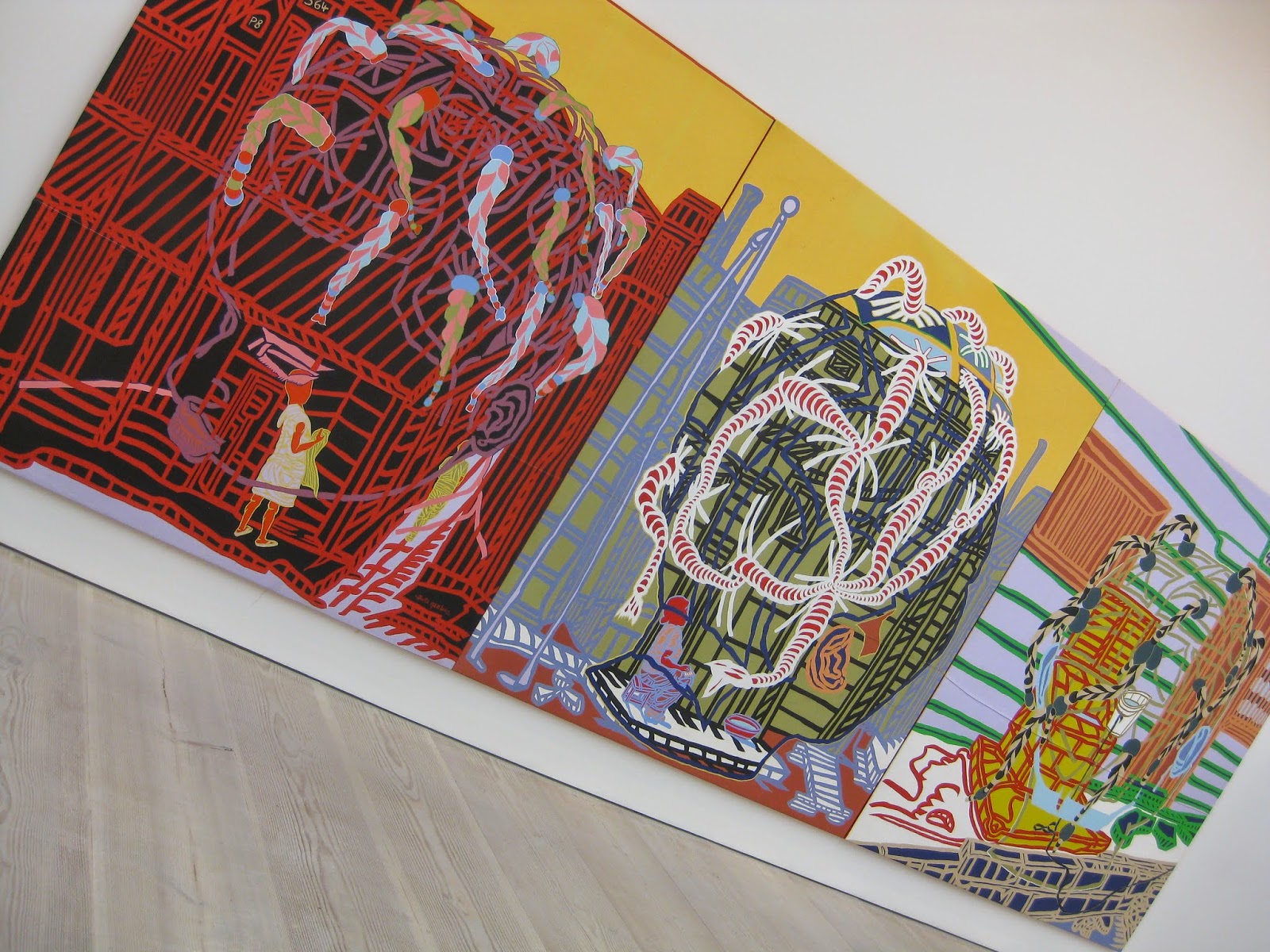
The Saatchi has huge light galleries which are ideal for showing off large colourful eye-catching pieces. That is exactly what they usually have in there and is exactly what I was hoping to see.
Of course small pieces of art can be very good too, for example I love the book illustrations by William Blake in Tate Britain, but there is something special about putting a large bright picture on a very large white wall. The simple act of walking in to the room can be breathtaking.
The exhibitions that I saw were called Pangaea: New Art From Africa and Latin America, and Abstract America Today, which means nothing other that the artists shared a geography and a time.
I was quite happy with that and was not trying to find any sort of unifying theme across the works. I just wanted them to surprise and delight me. Which they did.
It was not all about colour and I am quite a fan of greys and blacks too.
The "milk" piece at the far end was striking from a distance and from close-up and I settled for just the long range view to show it in context and also to give a better idea of the scale of it.
It was one of many works that I would gladly have had in my house if only I a spare room like that to put it in.
One of the galleries at Saatchi is double-height and that usually has something even larger that the other pieces in it. This time the walls were draped with what looked like used bags stitched together.
Again this piece worked at a distance because of its visual impact and also close-up because of its texture.
I really liked these pieces and I also wanted to show how they were presented. There was a lot of space around the works, even when they were by the same artist, and that made it easier to appreciate each one. It was almost as if each piece was alone in the gallery.
Another blast of colour simply because I liked it.
One small room, on the top floor I think, was quite different. It had a display of "normal sized" paintings by Richard Maurovic. I liked their industrial subjects, simple yet striking colouring and the way that the pictures wrapped around the edges of the canvas.
There are under twenty gallery rooms at Saatchi and most of these had just a few sparsely hung pieces. I was in something of a rush, I was on my way home after all, so went round with decent haste. Even then it took me almost an hour to get around.
I went to Saatchi on the spur of the moment for a quick lift and it did that and more. Good modern art galleries are some of my very favourite places and Saatchi is definitely one of those.
29 May 2014
Subscribe to:
Post Comments (Atom)


No comments:
Post a Comment
All comments are welcome. Comments are moderated only to keep out the spammers and all valid comments are published, even those that I disagree with!